Looking Back, Part 2
To celebrate the release of Modern Masters 2017 Edition, last week I started telling some design stories about some of the cards in the set. I didn't finish, so this week is Part 2 of that column. That said, on with the stories.
Death's Shadow
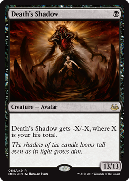
In Mirage, I was eager to continue a little game R&D had been playing where we kept one-upping the biggest creature in the game. Limited Edition (Alpha) had Force of Nature, an 8/8. Antiquities then introduced Colossus of Sardia, a 9/9. The Dark contained Leviathan, a 10/10. Ice Age then topped them all with Polar Kraken, an 11/11. I wanted to make a 12/12, but Bill Rose, the lead designer of Mirage, wasn't willing to create one just to make it. He told me if I could come up with a cool design, he'd consider it. I came back with this:
Bill's response: "A 12/12 trampler for one mana? Well played, Rosewater, well played."
Flash forward many years later to the design of Worldwake. The set was Ken Nagle's first lead design, and he was eager to make it the best set ever. Legions had the very first 13/13, Krosan Cloudscraper, numerous years earlier, but Ken was interested in breaking a different record. Could he make a creature bigger than 12/12 for only one mana?
Phyrexian Dreadnaught had demonstrated that you need a pretty big drawback to make this kind of creature work. Ken had to figure out a different type of drawback. His solution was to make a creature that got smaller based on your life total. This meant it could naturally be a 13/13, but it most often wouldn't be that big. Also, as you start with 20 life, the card seldom could be played on turn one even though it only cost one mana.
As a final trivia side note, three more 13/13 creatures would later be printed, all on the plane of Innistrad with its theme of having a lot of 13s.
Evil Twin
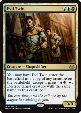
One of the things I like to do, especially with top-down designs (designs where we start with flavor and create mechanics to match), is to ask the creative representative to come up with cool, flavorful card names. Then I will set aside time in the meeting for us to design some cards as a group. One of my favorite designs from Innistrad came about through this process.
The way it works is the creative representative (for Innistrad it was Jenna Helland) brings a list of names. I put all the names on the board for everyone to see. I then start by asking one team member to pick a name on the board. Very early on, someone chose Evil Twin.
I wrote "Evil Twin" on the other white board, the one all the names weren't on, and started by asking what type of card people thought this should be. For Evil Twin, everyone agreed that it needed to be a creature. What kind of creature? A Shapeshifter, as it takes the form of creatures. What color or colors would that mean? It had to be blue, as shape-changing is primarily a blue thing. The team also felt that the card probably also wanted to be black. Evil Twin felt pretty blue-black.
Next I asked what people expected the card to do. Clearly it needed to be able to copy other creatures. Okay, what else? In horror movies, an evil twin kills you, or at least tries to, and takes your place. That meant we needed both a copy effect and a creature-kill effect. Let's start with the former. What existing card captures the feel we want? Clone (from Alpha). It enters the battlefield as a copy of any creature in play. That felt right.
Next came the creature destruction. Now, an Evil Twin can kill others, but the focus is always on killing the original, so we decided to zoom in on that. The creature takes the shape of another creature and then tries to kill it. Did we want the kill effect to also be when the Evil Twin enters the battlefield? No, that seemed too easy. We wanted the Evil Twin to have to work at killing the original. That meant we probably wanted an activated ability.
The big question was how to limit the killing to just the creature copied. And then somebody hit upon the solution. The Evil Twin and the victim have something in common—they share a name. The killing ability can be restricted to creatures that share a name with it. All of this probably took the team about five minutes to process, and before we knew it, we had an amazing design that got put into the set and made it all the way to print with only tiny number tweaking.
Opportunity
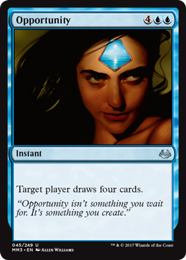
I spend a lot of time talking about designing offbeat cards, but another important part of design is making nice, clean basic effects. Opportunity is a good example of such a design. At the time, Magic had cards that drew one, two, three, or a variable (aka X) number of cards, but nothing that drew a larger number. I set out to make such a card.
I began by figuring out what it would cost to draw each number of cards from four through seven. I chose to make it an instant because I wanted it to be something a blue mage could do at the end of their opponent's turn, right before they untapped. (This was before we went through the multi-year phase where all card drawing was on sorceries.) The costs ended up being a bit higher than I expected, so I decided to stick with the lowest end of the spectrum—drawing four cards.
I then spent a bunch of time trying to come up with a nice simple name. Back in the day, it was commonplace to leave a name alone and let it go to print if the playtest name felt solid enough. I remember trying a bunch of different names before settling on Opportunity. I made the effect targeted, because it's been my belief that draw effects should be targeted as a default (you can read my argument on the point here, and a rebuttal here), and I also felt like there were times you could use it to mill out your opponent.
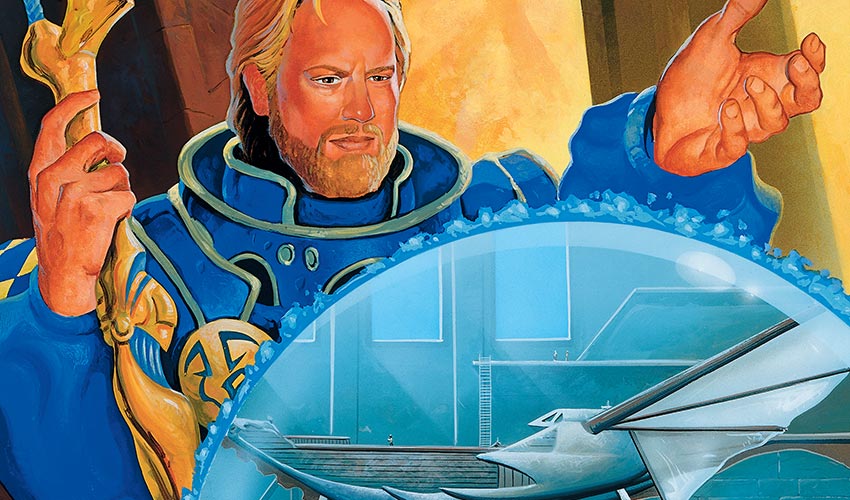
The original art, by the way, shows the moment when Urza comes up with the idea of creating the Weatherlight. There are not a lot of illustrations with Urza and the Weatherlight pictured together.
Pitfall Trap
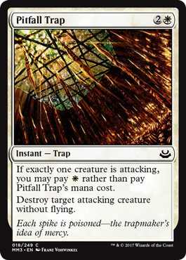
Once we knew Zendikar was going to be an adventure world, I spent some time looking at various tropes we could take advantage of. This exploration is what led us to doing Allies, quests, and Traps. The latter was heavily influenced by the opening scene to Raiders of the Lost Ark. (Stone Idol Trap was designed as a top-down rolling boulder trap just like in the movie.) I actually rewatched the opening scene a few times so I could write down all the various traps.
One trap I was very excited for was a pit trap. This is basically a trap where you create a deep trench, usually with spears at the bottom, that you cover up and hope that the victim falls into while watching out for other traps. The key to designing a cool trap was to come up with a condition that would allow you to cast the spell cheaper than normal. Ideally what you wanted was a condition that players would learn about so that they could begin to start playing around the trap. The idea was that traps would create a metagame where players are constantly on the lookout for other people's traps.
I liked the idea of the trap being attacking alone because it implied that you didn't have anyone to help you. It also played well. If you saw your opponent had a single white mana up, you had to think twice about attacking solo. The original version didn't have the non-flying rider, but in an early playtest I was about to kill a flier and said aloud, "That doesn't feel right" and changed it on the spot. "Your guy lives. A flier can't fall into a pit trap."
Of all the traps in Zendikar, this one was my favorite— both because the flavor is dead on and because I like how it created interesting moments in gameplay.
Sphinx's Revelation
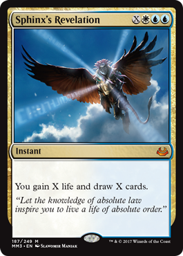
When we first put the guilds together, there were some guilds that took us a while to get a handle on, but not Azorius. White-blue had seen a lot of tournament play together and had a very clear identity—they were the two control colors that when they got together slowed the game down to a crawl. If you've ever played with Dissension, you might remember that Azorius didn't quite go down that path. It was more focused on fliers and was a bit more aggressive than white-blue decks of the past.
The reason for this change was that Champions of Kamigawa block, the block preceding original Ravnica, had pushed very hard on both white and blue. They had been dominating the tournaments with slow controlling decks, so it was decided in Dissension that we needed to take Azorius in a different direction. None of the design team was particularly happy about this, but we understood that sometimes set designs have to address larger gameplay issues.
Flash forward seven years and we were returning to Ravnica in a set appropriately named Return to Ravnica. Azorius was scheduled for the first set, and the whole design team had a very clear goal in mind: design Azorius as it had always wanted to be designed. Let it become the white-blue control combination that players wanted it to be. I bring this all up because Sphinx's Revelation was created from us asking, "Okay what exactly does a white-blue deck want?" Two things: 1) it wants a lot of card drawing and 2) a way to stall the game to allow its card drawing to eventually take control. Sphinx's Revelation embraced that desire whole-heartedly and never looked back.
Wake the Reflections
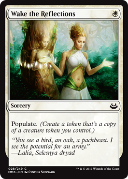
Wake the Reflections is unique in that it's a sorcery with just one word of rules text. (We define rules text as non-italicized text in the rules text box; there are Un-cards that mechanically care, which is why it's defined.) Creatures can have no rules text (we call them Vanilla creatures) or only keywords for rules text (we call them French Vanilla—creatures with just creature mechanics), but it's a lot harder to pull that trick off with instants and sorceries.
In fact, the only way to pull it off, I believe, is with a keyword action—that is a mechanic that acts as a verb. As of the writing of this column, there are 36 keyword actions in the game, most of which require extra words to use. There are a few instants and sorceries that have a single keyword action along with a number (Cached Defenses, Dromoka's Gift, and Lead by Example are the first the spring to mind), but only Wake the Reflections has rules text with a single keyword action with no numbers.
I'm sure one day we'll get around to making more, but at least for now Wake the Reflections gets this special honor.
Woolly Thoctar
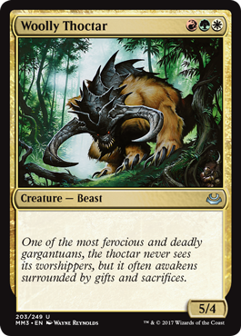
One of our informal rules is that we like to have a certain threshold of Vanilla creatures in each set (creatures with no rules text). Magic is a complex game, and we like to make sure to have some cards that don't put extra strain on a player's cognitive load. One of the challenges we have with Vanilla creatures is finding ways to make them thematically relevant. Obviously, making them creatively relevant is a lot easier.
There are a number of tricks for doing this:
1. Give them a relevant creature type
Most sets have a tribal component, even if only a small one, so a good way to make a Vanilla creature matter is to make it a creature type that's mechanically relevant. That way players who care about the tribal theme will put the creature in their deck.
2. Make power and/or toughness matter
Sets can often have mechanics or cards that care about creature size. Vanillas can be made relevant by either by being of a certain size (think Khans of Tarkir's ferocious) or by having power and/or toughness that interacts in an important way (think Gatecrash's evolve).
3. Make the cost matter
Some sets/cards make converted mana cost matter (for example, white tends to reanimate cheap creatures) or colored mana matter (think Theros's devotion mechanic), so sometimes choosing the right mana cost for your Vanilla creature can make it relevant.
4. Make color matter
Some sets have a color-matters theme (such as Shadowmoor), and making your Vanilla creature be a certain color or combination of colors can have a mechanical impact.
5. Take advantage of a component introduced in the set
Unhinged's Vanilla creature was Little Girl, a ½/½ creature that took advantage of the fact that the set used fractions.
6. Have a good cost-to-size ratio
Finally we get to Woolly Thoctar. We were making a three-color set and we wanted to encourage three-color play. One way to do that was to make very efficiently costed three-color cards. Because these were hard to get out early as you needed all three colors of mana, we could push the power level. Woolly Thoctar, for instance, got to be a 5/4 for only three mana.
Zur the Enchanter
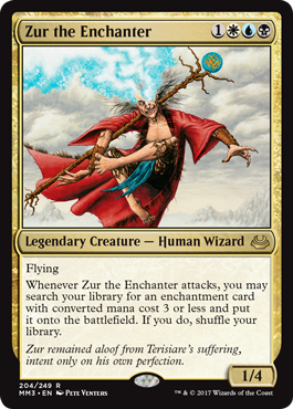
I'm often asked which set I had the most fun designing, and while there are many contenders, the set I normally pick is Time Spiral. I often pick on Time Spiral for being too self-referential and too complex, but as someone who understood everything being referenced, I had a blast making it.
One of the conceits of the design was that there was a temporal event that was pulling creatures from elsewhere in time. This meant we were free to make legendary creatures of anyone we wanted plucked from throughout Magic's history. We searched all the nooks and crannies to come up with a series of characters that we felt the audience would enjoy. One of them was a man named Zur.
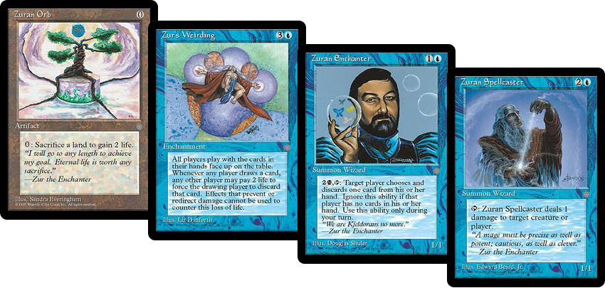
Zur is probably best known for an Orb he made known as the Zuran Orb. The Zuran Orb was quite powerful and ended up getting banned. The card that most endeared me to Zur though was a card called Zur's Weirding.
I've told the story of my job interview, where I played Joel Mick to prove I was a worthy hire. (The story is here if you've never read it.)
One of the key card's to the deck was Zur's Weirding. The card forces all players to play with their hands and (essentially) the top of their deck revealed, and then you have the ability to pay 2 life to mill the card to their graveyard instead. The card allows you to do what is known as a Zur's Weirding lock, where you have the means to deny them every card (often thematically using a Zuran Orb). For some reason, many players refuse to quit even when you literally have locked them out of being able to win (I talk about it more in this article).
So we decided to make Zur into a legendary creature. Three of the four cards with his name in their title were blue, so obviously he had to have blue. Zuran Enchanter had a black activation, so black felt right. We also did a little research on the character, and it turned out that he wanted white as well.
There was a lot of talk of what felt right. He was known as Zur the Enchanter and he obviously trained Zuran Enchanters and had a famous enchantment in Zur's Weirding, so we decided to focus on enchantments. We talked about also including artifacts because of Zuran Orb, but decided the card would be better with a tighter focus
The original ability got you enchantments that cost four mana or less so that you could have him go fetch his Weirding, but playtesting showed that four was too good so it got cut back to three. I believe we gave him flying because there was a reference somewhere that he could fly. There was a lot of debate about whether his abilities reflected all three of his colors, but because the ability at the time was pretty undefined, we decided it could be something the three colors did together. We have since defined these abilities a little more and, in modern design, I don't believe the card would need the black mechanically.
And that is how Zur came to be.
A to Z
That's all the time we have for today. As always, I'm eager to hear your feedback on any of the cards, Modern Masters 2017 Edition, or this column. You can email me or contact me through any of my social media accounts (Twitter, Tumblr, Google+, Instagram).
Join me next week when I explore why the ally colors get along.
Until then, may you have fun playing with your favorite oldies in Modern Masters 2017 Edition.
#416: Early Worlds
#416: Early Worlds
33:13
In this podcast, I talk about the first five Magic World Championships.
#417: Duel Masters TCG
#417: Duel Masters TCG
34:02
In this podcast, I explore the design of a trading card game, but one other than Magic. I talk about the creation of Duel Masters, a trading card game we created for the Japanese market.
- Episode 415 Teaching (30.5 MB)
- Episode 414 Ravnica Cards, Part 5 (28.0 MB)
- Episode 413 Ravnica Cards, Part 4 (26.1 MB)

