Out of the Closet, Part 2

Two weeks ago I wrote a column about T-shirts. It wasn't really about T-shirts. It was about Magic history using a personal filter as a connecting device. I expected it to be well received, enough so that I made it a two-parter, but then something interesting happened. It became one of my most divisive columns ever. By divisive, I mean that some people really liked it and others hated it.
I don't mind writing divisive columns (Elegance and Playing with Memories being two of my most famous examples —make sure to read the follow-up to each of these articles if you've never read them before, here and here.) But usually when I write one, I know what I'm getting myself into. My T-shirt column was not intended to be a divisive column. As a designer (and a writer), it's very important to understand your audience's reactions to your work. When they react differently than you expect, there's a learning opportunity.

So what happened? I've written plenty of Magic history articles before. Here's a two-parter about the Pro Tour (Part 1, Part 2), one about the Invitational, one about the first Worlds, and one about the first Japanese Grand Prix. None of these generated the response I got to "Out of the Closet, Part 1."
The column had a personal angle, but I've done countless articles with a personal angle many of which have been some of my most popular columns (such as this, this, and this). So what was going on? After spending a lot of time reading email and comments and talking to many people, I got to what I think the crux of the issue was. In the past I've tended to tie my personal columns into holistic design issues. My personal connection to all my past history columns was experience; I would talk about what I did at the event in question. What I had done in my T-shirt column was take two different things that have worked in the past and tried blending them together. The combination, though, was off-putting for the majority of my audience. (Yes, I do know there were many people who liked the column as is.)
What this all boils down to is that I'm going to try an experiment today. I'm going to approach Part 2 very differently than I approached Part 1. (Think of this as Aliens to last column's Alien.) My plan is to create something that keeps everyone who liked Part 1 happy but adds something for all those of you who begged me not to write Part 2.
Out of the Closet, Part II (or, How Many T-shirts Made Me a Better Designer)
Here's a trick I learned in college. If you want to get a very fast sense of a character in a movie check out what they are wearing and what book they are reading. These are the two easiest places for a writer to quickly capture the essence of a person. If you follow this line of logic through, one of the quickest ways to learn about a person is to check their bookcase or their closet. I'll save my bookcase for another day, but today (and two weeks ago) I'm giving you a chance to get a quick insight into the guy who's in charge of making Magic cards, sets, and blocks. My Top 10 Magic T-shirts say a lot about the things that matter to me. Today I'm going to walk you through what Magic shirts I hold most dear, and I'll explain holistically how those impulses apply directly to how I design Magic.
10) The Gathering 1 (1995)

Design Lesson: Good Can Come From Bad
Before I was a full time employee for Wizards of the Coast, I was a freelancer. One of the perks of being a freelancer was that Wizards would fly me out to different events. The very last event they flew me out to before I got hired full-time was an event known as "The Gathering 1." Held in the fall of 1995, The Gathering 1 was the Prerelease event for Homelands. As with the Ice Age Prerelease (see Part 1), there was only one.
While the Ice Age Prerelease was just a tournament, The Gathering 1 aimed to be something more. Sure, there was a series of Prerelease tournaments, but there was also a giant show created including what I could only describe as a Magic haunted house (think Halloween haunted house but with a Magic theme, and a little less scary). There were numerous activities for Magic fans to participate in. I was brought out to spellsling (what we called gunslinging at the time), a.k.a. play games against people. Back then I was the "Magic: the Puzzling" guy, as my Magic puzzles had gotten to be one of the top features in The Duelist (the magazine Wizards used to print about Magic).
There's a joke that in the early days Wizards was good at two things: making Magic and hemorrhaging money. It's quite possible that The Gathering 1 is the most expensive event Wizards has ever thrown. While I'm not at liberty to name a price, trust me—it was over the top crazy. What did we get for our ridiculous spending? An event that, to this day, is still ridiculed. It didn't help that the event was for Homelands, which I have mentioned many times as the worst-designed set in Magic's history.
So how'd this shirt make Top Ten if the event it was from was a joke? I like the shirt. It looks nice. The design lesson here is that not everything from something bad is bad itself. It's very easy to look at a set like Homelands and want to throw everything in it away, but there are many cards in it that have had a positive impact on Magic design technology, such as
There's good within bad (and bad within good). A designer has to examine each component of a design, because sometimes something great comes out something painfully bad. This shirt reminds me of that lesson and comes in at #10.
9) Wizards of the Coast Logo (1998)

Design Lesson: Don't Underestimate the Power of Simplicity
This shirt was given out to all Wizards of the Coast employees in 1998. (You can tell it's old because it uses an older Wizards logo. Our current one looks like this:

For trivia buffs, the original Wizards of the Coast logo looked like this:

Since that time, Wizards has never again made a T-shirt with just its logo. I wear this shirt all the time because I'm proud to work at Wizards of the Coast and I like having a shirt that says so plain and simply.
Interestingly, this design lesson is as simple as this shirt. Sometimes, oftentimes, the best way to do something is the simplest, cleanest way. Designers are attracted to the challenge of making cards that are new and different and like to tackle old problems with original solutions. What my years of design experience have taught me is to always start with the simplest version. If that works, stop!
The goal of a designer is not to show what he or she can do but to provide the best design for the given project. Most of the time, if simple works, that's what you should use. One of the biggest signs of maturity of a designer is the embracing of this simple truth.
8) R&D (2009)

Design Lesson: Let People Self-Identify
To the best of my memory, there have been three Wizards R&D shirts. All three came about because Brian Tinsman convinced Bill Rose that it would be a good bonding tool for R&D. The shirts were created to only be given out to R&D members, along with a few other people in the company that help out on design and development of sets. The first R&D shirt looked like this:

While I appreciated the shirt, it was a little too Star Trek-y for my taste. (I do like Star Trek, but I really wanted the shirt to reflect what we do.) The second R&D shirt wasn't a T-shirt but a baseball jersey. I told Brian when I got it that I appreciated him thinking outside the box but that I was never going to wear a baseball jersey; what I wanted was a T-shirt. I think I wore that shirt once, and I don't have it any more to even show you a picture of it.
The shirt I picked as #8 is the third and current version. It's the one I like the most and is a shirt I actually wear a good amount.
If I had to take all my shirts and grade them aesthetically, judged based on how they look, this shirt would do okay, but I highly doubt it would crack the Top 10. How did it get here then? Well, looks are only part of what makes me like a T-shirt. The reason I like this shirt is that I'm proud to be a member of Wizards of the Coast R&D and this shirt lets me publicly express that sentiment.
The design lesson here is that people want to self-express. They desperately want to have a means to let you know who they are. This is important for design, because good design will allow them to do this. It's no mistake that Ravnica is one of the best received blocks of all time. Its self-identification was built into the core of its design. Here are ten guilds. Which one are you? Scars of Mirrodin, likewise, got players to pick a side. Innistrad gets you to... well, we'll get to this one soon.
One of the reasons for Magic's success is that it so easy allows self-expression, but this isn't something where we can just sit on our laurels. For every set, I have to ask myself: how does this set let players self-identify? Because when I can let players bring part of themselves to my design, I am allowing them to elevate it to something much greater than I could ever create myself.
I am a member of R&D and I'm proud to have this shirt at #8.
7) Memory Lapse (2000)

Design Lesson: Don't Just Make Players Think, Make Them Feel
One of the cool perks of working at Wizards is that occasionally I get access to things I might normally not. For example, I don't know if this shirt was ever produced. I got it because there was a company that wanted to show off what kinds of Magic shirts it could create. When the Magic Brand team was done looking at them, they brought them down to R&D. (Once upon a time—not anymore—the majority of the Brand Team didn't play Magic.) I picked this shirt (with the one of the Homelands illustrations for
The design lesson for this shirt has a lot to do with my explanation for why it's #7. I can't explain why I like this shirt so much, I just do. Something about it taps into something deep inside that resonates. It's important for your designs to have the same kind of power. Your set wants to have some cards that players will be drawn to even if they don't quite get why.
How does a designer create these kinds of cards? There are a couple of answers. First, design some cards from your heart rather than your head. Make things that speak to you even if you don't understand why. Also, watch other people's reactions to cards. Cards that other players adopt as pet cards are usually doing something right. Finally, look at emotional favorites from the past and explore down similar paths. Don't copy, but try to find similar inspiration.
I don't know why this shirt is #7, but it is, and that is an important lesson.
6) Blue-Red Hybrid (2005)

Design Lesson: Know Your Own Biases
Every time I wear this shirt, someone asks me where I bought it. The answer is I didn't. The shirt was a birthday gift from Matt Cavotta. Where did Matt buy it? He didn't, Matt made it (with the help of a company that specializes in making custom T-shirts). The reason he got me an Izzet hybrid shirt was threefold.
#1: Hybrid and the two-color guilds it was first associated with are from Ravnica, a set I designed. (For the record, Brady Dommermuth came up with the idea of the guilds based on my desire to concentrate on the ten two-color pairings. I then created the guild block model to show it off and integrate it as tightly as I could into the design. It's all here, here, and here.)
#2: Hybrid mana was my brainchild and something I'm very proud of creating.
#3: I am soooo Izzet.
The reason I enjoy this shirt has a lot to do with the self-expression I talked about above. It also is a reminder to me, what my biases are. Magic is many games to many different players. No Magic designer is going to be all types of players, so it's very important that you understand what type of player you are so that you can recognize your own prejudices. I'm a Johnny. I love wacky cards that let me do things that no one else has thought of. But if every card I made was a Johnny card, I would drive a lot of people out of the game.
One of the hardest thing new designers have to learn is how to create cards they wouldn't enjoy. They have to get into other players' mindsets and learn how to make them happy. It's easy to make a card you care about. It's much harder to make one you're indifferent to. To become a good designer you have to embrace the challenge of creating things others will enjoy.
To help keep me focused on who I am, I like to wear this shirt, and it clocks in at #6.
5) Magic Dojo (1996)

Design Lesson: Don't Forget Your History
When Magic first started back in 1993 the Internet existed, but it was in its infancy. At the time, most of the talk about Magic was done on USENET and MTG-L (for the youngsters, imagine if all online discussion about Magic was restricted to forums). A man named Frank Kusumoto decided to start a website that would aggregate what he thought was the stuff worth reading. Soon players started submitting material directly to him, which Frank would edit and then post.
In a short time, The Dojo (which no longer exists but has been partially archived here and here) became the default website for Magic, especially competitive Magic. Understand that it wasn't a website; it was the first Magic website—well, the first of any importance. (Wizards of the Coast had a website, but it had minimal content and almost nothing about the inner workings of the game.)
This shirt is the very first Dojo shirt ever made. Below are the two others:

The reason this shirt ends up so highly is that it plays up a key belief I have not just in design but life as well. History is important. Not only does it chronicle how far you've come, but within it are all the lessons that got you to where you are now. Oftentimes, you stray because you forget lessons that have already been learned.
The most famous recent example of this was Magic 2010. Aaron spent a lot of time staring at the beta sheets on the wall, because he realized that Magic had drifted and forgotten something important that Richard had done when he introduced the game. As the saying goes, if you don't study your history, you'll be forced to repeat it.
I never want to forget The Dojo, so that's why it comes in at #5.
4) Doppelganger (1994)

Design Lesson: There Is Something Magical About Firsts
How did this shirt get so high on my list? Easy, it's the first Magic shirt I ever bought. In fact, it's the first Magic shirt ever made. Well, along with these three...

...and a Jyhad shirt I didn't buy. (Jyhad was Richard's second trading card game. It would later be renamed Vampire: The Eternal Struggle.)
I only had enough money on me to buy one shirt when I first saw them, and
The design lesson here is a simple one: People romanticize their first encounters with things. What this means to a designer is that you have to take extra care when introducing something. Now when I create a mechanic, for example, I think about where it wants to go and then about how we can start it. I am very happy, for instance, how cycling worked out. Its first appearance in Urza's Saga was in its simplest form. Every cycling card just had cycling
No mechanic that isn't evergreen (something we can use in any set) has come back more times than cycling. A big reason for this, I believe, is that we did a good job of making it something for people to fall in love with, allowing us to bring it back later with more twists and turns.
Another way to think about this lesson is this: players will always remember their first, so make it a good memory. That obviously worked with my Doppelganger shirt, as it sits here at #4.
3) Maro (1997)

Design Lesson: Put a Little of Yourself Into Your Designs
I'm asked quite often what my favorite card is. It's a hard question to answer, as I have been intimately involved with a lot of Magic cards. (Okay, taken out of context that sounds a little odd.) When push comes to shove, my answer is this card:
This is one of the first designs I ever made to get printed. (I had three cards in Alliances, making this tied for fourth.) Not only did I design the card, but it's named after me and I wrote the flavor text. To this day, my Magic nickname is Maro. (Short for MArk ROsewater, if you've never had it explained.)
This shirt was made by my mom to celebrate my buying of the
I talked above about the importance of allowing the players self-expression. The same is true of the designer. Last year I did a long interview with Ted Knutson, former editor for this site. Part 1 and Part 2 are here. In the interview, I talked about the importance of a writer finding his voice and putting something of himself in his writing. In the interview I explain that if you could take a writer's name off of the article and no one would know it was by them, they weren't really writing. They were just creating fluff. Design works the same way for me.

I want people who play one of my sets to get the sense that it was one of my sets. I am proud that a Rosewater-designed set is its own thing. R&D likes to tease designers because we each have prejudices that show through to our design. I embrace that, because I believe it's through putting yourself into your creations that you get the best work—and that's why this shirt sits at #3.
2) A Brain, a Deck, and a Friend (1997)

Design Lesson: Recognize Your Epiphanies
One of the ongoing demands of Magic is creating ways to bring in new players. The Duels of the Planewalkers of 1997 was a product called Portal.

For those of you unfamiliar with Portal, it was a very simplified version of Magic with only lands, creatures, and sorceries (although a few instants dressed up in sorcery clothing snuck in). To introduce Portal to the public, we created a bus and would drive to events and teach people Portal. This T-shirt came from that endeavor. It has on it the ad campaign we built around Portal: "All you need is a brain, a deck, and a friend."
Many of you might remember this shirt as the one I wore in 80,000 Words, my pictorial tour of Wizards. I like this T-shirt for many reasons. I found the ad campaign to be humorous. I like how it looks. I like that it calls Magic the #1 game in the world. But if I dig down deep, the reason I rank it so highly is that it ties into one of my most important Magic design epiphanies.
I joined up with the bus on numerous occasions to help teach Portal. Remember that Portal has very simple creatures, mostly vanilla and a few French vanilla, and only sorceries as other spells. I discovered something very interesting: once I got the players up to speed, meaning that they understood how to play, I couldn't lose. Sure, I would make suboptimal moves to make the games more exciting, but I was incapable of actually losing a game (barring land screw, and even then it was hard to lose, as many beginners are afraid to attack even on an empty board).
Why? Because even with just vanilla creatures and simple sorceries, there's still is a lot going on. Even stripped down to its essence, Magic still has a lot of decisions. It wasn't until that moment that I finally understood what the essence of the game was. It reframed completely how I thought about the game and how I approach the game as a designer. It was my big epiphany that fundamentally changed how I design.
My lesson here is that no matter what you design, make sure you understand the essence of what you are creating. It's very easy to get caught up in the surface of the design and shift your work away from the game's essence. That is the road to disaster.
It was an important lesson, and I feel the emotional response carries over to the shirt and brings it to #2.
1) Unglued Prerelease (1999)

Design Lesson: Sometimes, Lose the Restrictions
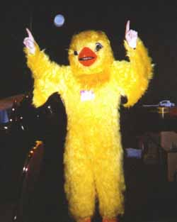
Anyone who knows me shouldn't be surprised by the #1 pick. I wear this shirt all the time. One of the reasons I can is that I actually own more than one. This was the prerelease shirt given away at the only Unglued prerelease ever, held at GenCon in August of 1999. Yes, this is the event that I head-judged dressed as a giant chicken. (For how that happened, see this article on Unglued design.)
This shirt gets the #1 slot for several reasons. One, Unglued is one of my favorite sets I've ever designed. Two, the Unglued Prerelease is one of my favorite events I've ever run. Three, I really like the color purple. Four, I'm a big fan of the art for
The design lesson comes from my entire experience with Unglued (and Unhinged). Few sets have had the impact on future designs that the Un- sets have. For example, split cards, the Pacts from Future Sight, the seals from Nemesis, the forecast mechanic from Dissension, the "mix and match" cards from Future Sight (such as
The lesson here is that while I often advocate restrictions I also believe it's important sometimes in design to remove the restrictions you normally have. See what happens if you try to do something you're not supposed to do. Magic is a game that breaks it rules. I feel Magic design, at times, should do the same thing. You will find that you get to places that you never have thought of but were glad you did.
And that is how we end up with the Unglued Prerelease shirt as #1.
A Little Tees-ing
I'm very curious for feedback, especially on Part 2 vs. Part 1. You can reply to my email through the link below, at my Twitter account (@maro254), or in the thread to this column using the Discuss link below.
Join me next week when I get thirsty.
Until then, may you feel free to audible every once in a while.