What's in a Name?
Hello, my name is Adam Prosak, and I was the Set Design lead for Modern Horizons. I've been waiting for far too long to show off the set to the world, so let's get started!
Modern Horizons was built on three main principles, each of which connects to the others and helps define what the set should be about.
For Experienced Players
At Wizards, we wrestle with how complex we should make our sets. On one hand, if you make your set too complex, the game becomes too difficult to learn. On the other hand, we want playing a game of Magic to be a deep, engaging, and infinitely replayable experience. Including these things almost always adds some amount of complexity, and one of the main challenges is trying to find the right balance.
As we make a wide variety of products and experiences, some of them should cater to a very specific audience. Modern Horizons started as an idea to cater to the deeply engaged player, with a focus on that rich gameplay. Therefore, we allowed Modern Horizons to be more complex than other sets.
Modern Horizons is mechanically indulgent. There are lots of returning mechanics in the set. At many points during the design process, we asked ourselves how we could get more mechanics into the set.
Modern Horizons is our effort to please the Magic player who has seen everything.
An Homage to Time Spiral
One of my favorite aspects of Magic is that there is a deep sense of history. Referencing that history brings me (and hopefully you!) great joy. When you talk to players who have played the game for 20-plus years, many of them will tell you that Time Spiral is their favorite set/block. There's so many cool characters and references to older cards that are delightful
- Lots of references to older cards and characters, but only famous cards. We wanted references to Serra Angel, Urza, and Force of Will. Electric Eel and Cloud Elemental weren't going to cut it for us (thanks, Stormcloud Djinn!), and we didn't want to put anagrams of Guided Strike in card names (thanks, Ridged Kusite!).
- Colorshifting (changing a card from one color to another) is still cool, but stays true to the color pie. Within Wizards, when we talk about color pie philosophy, we don't let Time Spiral block (especially Planar Chaos) establish precedent.
- No new mechanics, but use existing mechanics very liberally.
New Content to Modern
Modern is one of our most popular formats. In fact, it is by far the most popular format where we haven't made anything specifically to provide new content.
The reprints were chosen with this in mind. We liked a handful of reprints (There are 40, plus the snow-covered lands) as an homage to the Time Spiral "Bonus Sheet," but we didn't want the reprints to dominate so much of what the set is about. We wanted Modern Horizons to be different from a Masters set, and leaning primarily on reprints would undermine some of that.
One of the most challenging parts of working on Modern Horizons was finding a way to make cards that would impact the Modern format in a positive way. Modern's card pool is ever expanding, and even after fifteen-plus years of cards, our Standard sets are still impacting Modern. It was challenging, yet rewarding, to work on a set that is Modern-legal, but not Standard-legal.
While Modern is our main focus, not every card in the set is geared toward the Modern player. There are a lot of cards that we think will be very popular in Commander, and we worked hard to create a beloved Limited environment. We want this set to be for all experienced players, not just the ones who play Modern.
The Modern Horizons Design Team
Michael Majors – Michael once won a Grand Prix with a mill deck. Seriously. He has since brought his incredible talent to the Play Design team at Wizards. He has an unbelievable ability to break down Magic environments and figure out what makes them work. He was a phenomenal choice to lead the Modern FFL (Future Future League, the name of our Constructed playtesting team), and his skillset was perfect for finding the right types of cards to make.
One frequent occurrence would be Michael and I sifting through a trove of ideas, trying to figure which ones we could turn into fun Modern cards.
Mark Globus – Mark has a ton of experience working on Magic—he was one of the finalists in the very first Great Designer Search. Most of the time Mark is a product architect, working to ensure that all of our Magic products are great. However, Mark is also a fantastic game designer, something that I was able to experience while working with him on the set.
Each week, Mark, Michael, and I would sit in Mark's office, figuring out what we should focus on that week. These meetings were essential to a smooth card-creation process. There were tons of possible directions to take, and Mark's experience really helped us focus on which directions would be the most fruitful.
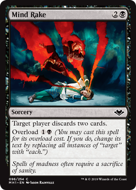
One of Mark's biggest talents was finding awesome, fresh, and unique ways to add a new mechanic to the set. My favorite Mark Globus–inspired card is Mind Rake. I distinctly remember doing a double take when he suggested overload as a drawback on a spell. It was one of many literal "laugh out loud" moments I had while reading through Mark's designs.
Dan Musser and Tom Ross – After we decided to make a Magic set with cards that were new to Modern, we then had to figure out how to make that set. We quickly decided we needed some additional expertise and brought on Dan and Tom explicitly to work on this project. Both Dan and Tom are excellent tournament Modern players, and along with Michael Majors, formed the backbone of our Modern testing team. Their expertise with tournament Modern was essential to accomplishing our goals for the set.
Dan and Tom were both phenomenal contributors, spending hours and hours playtesting cards, organizing a huge amount of decks, and providing feedback on which cards were too strong and which cards weren't strong enough. Check out Dan's article about how his team went about testing cards for Modern.
I could write paragraphs about the contributions of tons of other people at Wizards who I worked closely with, but I'd go waaaay over my word-count limit. I'd like to give special thanks to:
Kelly Digges – creative text and card concepting
Alison Luhrs – creative text and card concepting
Cynthia Shepherd – art director
Jules Robins – set designer
Sam Stoddard – set designer
Mike Turian – set designer
Nat Moes – lead editor
Ethan Fleischer – vision design lead
Mark Heggen – product architect
Working with each and every one of these people was a delight, and Modern Horizons would not be the set it is without their hard work and expertise.
What's in a Name?
Now I'd like to share some of my playtest card names, which are basically the names that a card designer (like me!) will use to convey something about the card. For Modern Horizons, I often used my playtest names to convey that a card was a riff on another card.
Playtest card name: Mutilating Blow
Card it's referencing: Mutilate
Modern Horizons card: Defile
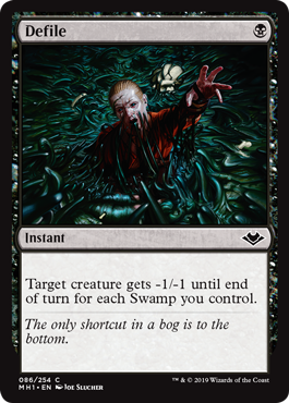
During vision design, one of the things that team worked on was finding ways to reference old cards by changing the scale of the effect. When looking for a black removal spell that was good at killing small creatures, we drew inspiration from a mass-removal spell but scaled down the effect to only one creature.
Playtest card name: Dark Lightning Helix
Card it's referencing: Lightning Helix
Modern Horizons card: Smiting Helix
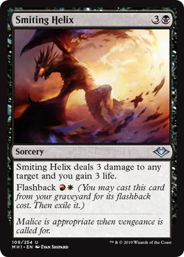
While it was important that we stayed true to the color pie, there are many ways to go about that. Mono-black cards like Essence Drain convey a soul-stealing flavor, represented by cards that deal damage and gain life. One of the common themes of cards that are both red and white is combining the strengths of the two colors, which is dealing damage and gaining life. Smash both concepts onto the same card, and bam!
This idea was originally pitched as a sorcery with an incredibly convoluted mana cost that involved many different hybrid mana symbols. Once Jules Robins pitched a version with flashback, I knew it was the right card. It's a card with an efficient flashback cost for Modern, and it better conveyed how both mono-black and red-white could both do the same thing.
Playtest card name: Snowwalla
Card it's referencing: Rootwalla
Modern Horizons card: Frostwalla
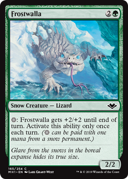
Snow mana wasn't always in Modern Horizons. Snow mana requires an infrastructure to support—there needs to be a sufficient amount of ways to produce snow mana. While Vision Design tried a little bit of it and discarded it, the Vision Design lead (Ethan Fleischer) pitched it against during Set Design, noting how it would fill some of the structural holes that were in the set. Prior to adding snow, the distribution of set themes across colors was unbalanced, and I was interested in the green-blue color pair expanding into multicolored play. Snow ended up being a wonderful fit, and we even ended up being able to make some beautiful full-art snow-covered basics. As for the Frostwalla, snow mana cards require a permanent with an activation, and Rootwalla is an ability that makes perfect sense for snow mana.
Playtest card name: Forevermind
Card it's referencing: Evermind
Modern Horizons card: Everdream
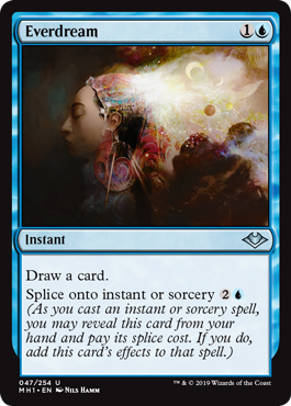
I love two things about this card. First, the art is an amazing homage to Evermind and is my favorite art piece in the set.
Second, the idea of splice onto instant or sorcery is amazing! And scary! There are tons of weird things that come up when you can splice text onto any instant or sorcery. My personal favorite is using this to splice onto a storm spell.
Playtest card name: Hideaway Mage
Card it's referencing: Spinerock Knoll, Shelldock Isle, etc. (cycle of five lands from Lorwyn)
Modern Horizons card: Watcher for Tomorrow
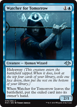
I love the hideaway mechanic. It's one of those mechanics that I always want to bring back, but with twists. Modern Horizons was a perfect opportunity to make a new, different hideaway card. I was excited to use Hideaway as card selection as opposed to trying to find something you want to cast without paying mana. I was also excited to put Hideaway on something other than a land. With the white-blue Limited archetype being about blinking creatures, this is one of the more exciting creatures to reuse the enters-the-battlefield ability. Just remember that it enters the battlefield tapped!
It's difficult for me to put to words how much fun Modern Horizons was to make. I got to work with amazing people. I got to make cards for the greatest game in the world. My only hope is that I can share any amount of the joy that I've had making Modern Horizons with you as you experience the set yourself.
