Crafting the Visual Identity of Mood Swings

Hey! My name is Colby Nichols, and I'm an art director in Studio X for Magic: The Gathering. I was the art director for Mood Swings and also handled the logo, card back, packaging, and card frame design. Today, I'm going to walk you through my process for the graphic design and art direction behind Mood Swings—and why this project was a dream come true for me.
Time Walk
Back in 1995, Mark Rosewater began his work at Magic, laying the foundation to become the legend he is today. Meanwhile, I was a wee lad of twelve, cracking my first packs of Ice Age and Homelands (the art and frame design on
Cut to 2025, when project "Rosebud" landed on my desk. The assignment read: "Mark Rosewater is releasing his project that's been in development for over 28 years, and we need you to bring it to life."
… It didn't feel real at first.
I've been reading Mark's articles since I was a kid, and now I'm in the halls of Wizards, working with him as a peer. Even as I type this, I'm still pinching myself. The pressure was on!
As a lifelong player and artist, I see graphic design as the foundation of the Magic card experience—rules text, card art, and frame design all colliding to make the tens of thousands of cards that exist today. My process started with sketching the logo.
The Mood Swings Logo
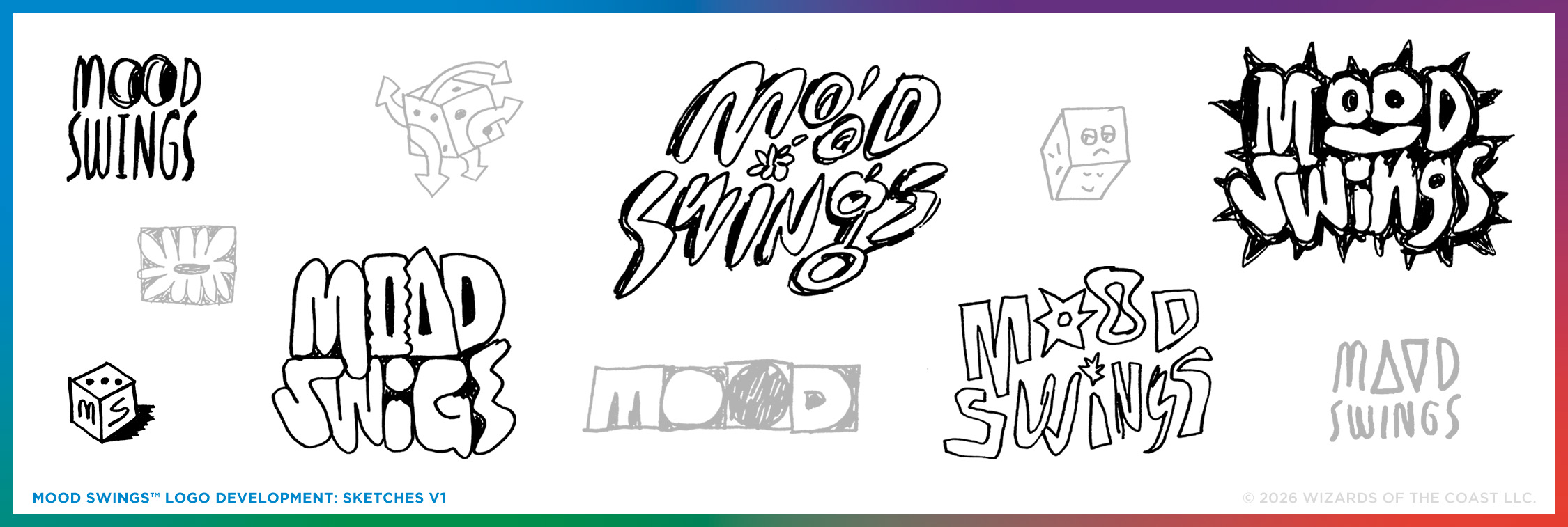
My approach to the visuals of Mood Swings was to create something that felt like it lived in the margins of Mark's time making Magic over all these years. The work started with initial sketches to work out the issues, exile any baditudes, and push what Mood Swings could be.
The look I was going for was cut-up, rough, loose, and untethered—a game that could exist between moments in Magic's history but still be strong enough to stand on its own. The first explorations were a scattershot of what could be, including a die that showed up very early on (but didn't end up in the main logo).
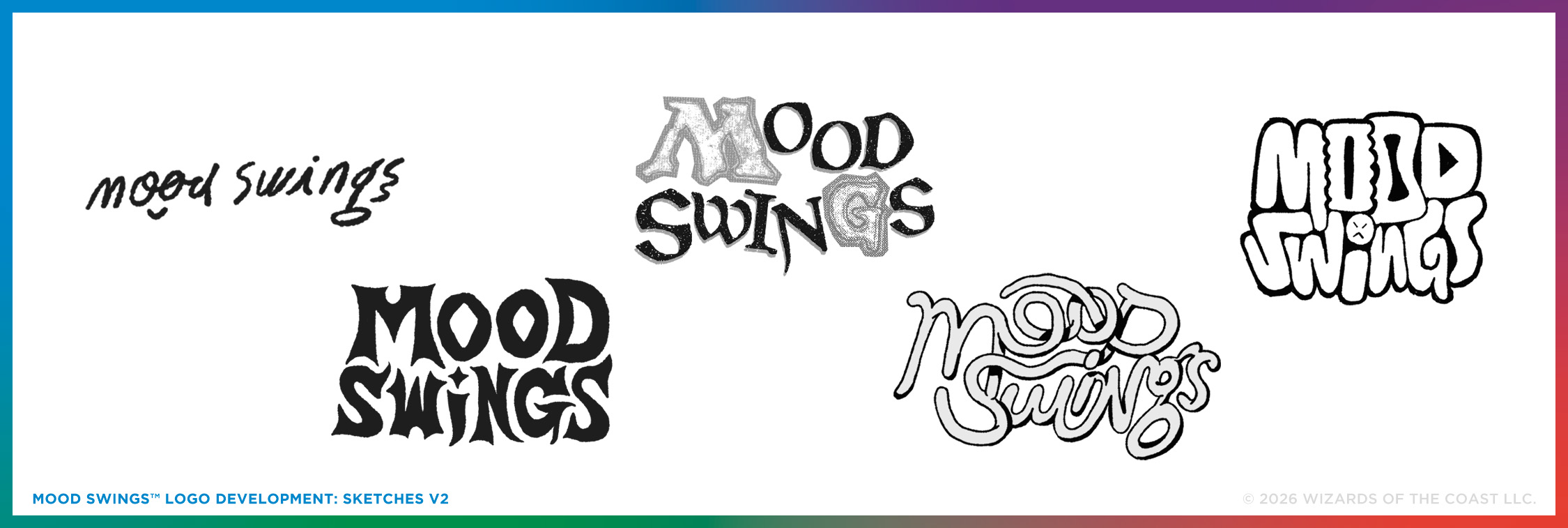
After refining things further before my initial presentation, the front-runners for the logo are what you see above. Early ideas spanned from Mark's signature as the logo, to a sketch that was very bouncy and silly, to an idea that felt grounded in fantasy. Everyone in the room gravitated toward the Magic "M" and "G" appearing in one of the sketches. While the sketch nodded to Magic (like Mood Swings does), it was too bold of a callout. It still needed refinement to feel complete.
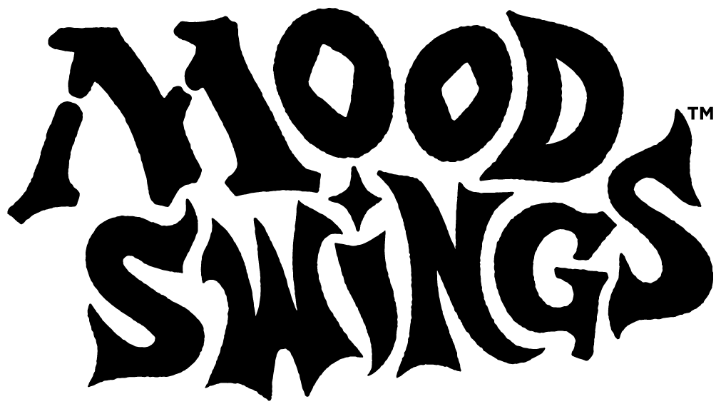
I paired those Magic-inspired initials with other whimsical, hand-drawn letterforms to finalize the logo. Each letter has a rough feel, which keeps the logo light and playful. I like that it carries the vibe of "All are welcome to play this game" and "Swords, spells, and epic moments await."
The Mood Swings Card Back
I've always found Magic's classic card back as a massive source of inspiration. It has so much lore baked into it—including all its imperfections. It's also an iconic piece of gaming history. Explorations for the card back began in color, using the logo sketches to bring things to life.
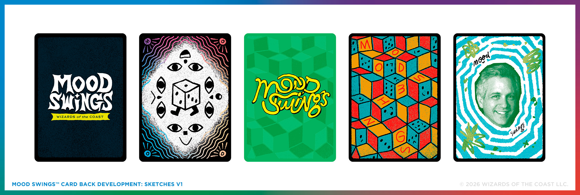
The final card back would have been amazing if we could've put Mark's face on it, but that was a little too on the nose. Instead, we focused on the colorful edges and let the logo stand out. What the card back was really missing was WUBRG representation. While Mood Swings is its own game, it includes key pieces of Magic—including the color pie. Starting at the center and spiraling clockwise, we added the color pie rainbow as a gradient through the card's detailing.
The Mood Swings Card Frames
With the card back figured out, I started the card frame design by exploring two extremes: one very close to Magic's traditional frame and one completely different. One design principle I like to work under is creating at least one option that is the thing you should not do. That way, we have a "What the heck?" version to measure all other ideas against. (Sometimes the extreme idea wins.) Early frame explorations used a mix of fonts and artwork fidelity (some without art at all) to find the right look and feel.
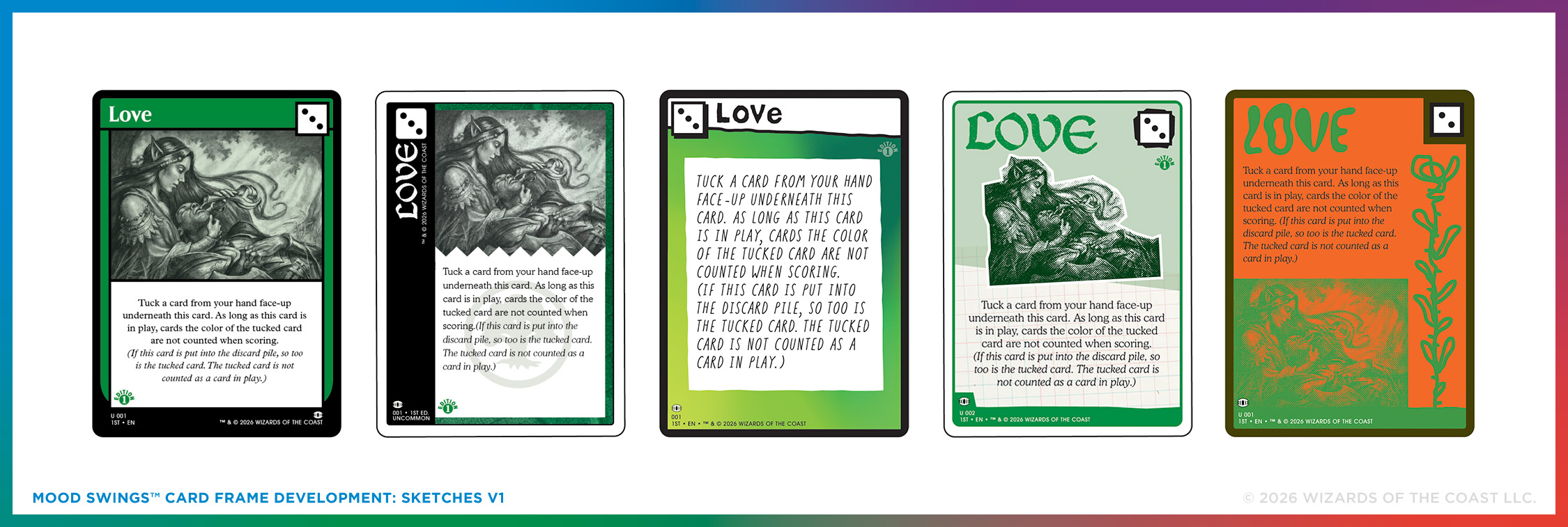
You can probably tell which direction won after the first round—especially if you've seen the final designs. Let's take a look.
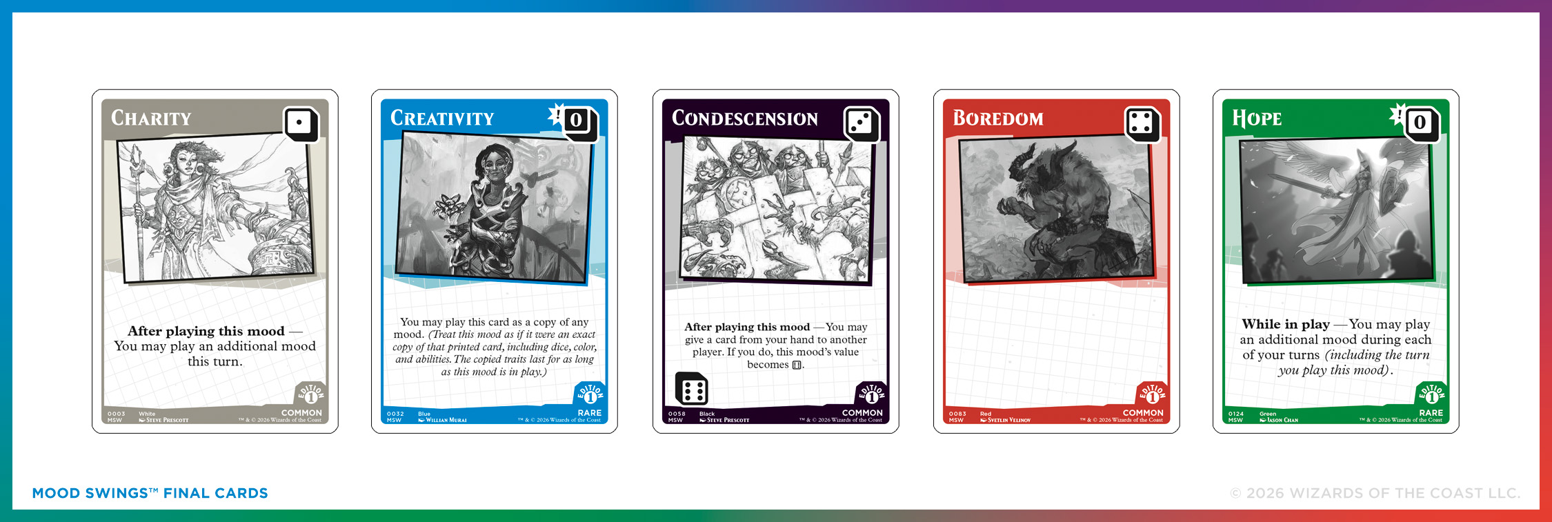
The final frames kept the rough, tilted, copy-and-paste vibe that started in the logo exploration. They're heavily inspired by zines (hand-made art books) and craft projects—things that feel unfinished, emotional, and a little chaotic. While each frame looks the same, there are subtle differences in each color of card, making each card feel like it was haphazardly assembled from ideas lying around.
The rules text is centered as a callback to Limited Edition (Alpha)'s layout. The white frame is another nod to early Magic. The dice in the corners are the boldest elements on each card. (Mark felt that using dice rather than numbers make it easier for players to track their scores during the game.) While earlier versions explored a wider range of fonts, the final designs leaned back into the typography used on Magic cards today. That helped everything feel grounded in our world.
*Note: The headliner card is mechanically identical to its other treatment. All card images are digital renderings and not actual cards.
My favorite frame came at the end, though, on the set's only foil card, Love: the headliner. The elements tilt even further, and it features Mark's art (which also holds the record for fastest art ever created for a Magic or Mood Swings card).
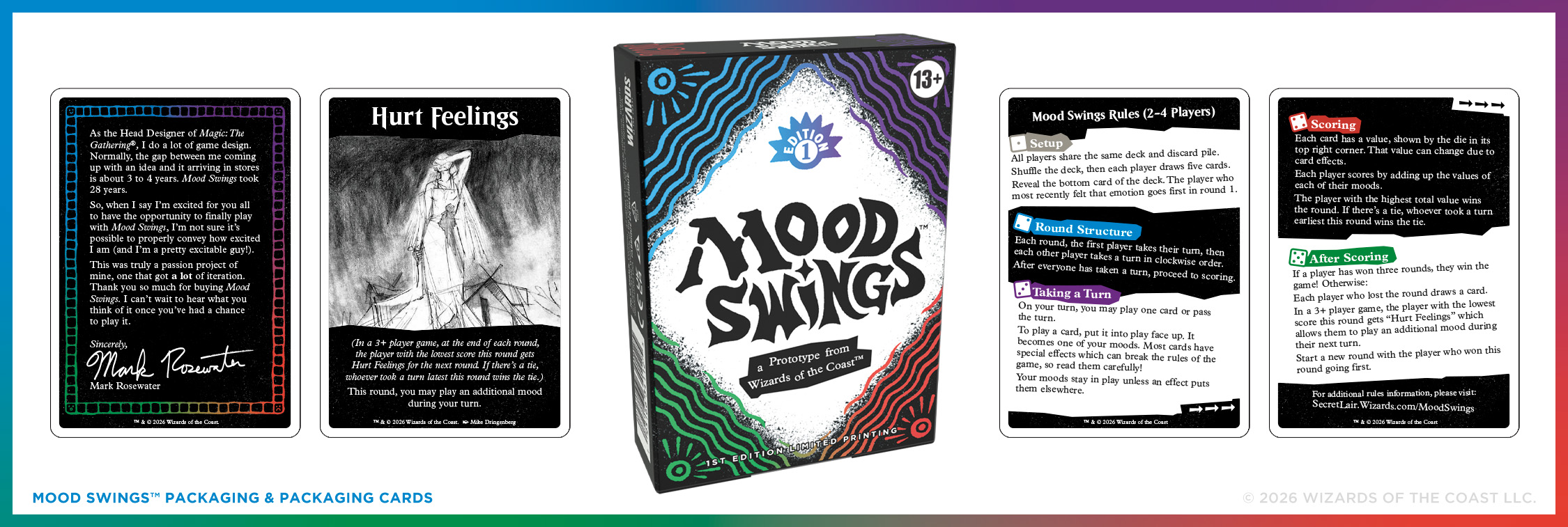
The packaging includes the WUBRG rainbow across the deck box. Inside, you'll also find a thank-you note from Mark, a Hurt Feelings card for multiplayer games, and a double-sided rules card. They're all slappy, wonky, tilty, and fun.
And there you have it: where we started and where we landed with Mood Swings. I hope you have as much fun playing it as we did making it.
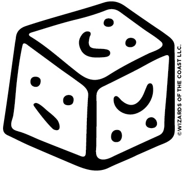
Oh—and this is Dice Friend. A sweet lil' die of emotions that I can't stop thinking about. Dice Friend is hidden somewhere in the game … If you find them, let them know it's time for another game? Thanks.
Mood Swings releases on June 1, 2026, only on MagicSecretLair.com. Check out the official Mood Swings website for more details!