In the Strixhaven, Part 2
Last week, I started telling you the story of Strixhaven's design, but there's more to tell, so today is the second half of that story. I'm going to walk through the rest of vision design, introduce the Set Design team, and then explain what major changes to the set happened in set design. So, sit down students, class is in session.
University Tour

When last we left, the Vision Design team, working closely with the Creative team, created five factions representing the five different colleges at Strixhaven University. Each faction was centered around an area of study. The next step was to create a mechanical identity for each college. Here were the parameters:
1. Each college had to embody its own field of study.
The key to creating a good faction set is making sure that the factions all have some relation to a larger structure and each have their own unique identity. The secret to doing this is to use the larger structure as a way to create that identity. Strixhaven, for example, takes place at a university. This means the factions get to be the colleges that make up that university. Because each college has an area of study that it focuses on, we can use that focus as a guide to make flavorful choices that would be unique to these factions. "Feel like the college of math" will push us in a direction of making a faction that no other impetus would. It's important that we understand the value of this directionality and embrace it.
2. The colleges had to be different than the guild of the same two-color pair.
One of the big goals of Strixhaven was proving that we could make a two-color faction set that has its own identity and didn't just feel like a rip-off of Ravnica. An important part of that was making different choices than the guilds had made. Yes, it would be possible for us to make colleges set in certain subjects that had the same play pattern as the Ravnican guilds, but we knew that would make for a less compelling set. This meant that while looking for definition, we tended to make choices different than the ones the guilds had made. For some factions, this was easy, and for others, it was more of a challenge.
3. The factions should be built around the conflict of the two colors and not their overlap.
I touched upon this last week. One of the ways to help these factions feel different than their related guilds was to approach them from a different vantage point in terms of the color pie. When making the guilds, we asked, "How are these guilds alike?" For Strixhaven, we asked, "What is the core conflict between these colors?" As we crafted each college, we made sure that the conflict was core in how we defined them.
I'll now walk you through each college and explain how we designed each one.
Silverquill College
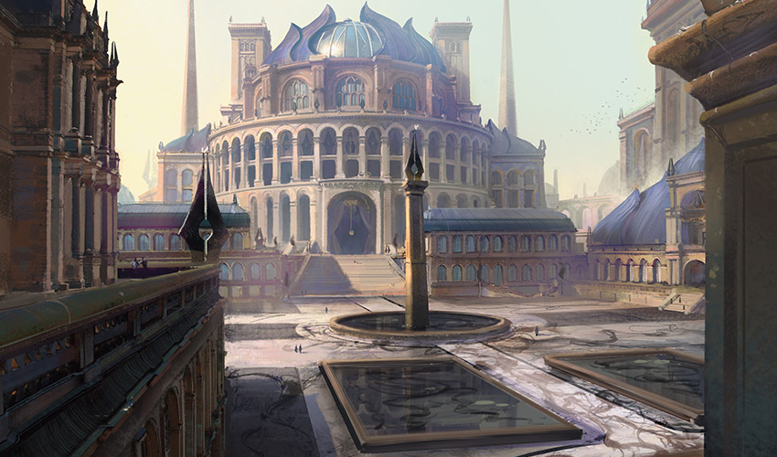
We needed an aggressive college, and we didn't want it to be Lorehold because Boros is the most aggro deck of the guilds. As we looked at all the choices, we liked the idea that white-black could be our aggro deck in this environment. Orzhov had been a slow, controlling bleeder deck, so we like the idea of pushing white-black in a very different direction. Also, in a spells-matter set, we wanted to have one faction that was about casting a lot of cheap spells for advantage and that worked well with an aggro strategy.
The one problem was that Silverquill was the college of words and language. What about that felt aggressive? Also, Doug (Beyer—the creative lead of Strixhaven) was looking for a college to hit the trope of military kids at college, what we call ROTC, Reserve Officer Training Corp, in the United States. (In addition, he was looking for a home for the mean-kids trope, which would get folded in later.)
How could we make that about words? That's when it hit me, what if each college did different kinds of magic? What if Silverquill was vocal magic where you had to use words to invoke spells? If we did that, Silverquill would have the fastest magic because words can be spoken quickly (unlike mixing ingredients, for example). What if having the fastest magic led Silverquill to teach combat magic? That would let us tie the college of words to military training. Also, the college of words seemed to be a great place for the kids who enjoyed verbally putting down the other kids.
Prismari College
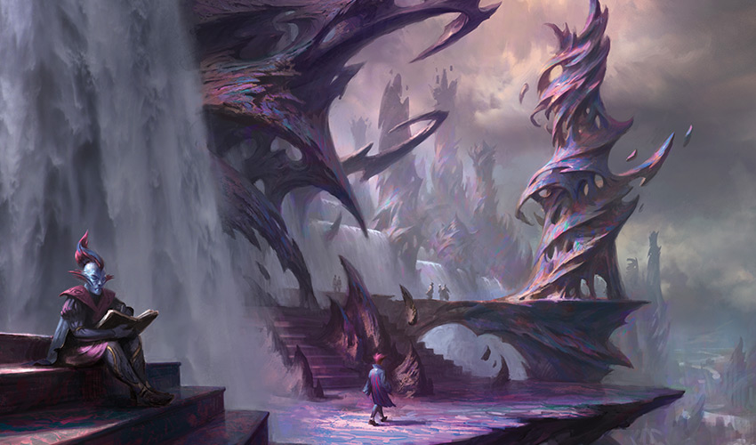
The big challenge with the blue-red college was that this was a world about spellcasting (aka caring about instants and sorceries), and the theme we did specifically for Izzet was spellcasting. How could we make this faction feel different? For starters, we pushed in a different direction flavorfully. Prismari is an art college where the students learn all about artistic expression. Izzet also cared about creativity, but it was focused into invention. In Strixhaven, it could be about presentation rather than functionality.
Mechanically, the key was to look at what Izzet did with instants and sorceries and try to do something else. Izzet was very "instants and sorceries matter," meaning the play pattern with them was to try and cast a lot of different spells. We decided to go in the opposite direction. What if Prismari was about building up to that one big spell? It made sense that the art kids were more about putting on a big show rather than just casting a lot of spells.
Witherbloom College
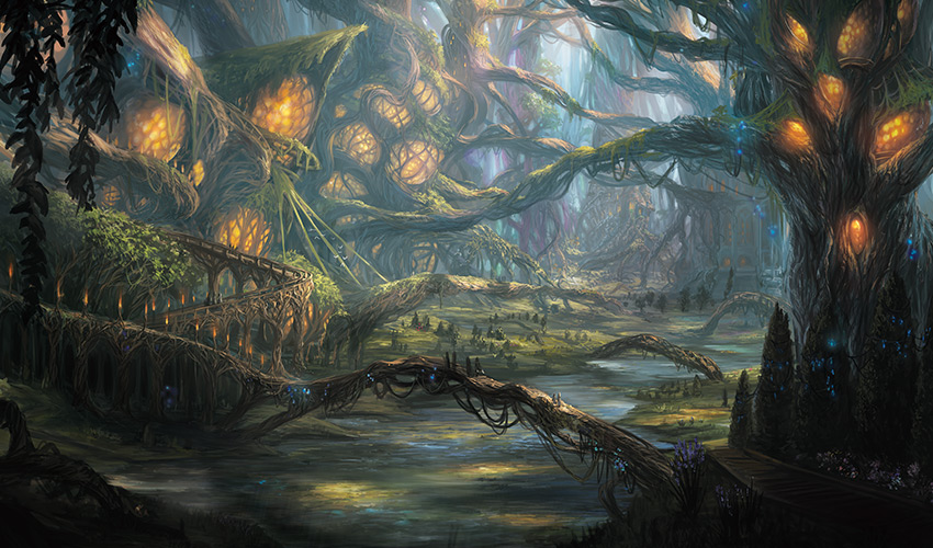
We knew the black-green college had to be the one centered on biology, as key parts of their conflict involve life and death. We wanted to keep this separate from Golgari, so we knew the graveyard couldn't be a component. Both green and black interact with life in various ways, and nothing screams biology more than caring about life, so we decided to focus this faction on the various ways to interact with life. We liked the idea that green was best at getting you life and black was best at spending it.
Another nice thing about this direction was that normally, the default for "life matters" decks is white-black, so this would allow us to build out an archetype in different colors than normal. Doug had wanted a goth clique, and because Witherbloom was the obvious fit, all the pieces came together for this college pretty quickly.
Lorehold College
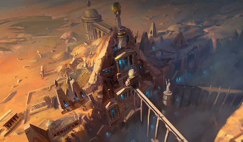
We really liked the idea of the red-white college being about history. How can you be focused mechanically on history and not care about the graveyard? It literally represents the past of the game. We also knew that we didn't want the red-white faction to be the aggro faction in this set, as we didn't want it feeling like Boros, so we leaned in the other direction. What if Lorehold was playing into the slower, more controlling aspects of red and white and made use of the graveyard as a resource?
On paper, that sounded really cool. The problem was that black and green are the colors focused more on the graveyard mechanically. This made us dig in and see what we had to work with. White had the ability to get most permanent types out of the graveyard back to hand and/or the battlefield. Red could get instants and sorceries out of the graveyard and had Phoenixes, which could get themselves out. We also realized we could care about things leaving the graveyard, as that hadn't been something we'd done a lot of before. It required some work, but we were able to put enough red and white effects together that we could make Lorehold into a slower graveyard-centric faction.
Quandrix College

We had a lot of fun figuring out what mechanics felt "mathy" (X spells, doubling spells, etc.). The tricky part with the green-blue college was not getting too close to the Simic guild. They made a lot of use of +1/+1 counters, and a lot of the math effects tended to also push in a direction that wanted +1/+1 counters.
Vision Design created this college as a go-wide college that made a lot of small 1/1 creature tokens (more on creature tokens in a bit), and we made a bunch of spells that helped make more of them (blue and green are good at copying and doubling stuff). Set Design ended up shifting this away from go wide to a ramping faction that uses its resources to make its creatures bigger instead of making the number of its creatures larger.
The Same, But Different
Having the factions feel unique was one way to differentiate Strixhaven from Ravnica, but it wasn't the only way. I was also very interested in trying a different structure. In previous factioned sets, we'd always given each faction its own mechanic. I was interested in trying something different. Strixhaven would give all the factions access to the same mechanics but differentiate how they used them.
Magecraft
First up was a mechanic we called spellcraft during vision design but ended up being called magecraft in the final product. We wanted spells to matter, so we decided to make a mechanic where they did. Landfall made lands matter and constellation made enchantments matter, so why not cut right to the chase and reward you for doing the thing the set wanted you to do? The nice thing about magecraft is that we got to differentiate the outputs, which let us make cards in all the colors and allowed us to give each college its own feel. Here's how we did that:
Silverquill
This college is about aggro, so its magecraft effects tend to pump creatures or give them evasion. This is the college that's happiest casting multiple instants or sorceries on the same turn.
Prismari
This college was more about casting a singular big spell, so its magecraft effects tend to not stack.
Witherbloom
This college's magecraft effects tend to revolve around life in some way.
Lorehold
This college has the least-defined magecraft effects as its graveyard focus does a lot of work to encourage spellcasting.
Quandrix
This college is about building up to big creatures, so it either puts +1/+1 counters on a creature or helps you get resources like land to cast bigger creatures.
Because we were trying to maximize triggering magecraft, we had it trigger off instants and sorceries being cast and off copies. One of the challenging parts of this set was finding ways to get enough spells into players' decks, so allowing copying to matter gave us another arrow in our quiver.
Creature Tokens
Another resonant idea that we glommed onto rather early was the idea that each college would have its own creature token that represents the animal mascot or familiar of that college. The reason creature tokens were important, beyond the flavor, was we were trying to up the percentage of instants and sorceries in the set while having enough creatures to keep gameplay interesting. Token-generating effects could be put on instants and sorceries, which would allow us to do things like trigger magecraft while generating creatures for the board.
Vision Design had two named mechanics that played into this:
- Conjure [creature type] – [cost] (If you cast this spell for [cost], when it enters the battlefield create an [appropriately sized, colored, and creature-typed] creature token.)
- Familiar – [Effect]
. . . if you control a creature token.
The first ability, conjure, was basically a kicker-like effect that allowed you to spend extra mana when casting spells to get a creature token. The second ability, familiar, was an ability word that rewarded you for having creature tokens. Set Design would end up using neither of the two abilities but kept the token-making aspect as a key part of the set. Here are the creature tokens that ended up in each college:
Silverquill
We wanted something aggressive and not too big so you could cast them early. We ended up making a 2/1 flyer. During vision design, these were Gargoyles (trying to capture a feel of the campus), but the Creative team ended up changing them to Inklings to better tie into the college's literature focus.
Prismari
The blue-red college was casting the biggest spells, so we wanted it to have the largest (natural) creature token. From the very beginning, we knew we wanted it to be an Elemental because we wanted some nod to blue and red's elemental nature. Vision Design made it a 3/3 Elemental, but Set Design upped it to a 4/4.
Witherbloom
We wanted something life related as the black-green college has a strong life theme. We talked about lifelink, but green doesn't naturally get that, so we ended up making our own creature. It's a 1/1 that gains you a life when it dies. Vision Design called them "Grubs," but it got changed to Pest during set design.
Lorehold
We knew we wanted these to be Spirits to tie into the history flavor of the red-white college, but we went back and forth on what size they were supposed to be. Vision Design ended up handing them off as 2/2 creatures, but Set Design changed them to 3/2s.
Quandrix
This was the biggest token change between vision design and set design. Vision Design's take on Quandrix was to have it be the one college that produced multiple creature tokens with its spells, and its creature tokens were 1/1 Fractals. This was when the college was based on a go-wide strategy. When Set Design changed it over to a ramp strategy, the Fractals went from 1/1 creatures to 0/0 creatures that came with some number of +1/+1 counters.
Modal Double-Faced Cards (MDFCs)
The original impetus for Strixhaven was to be a set built around MDFCs. When we decided to use them in all three sets of the Magic "year," it reduced how many we could use in Strixhaven. That meant we had to be judicious with them. We ended up using them in three different ways.
Deans
I explained above that we wanted the colleges to play up the conflict of the color pair. An idea we came up with early on was to give each college two deans rather than one. Each dean would represent its color's side in the fundamental conflict of the college. Legendary creatures are a great place to help reinforce elements of a faction, so if we wanted conflict to be a core part of it, we could weave that into the leadership. The fact that we had MDFC technology so that both deans could be put on a single card made it clear that this was something we had to do.
Planeswalkers
We've learned over time that we should start taking advantage of elements within a set to make the planeswalkers feel different where we can. Planeswalker design is limited, so anytime we can use design space only available within a certain set, we should be taking advantage of that. Kaldheim used the MDFCs to show Tibalt disguising himself as the Valki, God of Lies. Was there something cool Strixhaven could do here?
When we found out that Rowan and Will were going to be in the story, that presented a golden opportunity. The twins share a spark, so every time we've printed planeswalker cards for them, we've tried to find some way to show they're connected. Battlebond gave them partner and Throne of Eldraine put them on the same card. Obviously, we should have an MDFC with Rowan on one side and Will on the other. The opportunity for Lukka came a little later, as he wasn't part of the story in the earliest incarnations. Lukka is known for bonding with his pets, so using an MDFC to put him and his pet on the same card seemed like a perfect fit.
Permanents/Spells
The final category is interestingly what we had planned to do with the MDFCs in the first place—mix instants and sorceries with a permanent so you can squeeze more instants and sorceries into your deck. Each was designed to work synergistically in the same deck. There is a six-card cycle at rare, with each college getting one MDFC, as well as a colorless one. Mythic then got three enemy color legendary creature/spell MDFCs (white-black, black-green, and green-blue) to go with Rowan and Will (blue-red) and Mila and Lukka (red-white).
Two Last Mechanics That Didn't Make It
There were two other mechanics that Vision Design turned in, neither of which ended up making it through set design. The first is a mechanic you might recognize—flashback. We were looking for spell-friendly mechanics, and flashback seemed like a good fit. For example, it let you trigger magecraft twice. It didn't end up working out, and Set Design changed it for a different mechanic, which filled a similar function of helping enable "instants and sorceries matter." I'll talk about it shortly.
The second mechanic we called scrolls. The idea of scrolls was that they were artifact tokens that could hold an instant or sorcery in them. You then sacrificed them to cast the spell it was holding. Some cards let you make scrolls out of available instants or sorceries. Other cards made scrolls with spells (usually famous ones from Magic's past) already inside them. Scrolls also got cut during set design, but something filling a similar void got added. I will also talk about that in a moment.
On to Set Design
Before I get to what happened during set design, I want to let Yoni Skolnik, Strixhaven's lead set designer, introduce his team.
Click here to meet the Strixhaven Set Design team
Yoni Skolnik (lead)
The rest of these intros are written by Yoni, but I wanted to say something about Yoni first. This was my first time handing off a vision design to Yoni (it was Yoni's second lead of a premier set, his first being Core Set 2020), and as I explained last week, Yoni was on the Vision Design team. I cannot be happier with Yoni's execution on this set. I feel he took the essence of the vision I gave him and made the best set he could with it. He stayed true to the things I cared about and found ways to upgrade things that could be improved. I would, in a heartbeat, work with Yoni again. That said, I'm excited to have Yoni introduce his Set Design team. (I should note that many of the following people worked on just part of the set design. The team was never as big as the following list might imply.)
Erik Lauer
Erik led the team for the first month of set design. That month was focused on vetting the handoff from Vision Design, which makes me realize it should be called vet design. Erik's keen mind for set structure, and his experience leading Ravnica sets, was vital for helping us set up the structure of the set and figuring out where the Limited experience should be similar or differentiate itself from Ravnica.
Ian Duke
As the leader of the Play Design team, Ian also joined for the first month of design, helping with the transition from vision. In addition to his play design expertise, he is also a strong designer and helped us refine the shape of the set.
Mark Gottlieb
Mark joined us while also working as the set design lead finalizing Theros Beyond Death. His strong experience made him a grounding presence on the set, which was very much appreciated by myself in my first time as the set lead of a premier (non-core) set.
Daniel Holt
Daniel is a hybrid graphical and game designer. He has a unique way of evaluating card designs, and it was very helpful to continuously check in on different aspects of the set through his eyes. His passion for creative designs and the Commander format also brought important perspectives to the team.
Ken Nagle
Ken is a veteran designer whose wellspring of new ideas shows no sign of drying up. He was on the Set Design team during the early stages of set design and helped create the depth of design for all the things the colleges could do mechanically while still having a thematically linked core.
Michael Hinderaker
Michael is a play designer and was briefly on the team early on in set design. During that time, we were also both working on putting final polishes on Jumpstart. It was a pleasure to be able to work with Michael as my one-stop shop for all my play design consultation needs.
Andrew Brown
Andrew was my main partner for much of the design process. He also led the play design standard playtesting phase for the set. We had previously worked together a ton on Core Set 2020, and I was glad to partner with him again. Andrew is excellent at playing both good cop and bad cop. Encouraging the team's stranger ideas to a point, before pulling them crashing down to reality and evaluating them strenuously.
Ben Hayes
Ben briefly joined the team a few months into the set design process. During that period, we had solidified learn, Lessons, and magecraft as the mechanical core of the set, but we were exploring whether we wanted to add another major mechanic. Ben's variety of design experience was very useful in creating an array of mechanics and determining what the pros and cons of adding them to the set would have been.
Kazu Negri
Kazu joined the team fresh after joining the company as a play designer. He made countless contributions to Strixhaven, both as part of the Set Design team and in playtesting the set thoroughly. His fresh outside perspective was crucial to helping us design old-timers in reexamining our biases, and his dedication to the set kept us from becoming complacent in our designs.
Ari Nieh
Ari rejoined the Set Design team after originally working on the vision design. I was thrilled to have him as a check on whether we were drifting too far from the core elements of the vision design that we didn't want to lose.
Andrew Veen
Veen also rejoined from the Vision Design team and helped to refocus us on strong thematic expressions of the set after we had spent time going deep through the mechanical weeds. His quick thinking in evaluating the opportunities and pitfalls of design space kept design meetings from rubber-stamping without having the important discussions first.
Chris Mooney
Chris joined the team halfway through and stayed on the team until the end of the process. They served as our primary consultant for Commander and helped keep us iterating on designs for the broadest appeal possible. We had many meetings that consisted of myself, Andrew Brown, Kazu Negri, and Chris. The rest of us being more competitively minded, Chris's feedback on Limited was invaluable in improving the accessibility of the format.
Reggie Valk
Reggie was on the team for a stretch near the end of the process and served to check our preconceptions. His combination of having an incredible enthusiasm for Magic in all its forms, combined with his critical insight, helped us refine our thinking on many aspects of the set.
While the Set Design team did a lot of great work, there are two big elements of the design that entered during set design that I'm going to talk about.
Lesson and Learn
In Kaladesh design, we created a mechanic called "inventions," the idea being that certain cards let you fetch artifact cards that were outside your deck (although they did have a mana cost so you could play them in your deck). The flavor was that as an inventor, you could design the item you needed on the fly. The development team said that they could only develop energy or inventions, as both were pretty complex to balance, and energy was just more important to the overall set, so inventions were shelved.
After flashback was removed, the team was eager for a different mechanic that helped up the number of instants and sorceries in your deck. Was there a different mechanic that would let you cast two spells with one card? Thinking back to inventions, they thought to try a variant of it, but instead of artifacts, you got instants and sorceries. The suite of effects you could get with instants and sorceries ended up working a little better than artifacts, and the Set Design team quickly realized they had the solution to their problem. To add a little flexibility to learn and Lesson cards, they added the ability to loot (draw and discard) as an alternate option.
Mystical Archive
Strixhaven, the school, is the greatest school for mages in the Multiverse (well, of the explored Multiverse). Strixhaven, the set, was the first Magic set to focus on instants and sorceries as a major theme. Was there any way for the set to hammer these points home? What tools has Magic used in the past that conveyed something like this? Time Spiral had a bonus sheet that put old cards into boosters to reinforce the past theme of the set, and players' reactions were very positive. Could we do the same thing with just instants and sorceries? We could collect some of the coolest ones from Magic's history—even ones from an upcoming set—and put them in Strixhaven's boosters. That would accomplish both goals above.
The one change that was made from Time Spiral's bonus sheet was that we decided not to make the cards be Standard-legal, which would open up our choices for what to include. The reason for that change came from The List that we'd been using in Set Boosters. The List is a collection of old cards that show up at a certain rate in Set Boosters, and we'd also chosen with that to not have the cards be Standard-legal because we knew it would allow us to make the cards on the list more exciting. The List had gone over well in Zendikar Rising and Kaldheim, so we decided to try something similar for Strixhaven Draft Boosters. (Mystical Archive cards show up in Draft, Set, and Collector Boosters.)
That's the Bell
And that is how Strixhaven design came to be. As always, I'm eager to hear your thoughts on this article or on any aspect of Strixhaven. I'm especially interested in what you think of the five colleges. You can email me or contact me through any of my social media accounts (Twitter, Tumblr, Instagram, and TikTok).
Join me next week when I share some card-by-card design stories from the set.
Until then, may you learn much from Strixhaven.

