The Challenges of Making Universes Beyond
Hello, and welcome to Magic: The Gathering® – Doctor Who™ previews. Lead Set Designer Gavin Verhey will have another article detailing the specifics of the design, and I'm going to approach the larger issue of the challenges of making a Universes Beyond product, for which I'll be using examples from Magic: The Gathering® – Doctor Who™. Before I'm finished, I will also show off two cool new cards. Hope that sounds fun!
In the Beginning
Let's start with the broadest question: How do we decide which properties we want to make into a Universes Beyond product? Here are the main things we look at:
- Overlap with Magic players or potential Magic players
First, we ask, what makes business sense? There needs to be a combination of existing Magic players and prospective new players who are fans of the property, interested in new games, and willing to learn and play Magic through their love of the property. Basically, we're asking if there's a big enough potential audience for the product. If the answer to this question is no, nothing else matters. It's not a good fit for Universes Beyond.
Doctor Who™ does well in this category. It's a beloved science-fiction brand that has a large audience reach and crosses multiple generations. There's also a high correlation between game players and fans of science fiction.
- Elements that translate well to Magic cards
To fit a Magic set, a property needs to address numerous needs.
First: Does it have elements that will fit all the card types? Are there characters, creatures, objects, locations, events, etc. that will make for compelling cards? Are there enough to fill out the product?
We also need to think about the property hitting the major actions that take place in a Magic game (attacking, blocking, protecting, injuring creatures, disabling creatures, killing creatures, strengthening creatures, drawing cards, healing, etc.). Some properties are very focused on how much stuff they have—maybe they have a very small cast of characters or a very limited scope in size and there simply aren't enough elements to fill out a bigger product.
Second: Do you have the elements to fill out the set at all different mana values and sizes? Are there small things, medium things, large things? Some properties mostly consist of human characters and present a problem for making larger creatures.
Third: Does the property have enough elements to fit all five colors? Magic environments are designed specifically to be color balanced. Other properties don't have that concern, so most of the time, they're not.
In the case of Magic: The Gathering® – Doctor Who™, it leaned toward blue. The Doctor is all about outthinking his foes, using technology, traveling through space and time, all things that lean toward blue. In contrast, there are fewer things inherently green. (There are some, though, which was one of the challenges for the design team.)
Fourth: Does the property have aspects that Magic requires to function as a game? The classic example is evasion. Magic usually relies on a lot of flying to make sure the battlefield doesn't get clogged. Magic: The Gathering® – Doctor Who™ doesn't have as many flying creatures as an average Magic environment, meaning the design team had to figure out other ways to work in evasion.
This category asks if the property has the elements that would lead to making a good Magic game. Much like having a big enough audience for the product, we also need the guarantee that we can make something with compelling gameplay. If a property wouldn't make for a fun Magic set, not much else matters.
Magic: The Gathering® – Doctor Who™ was a good fit. For starters, it has 60 years of content, so there's a lot of characters, creatures, objects, locations, and events. It has things that can span all mana values and colors (with the caveat mentioned above that it fits some colors better than others). There were a few issues with having enough evasion, but it was something the design team was able to address.
How the property addresses this concern will have a big impact on the kind of product we can make. Only have a few characters? Maybe something like Secret Lair is more appropriate. Fully fleshed out environment? Perhaps a large draftable set. Magic: The Gathering® – Doctor Who™ seemed best suited to a series of Commander decks. The color and evasion issues I talked about above were things we could deal with using a lower card count, making Commander decks the best option.
- A partner that wants to work with us
Let's say we find a property that overlaps well with the Magic audience and feel it has the components to make a compelling product. The next obstacle: Are the owners of that property interested in making a Magic set with it?
Part of making a good Universes Beyond product is having a strong partnership with the licensor. We are the experts on Magic, but they are the experts on the property. A good partnership will result in a product that fans of Magic, fans of the property, and, especially, fans of both will enjoy. That comes from working closely with the licensor.
The BBC, the licensor for Magic: The Gathering® – Doctor Who™, were excellent partners and, luckily for us, were excited to show off Doctor Who™.
In summary, we find a property that we think overlaps well with our audience. We do the preliminary work to ensure that we can make a compelling Magic experience with it. We get the licensor on board with a partnership. Now, we get to part where we actually design the product (noting that we've done a bit of preliminary work in our investigative portion of the process).
Choosing the Product
A Universes Beyond product can take many forms. It can be a Secret Lair drop with a small number of cards. It can be overlays where cards appear in two forms, as part of the property and as part of Magic, but with the same card text. It can be mixed in with a premier set. It can be Commander decks. It can be a small set. It can be a large draftable set. There are a lot of options.
Usually, the architect for the product works with the R&D team that did the exploratory design work to figure out which product best enhances the strengths of the property. With Magic: The Gathering® – Doctor Who™, it was decided the product would work best as a series of Commander decks.
The original plan was to have two decks, but after the success of our first Universes Beyond Commander decks (Warhammer 40,000) the spec for the product changed to four decks. It's customary for us to agree with our partner on what products we are going to make before we start designing them.
Finding the Design Team
The first thing we look for in R&D, and sometimes in the broader company, is what we call SMEs (subject-matter experts). If we're going to translate a property into Magic cards, we need people who are hardcore fans of that property.
Ideally, we like for the lead designers (for the vision design and set design) to be experts on the property; we do that whenever we can. If that's not possible—in other words, there aren't people equipped to lead design a Magic set that have that expertise—our backup is to make sure the lead designer has SMEs on their design team that they can turn to make sure they're capturing the property properly.
For Magic: The Gathering® – Doctor Who™, our decision was a slam dunk: Gavin Verhey is a die-hard Doctor Who™ fan. I've seen him dressed up as the Doctor at San Diego Comic-Con numerous times. Gavin was so excited to do this product that he left another product mid-design to come work on Magic: The Gathering® – Doctor Who™. Gavin would lead the design of the product the whole time, so there wasn't any delineation between the vision design and the set design. R&D/Studio X had numerous other subject-matter experts who also worked on the product.
I should mention that, on top of all this, part of having a licensor is having a partner you can turn to for feedback on how well you're capturing the property. The BBC gave us excellent notes to allow us to fine-tune our designs.
Figuring Out the Details of the Product
The design team is usually given the product to design, but it's up to them to figure out how to best represent that property.
In many cases, as with Doctor Who™, there's far more material than cards to represent that material, so the design team must figure out what aspects of the property to focus on. As with all Universes Beyond products, any decisions made are then run by the partner to make sure they're on board with what's being done. Our partner, being the expert on the property, is a wonderful sounding board on whether we've captured the essence of what makes the fans love the property. Whatever notes they give us are incorporated in the next series of changes.
Let's look specifically at how this process works using Magic: The Gathering® – Doctor Who™. Gavin and his design team started the design knowing they were making Commander decks, but it was left up to them as to how best to divide them.
Their initial thoughts were to build them like more traditional Commander decks. This deck was the Dalek deck. This was the Cyberman deck, etc. But they found this approach didn't work well. Doctor Who™ isn't really faction focused in the way Magic tends to make factions, so we struggled to fill out decks with enough different concepts. Meanwhile, other whole swaths of exciting material were getting left out of decks.
The more the design team thought about the division, the more they realized that the Doctor Who™ audience already had a way they thought of it: segmented by time. The fans literally talk about eras by identifying who was the Doctor, or Doctors, of that time. What if they divided the decks by era? They then decided the villains could have their own decks, as many of the iconic ones tended to transcend any one era.


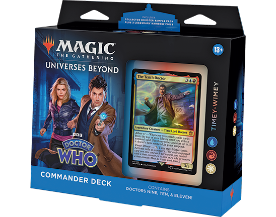
Timey-Wimey (Blue-Red-White)


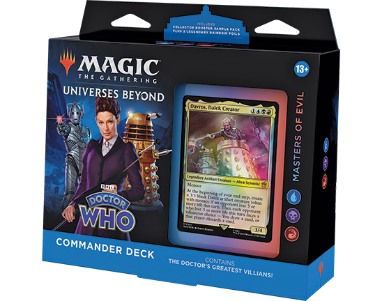
Masters of Evil (Blue-Black-Red)
Capturing the Essence of the Brand
Another unique element of designing a Universes Beyond product is making sure you capture what people love about the property. What exactly that is varies from property to property, but it's a key part of a good Universes Beyond design. Here's how it went while designing Magic: The Gathering® – Doctor Who™.
Gavin and his design team knew capturing the Doctors and the companions (the people who travel with the Doctor) were essential to making Magic: The Gathering® – Doctor Who™. The relationship between them is a core aspect of the series. First and foremost, this meant turning most of them into card designs, but there was a need that went beyond that. There had to be a relationship between the Doctors and their companions, something mechanical.
The initial approach is to look at existing Magic design and see if something already exists that's a good fit. For companions, there was an actual mechanic called companion (from Ikoria). What if the companions literally used the companion mechanic?
It worked like this: you got a free card that didn't start in your deck, and you could play it only if you controlled the correct Doctor. But this had a few problems:
- The Doctors kept getting recast, as they were commanders, but the companions would leave play and never return.
- Part of the joy of a trading card game is the modularity that lets you mix and match. Yeah, it's fun to play Amy Pond with The Eleventh Doctor, but wouldn't it be cool to team her up with The Fourth Doctor or The Thirteenth Doctor?
- Companion text fills up half the text box, and it would limit the team's ability to design flavorful and fun companions.
This led them to the idea of making use of a "partner with" variant. It would be cool if each Doctor could be paired with a companion as a commander. They're paired on the show, so that was flavorful. They worked under the restriction that they didn't want more than three colors to show up with paired commanders. How could you flavor all the Doctors and the companions in a way to make that happen?
The answer was to make all the Doctors two colors and all the companions monocolor. If any one Doctor could only pair with any one companion, then you're guaranteed to have three or fewer colors.
This leads to a quick aside. Capturing colors and characters is tricky business. Any well-written character who appears in enough stories is going to have the potential to be many colors. Most of the time, how many colors a character is has more to do with the needs of the product than the individual card design.
For instance, the Doctors had to be two colors and fit within the color identity of their deck. Most of the time, this allowed the designers to focus on the two colors that best exemplify the character. But sometimes, they would have to find ways to justify other combinations. The most common way to do this was to focus on a particular moment in a story that played up the colors you wanted.
Coloring the companions was even trickier, as they only got one color. The initial idea was to try and color the companions such that, when combined with their associated Doctor, they'd make up the three-color identity of the deck in which they appeared.
This worked some of the time but proved too hard to make a constant rule. For example, The Tenth Doctor is blue-red. Rose Tyler is mono-white, so that worked out, but Donna Noble made much more sense as mono-red than mono-white, so that pairing doesn't get to all three colors. The design team decided matching the flavor of the characters superseded larger design patterns.
Choosing What to Include and What Not to Include
Another important part of any Universes Beyond design is making sure you include the things that the fans of the property want to see most. The bigger the property, the trickier this can be. Doctor Who™, for instance, is 60 years old. There have been many, many episodes of Doctor Who™—over 850. There's no way to capture every episode on a card. There aren't even as many cards in the product as there are episodes. That means the design team had to pick and choose what to include and what not to include.
Gavin and his design team decided that they would take a handful of iconic episodes (episodes like "Blink") and give each several cards but that no other episode would get more than one card so that they could capture as many episodes as possible. They also made the decision to have one Saga for each Doctor that captured a key episode for them.
This problem of not being able to include everything affected characters as well. The set can only have so many legendary creature slots. Doctor Who™, in its 60 years, has had a huge number of characters. Not everyone could get their own card. Gavin and his team prioritized the ones they expected the fans to want most and found ways to reference other characters where they could. For instance, many cards were concepted so that characters who didn't get a card could appear in the art, and fans would get a nod to them.
Using Your Art Resources
One of the features of Universes Beyond products is that all art in the product is new because it must be for the property. Even reprints, which in most products reuse art, get new art.
This can have a big impact on the design. For example, normally in a Commander deck, the design team gets ten new cards per deck. But as the Magic: The Gathering® – Doctor Who™ Commander decks have all-new art, Gavin and his team had the freedom to make as many new cards as needed. This allowed them to explore some mechanical themes (like the time-manipulation theme of the Timey-Wimey deck) that would be off-limits to a normal Commander deck because it simply wouldn't have enough cards in the theme to pull it off.
It also allowed them to solve the problem of having few Magic creatures that made sense to reprint (a common problem to Universes Beyond properties that aren't based in fantasy).
Balancing the Colors (As Best You Can)
One of the pinch points in designing for Universes Beyond is color balance. Normal Magic products usually try hard to have an equal representation of each color. Commander and Secret Lair decks have an easier time than randomized booster products even though there's an expectation that each color will show up and that no one color shows up too much.
For Magic: The Gathering® – Doctor Who™, the two troublesome colors ended up being blue and black. Blue just wanted to be in all the decks. As I explained above, Doctor Who™ philosophically leans toward blue. The design team experimented with having a deck without blue, but its absence was too large. In the end, they decided it was okay for all four decks to have blue.
Black had the opposite problem. Three of the decks had Doctors as their commander, and putting black in any of the Doctors just didn't feel right, so the design team decided to let one deck, Masters of Evil, have black.
For those unfamiliar with the four decks, here's how we broke them out:
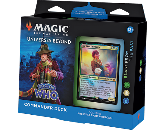
- Blast from the Past is based around the Doctors from before the reboot, the First Doctor through the Eighth Doctor. The deck is green-white-blue. It's centered around the historic mechanic.
- Timey-Wimey is based on the first three Doctors of the reboot, the Ninth Doctor through the Eleventh Doctor. The deck is blue-red-white. It is a time-manipulation deck making use of a new time-travel mechanic that lets you add or remove time counters from cards.
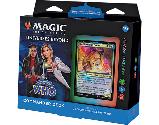
- Paradox Power is based on the Twelfth and Thirteenth Doctors. The deck is green-blue-red. It makes use of a new ability word called paradox that rewards you for playing cards from places other than your hand.
- Masters of Evil is based on the villains of Doctor Who™. The deck is blue-black-red. It introduces a new mechanic called villainous choice where you make opponents choose between two negative effects.
Figure Out What Contradicts Normal Magic Execution
The last thing a Universe Beyond design team figures out is when they need to do something that normal Magic wouldn't do. Our planes are built to match the needs of the game, so we don't find ourselves having to abandon our own rules very often, but properties that weren't created to maximize the game of Magic can run into issues. Here's a good example of this from Doctor Who™:
One of Magic's rules is that if we show you wings in art, the character flies. This comes from some early illustrations where creatures were shown with wings, sometimes ironically in flight, but weren't actually fliers. Players would treat them like they had flying based on the art, and it caused problems. To fix this, we made a rule: If the creature has wings, it flies. If it doesn't fly, it can't have wings.
This brings us to the card Weeping Angel. Weeping Angels are popular villains from Doctor Who™. They appear as stone statues of angels. They have wings. They canonically cannot fly. The design team even double-checked with the BBC just to make sure. We didn't want to have Magic: The Gathering® – Doctor Who™ without a Weeping Angel. They're very popular. They have wings. They don't fly.
The only answer was to break our own rule. This isn't something we plan on doing often, but part of making a Universes Beyond set is understanding that situations will occasionally arise where we must do something we normally don't.
In Full Preview
Before I end today's article, I have two cards to preview.
First is a land that shows up in three of the decks (Masters of Evil, Timey-Wimey, and Paradox Power), and it features one of the Weeping Angels I mentioned above.
-
Click here to visit the Ominous Cemetery
-
Ominous Cemetery
Finally, you might think you've seen all the Doctors, but I have one more. Click below to meet The War Doctor (from the Timey-Wimey deck).
-
Click here to meet The War Doctor
-
The War Doctor The War Doctor Extended Art The War Doctor Showcase
And with that final preview, my article ends here. I hope you enjoyed my look at what goes into making a Universes Beyond product. As always, I'm eager for your feedback on today's article, any of the cards I showed you, on elements I talked about, or on Magic: The Gathering® – Doctor Who™ itself. You can email me or contact me through any of my social media accounts (Twitter, Tumblr, Instagram, and TikTok).
Join me next week for another article in my "Lessons Learned" series.
Until then, may you have fun traveling with the Doctor.

