Top of the Duskmourning, Part 1
Welcome to the first week of Duskmourn: House of Horror previews. Today, I'll be introducing the designers from exploratory design and vision design, I'll start telling the story of how Duskmourn was mechanically created, and I'll be showing off two cool new preview cards, both with an exciting new mechanic in the set.
Mourn-ing People
As is tradition, I have the lead vision designer introduce the Exploratory Design and Vision Design teams. For Duskmourn, that was Annie Sardelis. Duskmourn was her first time as the vision design lead for a premier set, although as you will see in her bio, she has already led the design of numerous other products.
-
Click here to meet the designers
-
Mark Rosewater (Exploratory Design Lead, Vision Design)
Mark is an all-time legend at exploratory design and vision design. While working alongside Mark on the Vision Design teams for Murders at Karlov Manor and Outlaws of Thunder Junction, I learned a lot about the ins and outs of finding the fun within our new planes and genres. Duskmourn is another jump into a new plane, and with Mark's guidance, we kept top of mind at both the individual card and mechanical level that making Duskmourn was a love letter to the horror genre.
I've asked everyone on the team what their worst nightmare is; what keeps Mark up at night is being swarmed by people questioning his design decisions.
Doug Beyer (Exploratory Design, Vision Design)
Doug is the creative director for Magic worldbuilding. He keeps the big picture in mind, getting involved with every Magic set early to make sure we are setting ourselves up for success. Having previously led the vision design for Bloomburrow, his designer hat came in handy for exploring resonant and more "out there" mechanics involving exploring the House of Horror.
Doug's worst nightmare is
Gilder Bairn , presented without further context.Annie Sardelis (Exploratory Design, Vision Design Lead)
I wore a lot of hats while working on Duskmourn, having worked on the set from exploratory design to set design, as well as leading the Commander decks. Each step along the way, if an idea or card slipped through the cracks for one reason or another, I kept it in my back pocket to pester Jules Robins (the set design lead) with or to sneak into the Commander decks. Being able to work on a set from a blank slate to print was a great experience, even if I had to watch scary movies 24/7, which definitely lost me some sleep.
Speaking of which, my worst nightmare is finding out I put one of my favorite cards through the wash. It happened once—never again.
Jacob Mooney (Exploratory Design, Vision Design)
Jacob was a part of Casual Play Design team, focusing on making sure our card designs are balanced, aspirational, and fun for the Commander format. Those ideas I just mentioned saving for Commander? Many of those came from Jacob's work early on in play design. He played a big role in iterating on the gameplay expression of moving through a house. His drawings and diagrams of the early version of Rooms were key to getting us to the final execution.
Jacob's worst nightmare is opening a bunch of cool rares at Prerelease but never drawing them in his games. We've all been there.
Jeremy Geist (Vision Design)
Jeremy is a top-down design fiend in the best way possible, making cards for any and every horror trope. Sometimes I'm guilty of second guessing myself with, "Is this design actually cool, or do we just think it's cool?" and Jeremy is always able to cut through that doubt to advocate for resonant designs and mechanics. Jeremy is a staple on many Vision Design teams.
Jeremy's worst nightmare is his sleep paralysis demon having strong opinions about the black-green Serra Angel question (if you know, you know).
Dan Musser (Vision Design)
In addition to design contributions, Dan lent his expertise to make sure early versions of the file were ready for playtesting, adjusting numbers and making sure we were covering all our bases for card effects required for Limited. We rebuilt that file many times, and playtested many times, so it was a lot of work. We previously worked together in a similar fashion on Outlaws of Thunder Junction, so we had a bit of a system figured out.
Dan's worst nightmare is playing against burn.
Emily Teng (Vision Design, Worldbuilding Lead)
Emily was our worldbuilding lead, which was no small task on this new, strange plane of Duskmourn. We constantly asked her questions about the nature of the House, what kind of monsters are there, whether people actually live there, where they go to the bathroom, and so on. She helped us nail down the right suite of mechanics through playtests, to make sure that every element of the worldbuilding (nightmares, survivors, and so on) had their own identity.
Emily's worst nightmare is people bridge-shuffling their decks unsleeved.
Jules Robins (Vision Design, Set Design Lead)
Jules Robins joined the Vision Design team in the latter half as the designer that was lined up to take over in set design. Jules had just finished up The Lost Caverns of Ixalan development and was ready to jump into a new, entirely different set with its own challenges. While a lot of things changed between vision design and set design, Jules was in tune with the feelings we wanted to capture and carried that with him, eventually rebuilding the set from the ground up with only the best of our component mechanics.
Jules's worst nightmare has power and toughness equal to the number of Swamps he controls.
Bryan Hawley (Vision Design)
Bryan was on the team at a similar time to Jules, checking out how the set was going in its final months leading up to what we call a "vision summit." At this summit, directors and stakeholders like Bryan check out the set and weigh in to make sure it is in good shape to go to set design, and if not, identify what needs to happen before then. I greatly appreciated his level of expertise, and he helped us get to what is now manifest dread (my personal favorite mechanic of the set).
His worst nightmare is taking mulligans down to five while playing for the Top 8 of a Pro Tour.
Building a Haunted House
Magic is currently in a phase where it's stretching creatively and pushing our boundaries. Following the success of Kamiagwa: Neon Dynasty, one of the areas we were interested to explore pushed more into the modern space. High fantasy is traditionally associated with a technology level of many centuries ago, but there's no reason it can't exist with other technology levels. Was there a setting we'd like to explore that has a more modern level of technology?
Magic has also been exploring various subgenres. Horror is popular enough with players that we felt we could try creating another setting with the horror genre as its center. Innistrad focuses on gothic horror and New Phyrexia on what I'll call "alien" horror. Were there other subgenres of horror we could explore?
These two forces came together with the idea of a plane that revolves around "modern" horror, focused on the horror films of the 70's and 80's. We then combined it with another idea we'd been talking about: a set that was all indoors. The idea of an impossibly large mansion plays into the horror trope space we were exploring, so that's what got greenlit:
- A new plane
- 70's and 80's horror film inspired (and the technology level that came with that)
- A set that takes place solely inside a single mansion
In exploratory design, the first question we asked was, "How do we keep this world from mechanically stepping on the toes of the planes of Innistrad and New Phyrexia?" Early on, we realized the horror we wanted to evoke relied on a specific mood and tone. Often in these movies, the creepiness starts long before you actually see a monster. So, we asked what card type best represents mood and tone? The answer was clear to us: enchantments. The rest of the permanent types are more tangible, representing an actual thing or place. Enchantments are more vague and focused on intangible qualities.
Focusing on enchantments was nice because it was a departure from the mechanical identity of Innistrad and New Phyrexia. From a permanent standpoint, Innistrad was very focused on creatures, as the core of the experience is about humans facing monsters that were once human. New Phyrexia cared about creatures, this time monsters that were more alien in origin, and artifacts that tapped into a sense of modernity that alien horror evokes. Enchantments still showed up—Innistrad, for example, had Curses—but they didn't play a major role. Focusing on enchantments would give the plane of Duskmourn its own mechanical feel.
Having the set focus on enchantments would require two things. First, we had to have things—ideally some new—that were enchantments, and then second, we needed to have things that mechanically cared about enchantments. I'll begin with the former.
Because we knew early on that this plane was entirely inside a giant house, we spent a lot of time in design figuring out how to capture the concept of a room. We've used both lands and enchantments in the past to represent the concept of place, but because we wanted the rooms to evoke a mood and tone, and to have effects that impact the game, we wanted them to be enchantments. (Also, we have to be careful how much functionality lands have outside of producing mana.) To get the word "room" onto cards and make it something we could mechanically care about, we made Room an enchantment subtype.
Next, we asked ourselves what a Room card would do. It needed to have a certain feel, and we wanted effects that would influence the game. Since these cards were enchantments, it could be a static ability, a triggered ability, or an activated ability. We also knew we liked the idea of movement, so we experimented with ways to move from Room to Room.
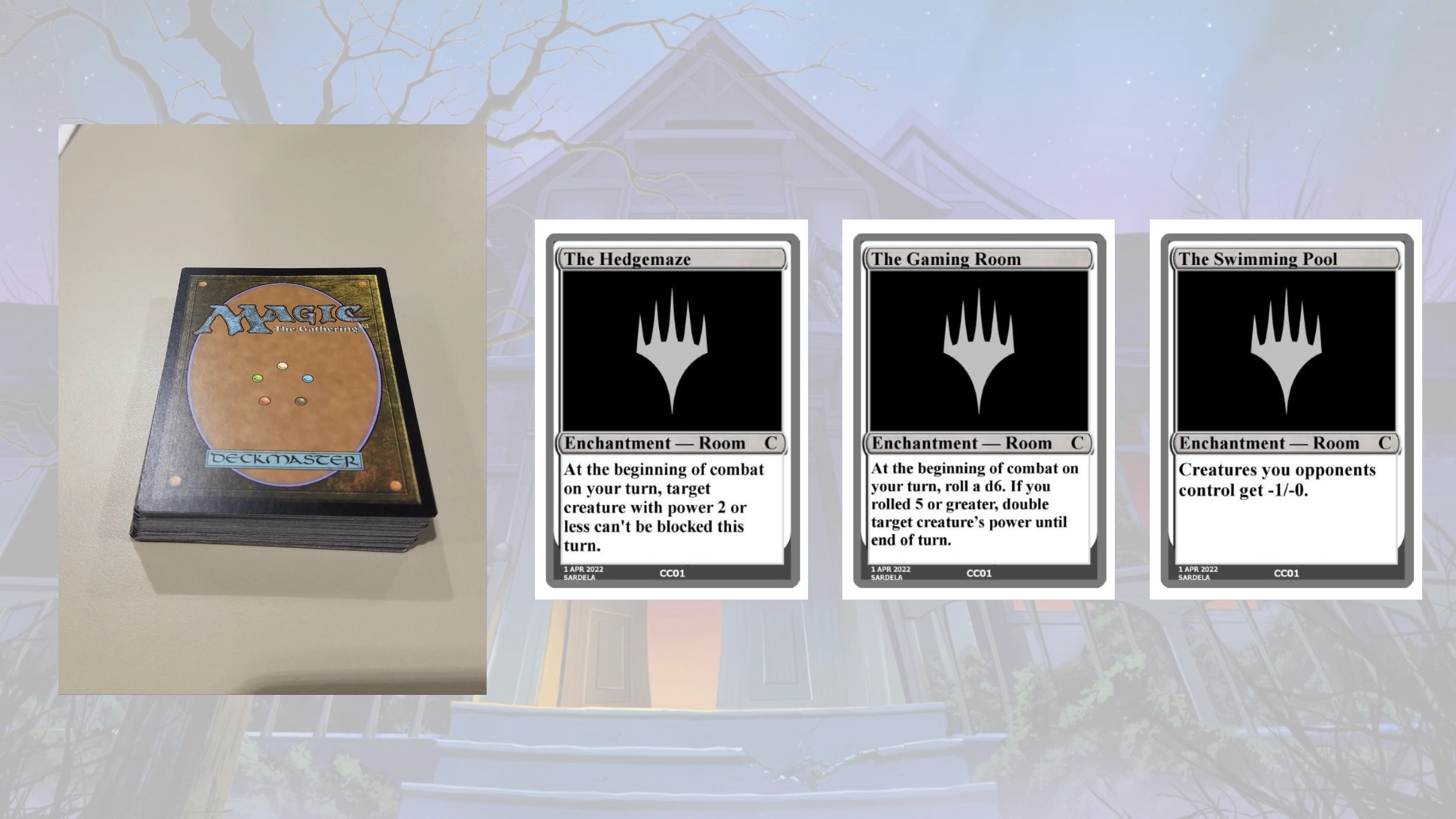
Our earliest exploration into this space, in exploratory design, involved a deck called the Mansion. It was a separate deck, similar to Contraptions or Attractions. Rooms were cards in that deck. There were three slots for Rooms. Cards in your main deck had a mechanic called "explore the mansion" that allowed you to flip up cards. If you ever played a fourth one, it would have to cover up one of the first three. Each Room was an enchantment, much like Contraptions and Attractions were artifacts, with an effect on the game.
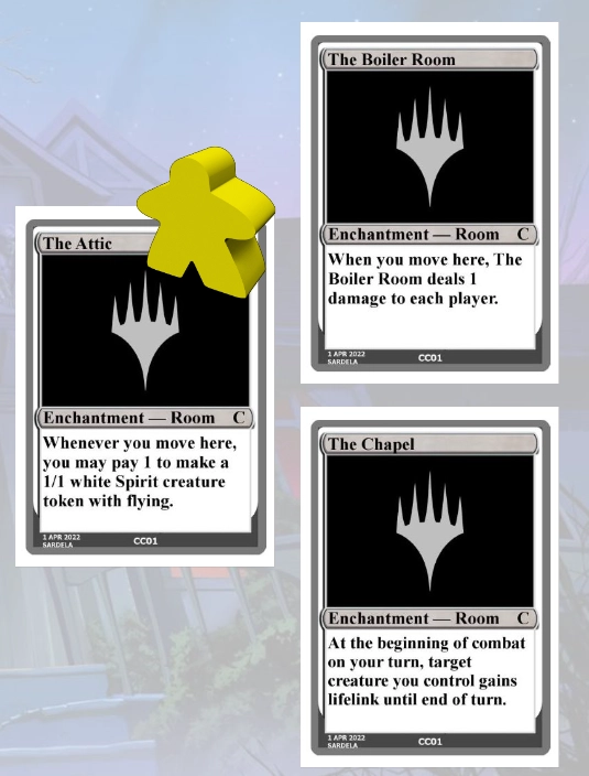
Having three enchantments out at once was a bit much, so we added a meeple, a game piece that would represent you, the player. You could now move around between Rooms, and only the active Room's effect would impact the game. Cards would help you move your meeple and care about what Room your meeple was in. We really liked the meeple because it added the feeling of movement that we wanted.
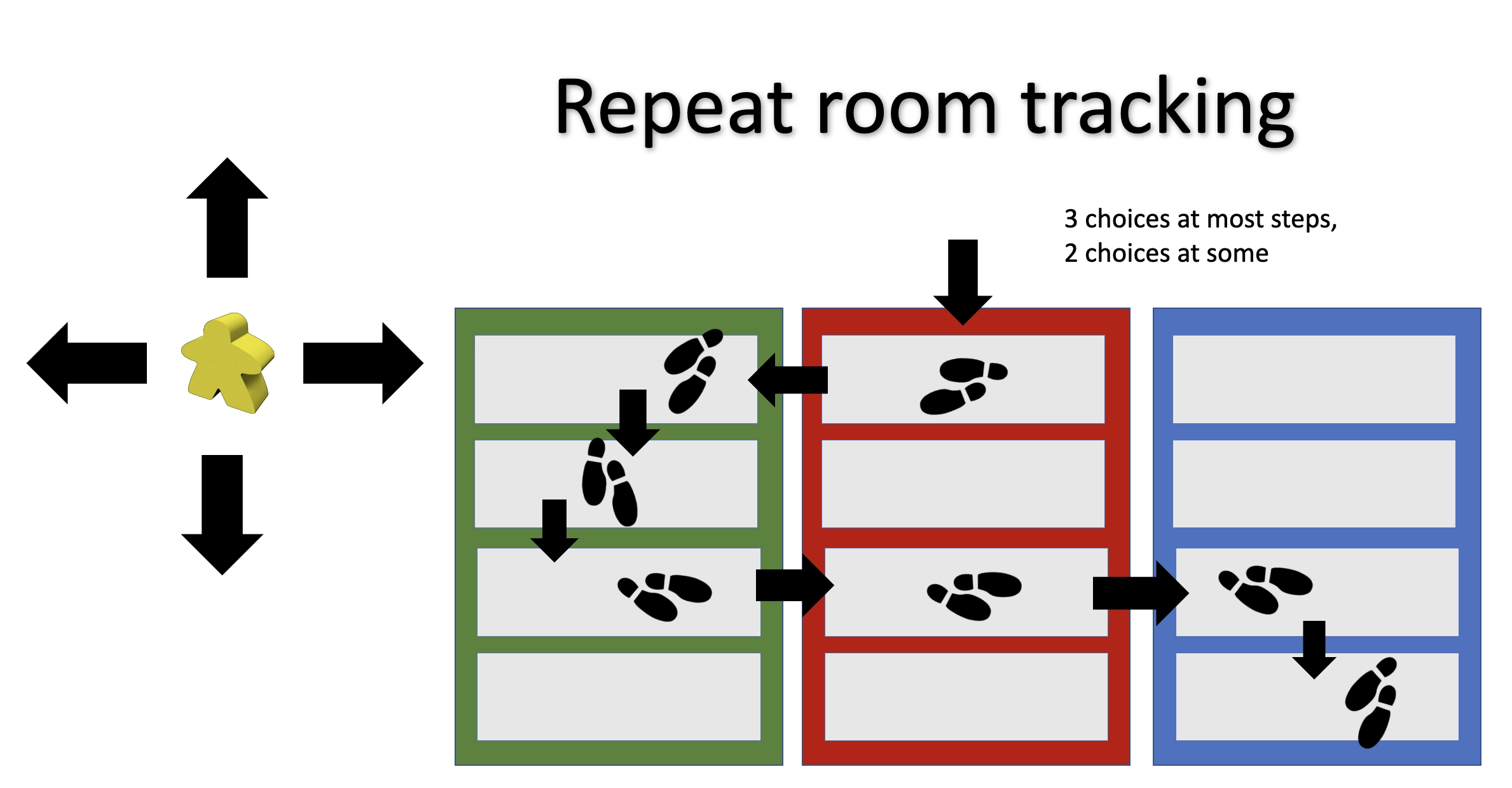
Unfortunately, the movement couldn't happen until you had two or more Rooms open, so it took a while for the fun part of the mechanic to kick in, so the next version had multiple Rooms per card. The earliest version started with four Rooms on a card. Again, you could have up to three Room cards at once, meaning you could have access to up to twelve Rooms. We had rules for how the meeple moved between Rooms; you had to go through an open door, which meant the Rooms had to be next to one another, either adjacent vertically on the same card, or horizontal to a card next to it. Because there were more Rooms, we allowed you to move through multiple Rooms at once.
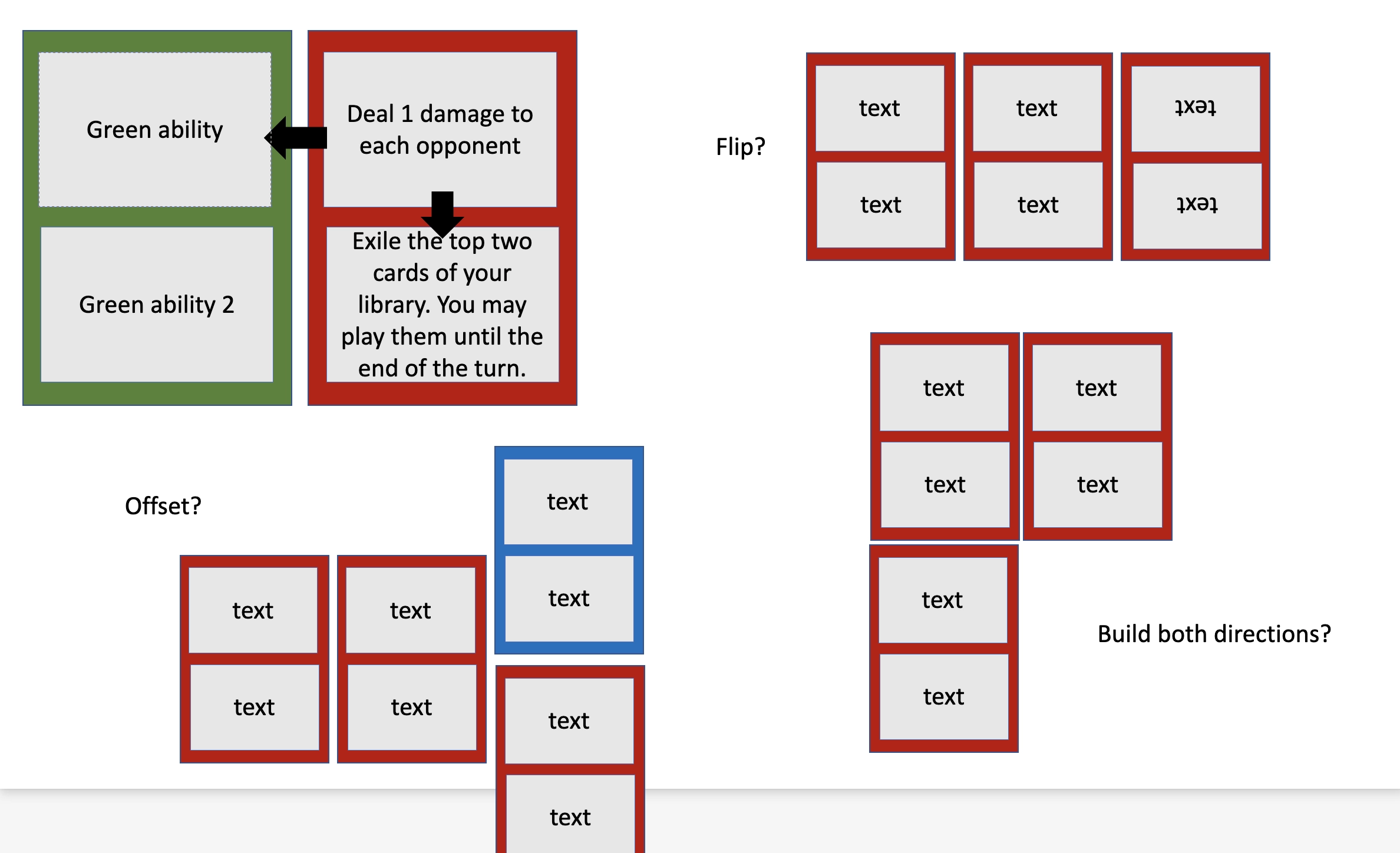
Four rooms on a card was a bit too much. We then tried three and ended up at two. It was during this stage that we started exploring the ability to position the Rooms outside the three locked positions. The placement was similar to how domino games work
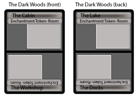
The next big issue was the extra deck and the meeple. While acorn sets can make use of extra decks, it causes a lot of issues for tournament play, so we looked for a way to get the Rooms into the main deck. Making spatial movement matter was very tricky, so we ended up just getting rid of the meeple. The next iteration of Rooms was influenced by split cards and modal double-faced cards that allowed you to access two different cards. Since these were enchantments, you wanted to put them onto the battlefield. We also experimented with Rooms being on both sides of a card.
The version that ended up in the set looks similar to a split card, but each mini-card is an enchantment rather than an instant or sorcery. You are able cast either one and unlock it, meaning its effect happens right away. The other door to that Room is considered locked, but you can unlock it by paying its mana cost. The ability to unlock the other half of the Room added more functionality. You could now have triggered abilities that trigger when you unlock a door, allowing you to mimic the effect of a sorcery.
My two preview cards today are Rooms, so this seems like a good time to show them off.
-
Click here to see Smoky Lounge // Misty Salon
-
0235_MTGDSK_Main: Smoky Lounge This Room demonstrates that not all Rooms are monocolored. This card can go into a mono-blue or mono-red deck, but shines in a blue-red deck. Misty Salon showcases how some Rooms can care about how many halves of a Room you have unlocked. Misty Salon is stronger if you unlock Smoky Lounge first. Smoky Lounge's effect will also make it easier to cast Misty Salon.
Smoky Lounge // Misty Salon is uncommon. My other preview is mythic rare.
-
Click here to see Mirror Room // Fractured Realm
-
0067_MTGDSK_Main: Mirror Room 0337_MTGDSK_BdrlsRm: Mirror Room Note that Mirror Room has a triggered ability, so if you unlock Fractured Realm first, you'll get to do the effect of Mirror Room twice, and you can choose two different targets if you desire.
Beyond the Rooms, we looked at various other ways to include more enchantments in the set. The low-hanging fruit was to include some enchantment creatures. The key to making a set care about a particular card type is to get the as-fan of that type up, and including it on creatures is an easy way to do that. Here are some ways we explored:
Enchantment creatures with an enchantment effect
Many horror films, especially of the era we were capturing, make use of ephemeral creatures that have an influence on the environment. A classic example is that the room will feel colder, or people start seeing things they normally wouldn't. This seemed like a great top-down feeling for enchantment creatures. The creatures have a power and toughness and can interact with players and other creatures, but they also have an effect on the environment. Some also have an effect when they enter the battlefield or when they die. The key was to capture the feel of creepiness on creatures.
Vision Design created a lot of different executions of this idea, pushing in different directions. Set Design, working with Creative, made a series of creatures that represent different types of fears, all with the creature type Nightmare.
Enchantment creatures that became enchantments
Another trope we explored was the idea of creatures that, although dead, still have a presence. They could die, but their death wasn't the end of their influence. We represented this by having enchantment creatures that died and became noncreature enchantments. We created a mechanic we called possess, and when a creature with it died, it turned into an Aura, which then enchanted one of your creatures. Here's an example:
Endlessly Falling
3U
Enchantment Creature- Nightmare
3/3
Possess (When this creature dies, you may return it to the battlefield as an Aura with enchant creature. Enchanted creature has the following abilities.)
Flying
Set design liked this idea but ended up making the enchantment not an Aura. The Aura version too often didn't have a target or the available target wasn't a good choice for the Aura. The current version increases its relevance during the game.
Enchantments that turn into enchantment creatures
Another trope we wanted to hit was the feeling that something was out there, similiar to how film characters feel something isn't right, but there's nothing there that they can see. The monsters eventually take form over time. Vision Design didn't envision this as a whole mechanic but as just individual cards. Set Design would then turn it into a mythic rare cycle, where the enchantment has an effect when it enters, gets time counters, and doesn't turn into a creature until the time counters go away. The team explored using suspend early on, but it was wordy, and having the card be an enchantment until the time counters ran out was much more flavorful.
Enchantment creature tokens
Another way to get your as-fan of enchantment creatures up is to create enchantment creature tokens. From pretty early on, we liked the idea of enchantment creature tokens being something that was helpful to the survivors. Originally, we called them Light tokens, playing into the idea that the scary things lived in the dark, and the ephemeral creatures of light helped illuminate things to keep you safe. They were always white 1/1 creature tokens, but we'd go on to give them "When this attacks, scry 1."
We had two reasons for adding scry to these tokens. It flavored them as helpful creatures, and it served as one of our smoothing mechanics to help players draw relevant cards. While we'd normally use surveil in a set with graveyard mechanics like Duskmourn, it didn't have those during vision design. We were trying hard to not be Innistrad, so we avoided things that Innistrad was specifically known for mechanically. One of those things was its interaction with the graveyard.
Set Design decided that the graveyard was so flavorful to the horror genre that we should do it anyway. The idea was the rest of the set was different enough from Innistrad that it was okay to have overlap with the graveyard. This change had a lot to do with the Light creatures losing their ability. Once the set cared about the graveyard, most of the scry effects turned into surveil. The tokens, and many of the cards that created them, wanted to be white from a flavor perspective. While white is second at scrying, it's fifth at surveiling, as white isn't good at getting things into the graveyard, so the scry ability was cut from the token. This also simplified it, which had additional value. Light creatures would change to become Glimmer creatures.
You'll see more of the Glimmer tokens later in preview season. Besides enchantment creatures, another way to up the as-fan of enchantments is to just have more enchantments. Here are a couple ways we did that:
Spells as enchantments
One of the secrets of design is that there are many ways to execute the same effect. If a set cares about a certain thing, in this case enchantments, you can make more effects of that type. Nowhere to Run, for example, is a removal spell. In most sets it would probably be an instant, but in Duskmourn, we made it an enchantment with flash to function similarly, but up our enchantment as-fan. We also put a static ability on it, so after you kill the creature, the card is still doing something on the battlefield.
Bring back popular enchantments
We also like to lean into mechanics and cycles that have proven popular in the past. We talked about doing Curses, but the desire not to feel like Innistrad made us decide against it. Leylines would be added during set design. Leylines are enchantments that can go onto the battlefield for no cost if you draw them in your opening hand. They premiered in Guildpact and then showed up again in Magic 2011 and Core Set 2020.
The final piece to the enchantment puzzle was having cards that cared about enchantments mechanically. We started by looking at constellation from the Theros sets. It triggers when an enchantment enters. The name constellation wasn't a good fit, and we wanted the ability to interact with additional parts of the set, so we decided to make our own ability word that cared about enchantments. We went through various versions, but here's what we handed off from vision design:
Afraid (If an enchantment, Horror, or Nightmare you control entered the battlefield or attacked this turn, all opponents are afraid.)
This version interacted not just with enchantments, but a few of the creatures we felt most embodied the genre, Horrors and Nightmares. Because the set had enchantment creatures, including the Light tokens that wanted to attack, all three items were capable of attacking, so we added that as a trigger.
Set Design decided they didn't need to care about non-enchantment creatures and removed both the Horror and Nightmare reference and the attack trigger. This was partially influenced by the fact that all the Nightmares became enchantment creatures. By that time, Rooms had shifted such that you unlocked one when you cast it and the second door unlocked later. Afraid became eerie, and unlocking Rooms also triggered the ability. Eerie shows up mostly in white, blue, and black.
"Oops, I forgot my flashlight. I'll be right back."
That's all the time we have for today. As always, I'm eager for any feedback, be it on today's article, any of the mechanics I talked about, or Duskmourn: House of Horror as a set. You can email me or contact me through any of my social media accounts (X, Blogatog, Instagram, and TikTok) with any feedback.
Join me next week … if you can. I'll be continuing the tale of Duskmourn's design.
Until then, don't split the group.

