To Unfinity and Beyond
(Editor's Note: This article originally ran November 29, 2021. With Unfinity previews beginning September 20, we wanted to refresh everyone with what's been shared about the set so far. Mark's introduction is just the breakdown you need to get ready for all the reveals to come!)
This week is something special. I've been given the go-ahead to share the first sneak peek at Unfinity, the fourth Un- set, coming October 7, 2022.

I'm going to talk a little about how it initially came together, discuss a cool aspect of the product, and show off a whole bunch of preview cards. I hope that encourages you to keep reading. I should note as this is an early preview, I'm not going to be introducing any of the new named mechanics from the set today. That will happen during the preview right before release.
Our story starts in mid-2018. Unstable had come out in December of 2017 to much fanfare. The set went on to get reprinted four times. I remember being in Mark Purvis's office (Mark is one of the Marks in the Council of Marks that helped get Unstable made). He asked, "So, do you have any ideas for the next Un- set?" and I replied that I did.
One of the things I enjoy doing with Un- sets is exploring design space that has proven successful in traditional Magic sets. For example, Unstable was a faction set where you take some combination of colors (in this case, the ally combinations) and give each faction its own unique creative and mechanical identity. I had a clear idea what I wanted to do with the fourth Un- set. I wanted to create a top-down set. For those unfamiliar with the term, a top-down set refers to a design where you start with the flavor and build the mechanical structure around that flavor. (For more on top-down design, click here.) Innistrad, Theros, and Throne of Eldraine are all examples of top-down sets. The big question: what top-down idea should we use?
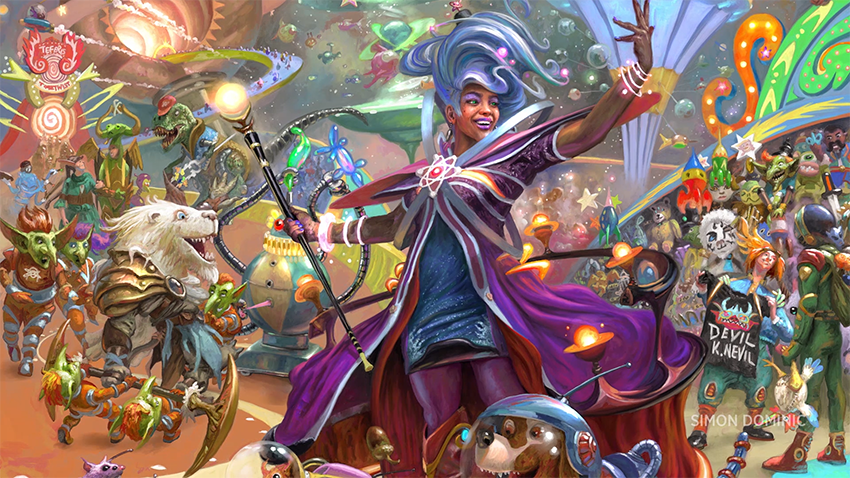
As is always the case for an Un- set, I wasn't interested in doing something that a traditional Magic set would do. I wanted to find a top-down theme that would allow us to explore things we normally wouldn't. Dawn Murin had been the art director for Unstable, and she'd been amazing, so it was clear to everyone that she'd be the art director for Unfinity. She and I talked for about a month sharing different ideas.
The thing I was most passionate about was an idea I'd been thinking about for years—a circus-themed set. I'd pitched it a few times, but I was always told that the tone wasn't right for a Magic world. I was sure we were never going to do it, so much so that I used the theme for the top-down challenge for the third Great Designer Search. Dawn had her own thing she'd been dying to make, a retro-science fiction set. She liked the circus idea, and I like the retro-science fiction idea, so we said, "Why not do both?"
As we started doing design, it quickly became apparent that there weren't enough circus tropes to fill a whole set, so we expanded to carnival tropes. When it was clear we still needed more, we expanded to amusement park tropes. When the dust settled, we had a giant park that fused circus, carnival, and amusement park aspects. To add in the science fiction element, we made the whole park a series of interconnected flying spaceships that could move from planet to planet, much like a traveling circus or carnival. We dubbed the park Myra the Magnificent's Intergalactic Astrotorium of Fun.
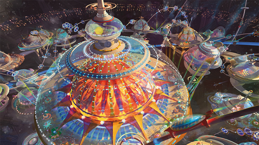
The first big challenge was figuring out how we could make the set feel like science fiction but still feel like a Magic set. We found it was best to include components that closely identified with each category.
For science fiction, we made sure the set had robots and aliens and spaceships and technology. For Magic, we included many of the staple creature types. The employees of the park are Goblins and Elves and Vampires and Zombies. In addition, to help get more Magic into the set and increase our ability to do parody, we came up with a cool concept. What if Myra, the owner of the park, made use of Magic itself as the main motif for the Astrotorium (off the books, of course, she wouldn't pay for such a right)? This would allow us to give the park a strong theme and make lots and lots of references to Magic.
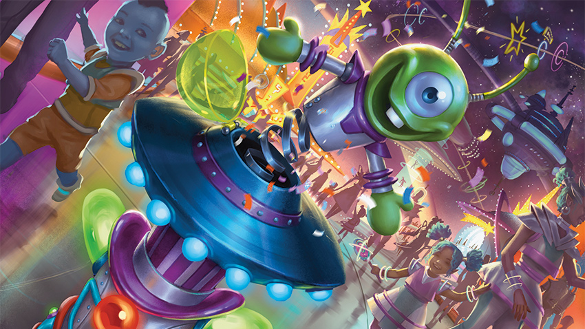
The second thing we tackled was how to lean into the humor. One of the key traits of Un- sets is that they're funny, and we wanted to make sure that we optimized our ability to make a world that was not only cool and evocative, but also one that was playful and humorous. I hope the art and cards we show today capture the atmosphere we've established.
Just like a normal premier set, we had a world-building push, and Dawn did an amazing job finding artists that could tap into their sillier side to create this wonderful world we're showing off today. Dawn told me that the artists were constantly telling her how much fun they had illustrating this set.
We also did one other cool thing to play up the humor. Ari Zirulnik was in charge of names and flavor text, and he had a great idea for getting a team of comedy writers to do the creative work. Here's who he got:
- Kathleen De Vere, Cameron Lauder, and Graham Stark are members of the Canadian comedy group LoadingReadyRun, best known for their sketch comedy, game streams, shows, charity work, and more.
- Seanbaby "invented being funny on the internet" and is also known for his contributions to media outlets such as Electronic Gaming Monthly and websites such as Cracked.com. He currently writes for 1-900-HOT-DOG.
- Austin Bridges is an established Magic creative text freelancer, as well as a writer, editor, and podcaster—this guy does it all!
I had the great pleasure of working with this team (stretching my own comedy-writing muscles), and it was a blast. I'm so proud of the work we created, a little of which you'll get to sample today.
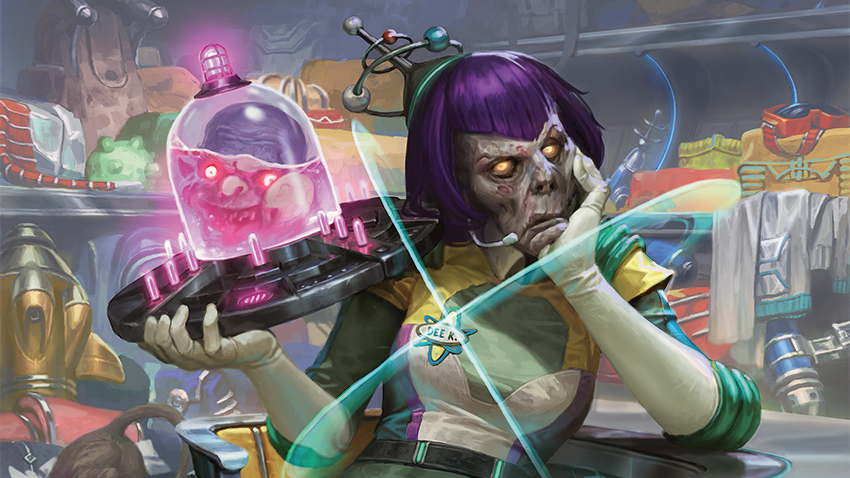
Another important contributor to the world was Annie Sardelis, who did all the card concepting for the set (i.e., figuring out what each card represents visually). She worked with me, Dawn, and Chris Mooney (my right-hand person for the length of the set's design—more on them in a second) to make sure the art of every card enhanced the world and included as much humor as possible. Annie also sent reference materials to the artists to ensure every joke had as much Magic relevance as it could.
The final big component of making the world capture the right feel was the design itself. I wanted this to be a top-down design, and I made sure my design team was always focused on maximizing the design to capture the flavor of the tropes. Again, some of the preview cards will show this off.
Two quick callouts. First, when I started exploratory design, I asked Chris Mooney (one of the three finalists for the third Great Designer Search) to be my strong second, and Chris was with me for the entire duration of the design (over two years). They were an invaluable part of mechanically capturing the flavor of this set. Second, early on, I went to Aaron Forsythe, my boss, and asked if I could lead this set from the beginning of design to the end (exploratory, vision, and set design), and he said I could as long as I listened to my play designers, as card balance is not my strength. Those two play designers were Donald Smith Jr. and JC Tao, and they helped me immensely in making this a fun, balanced set. I had numerous amazing design team members, and I will introduce them all when we get into the usual preview cadence.
Rolling with the Punches
We were well into design (having started earlier; Un- sets usually take a little extra time because we like to mess around in weird mechanical spaces) when the following happened:
For Dungeons & Dragons: Adventures in the Forgotten Realms, we decided to bring die-rolling to a premier set. Die-rolling had always been a staple silver-border ability and was something Unfinity was using to great effect in its design. (While Adventures in Forgotten Realms came out first, a good chunk of Unfinity had been designed before it.)
Un- sets had always been thought of as advanced design, testing waters for future design space, so I'd always expected certain elements would move from silver border to black border, just never in the middle of a design, one where the component in question was a core part of that design. Also, Adventures in the Forgotten Realms had worked hard to limit the variance of their die-rolling cards, the exact opposite of what an Un- set wants. Un- sets are far on the casual side of the competitive-casual scale and see high variance as a plus (competitive formats want consistency, whereas casual formats prefer that exciting things happen). The loss of die-rolling would be a big blow to Un- sets, and Unfinity in particular, because we want to use it in a way that other Magic sets don't. But what did that mean for the set?
This made me look back and rethink what exactly Un- sets were supposed to be. When the idea of a silver border was first conceived, there weren't a lot of supported formats. There was Type 1 (Vintage) and Type 2 (Standard), plus Type 1.5 (Legacy), which was Type 1 with its restricted cards banned. Everything that wasn't one of those formats was considered casual. When silver border was dubbed "not for tournament play," that meant not for Vintage, Legacy, or Standard, but for every other format, especially the casual ones. Over the years, silver border slowly shifted to end up meaning "not for any official format, casual or not," which flies in the face of what it was originally intended to do.
The card that hammered that point home was this card:
This card was silver border for three reasons:
- It rolled a twenty-sided die.
- It referenced a non-Magic IP.
- It made a token that was gold, not an official Magic color.
We'd just done the first two in a premier set, and the last could have easily been changed if we cared. It being gold was more of a joke than being necessitated by anything mechanical. Why was this off limits to every format?
I then dug more into Unstable. Why couldn't casual formats make use of host/augment or contraptions? They both worked in the rules. They were silver border only because the set was silver border, not because they couldn't work in black border. Why were we making cards casual players could play and then not allowing them to play them?
So, I asked the following question: what if we just made Unfinity black border? The two main new mechanics (which, again, I'm not revealing today) were quirky, but they worked within the rules. Die-rolling obviously worked. But as I looked at the file, I realized we had a lot of cards that clearly wouldn't work in black border for a whole variety of reasons, so my team and I did the following exercise: we put every card in the set into one of two piles, black border or silver border, and then listed the reasons for cards needing to be in silver border.
The silver-border cards fell into a small grouping of categories:
- Cards that don't work within the black-border rules
- An element of "cards matter" that black border doesn't reference (flavor text, as an example)
- Cards that require interacting with people outside the game
- Cards that require a physical or vocal component
- Cards that reference a state external to the game (are they able to see something from their seat, for instance)
- Cards with some effects that just don't feel right in black border
Here was the most interesting part of the exercise. Over half the cards, including over one fourth of the rares and mythic rares, were in the black border category. It seemed odd to print a set where half the cards would be perfectly fine to play in casual formats (in other words, ones that didn't allow silver-border cards) but make it so they couldn't. That then led us to our big idea: what if there was a way to express "silver border-ness" that didn't require a silver border?
Universes Beyond had started using the security stamp to express information about the card (normal Magic cards have an oval security stamp, while Universes Beyond cards have a triangle). What if we used the security stamp to indicate what silver border used to indicate? We looked at a bunch of shapes and ended up choosing this one:
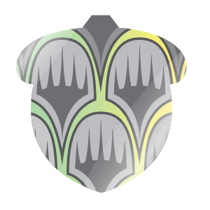
Yes, an acorn. Squirrels have long been associated with Un- sets, and the shape was distinct. What an acorn security stamp means is exactly what a silver border used to. This is a card not meant for tournament play and should only be used in casual formats where all the players agree to its inclusion. We have dubbed these "acorn" cards. If a card has an oval security stamp (or no security stamp at lower rarities), it's legal in Eternal formats (which includes Commander, Legacy, and Vintage). We have dubbed these "Eternal" cards. This security stamp technology would allow us to let the two different types of cards commingle in the same set.
I should stress that all the cards in this set were designed before this distinction existed, so cards weren't made to be one or the other. We just made cool cards for the set and later divided them into categories. We tweaked a small number of cards that were close to being non-acorn, but mostly things stayed as originally designed. Let me give some examples using some preview cards.
Click here to see two acorn cards from Unfinity
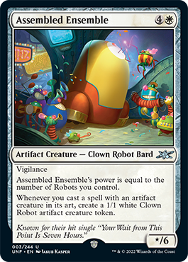
Assembled Ensemble is an acorn card because it mechanically references art which is something the black border rules don't allow. Also, yes, Robots are a new creature type in the set, and there are enough of them to care about tribally. One of the design choices we made in building the world is that all the Clowns are Robots, but not all the Robots are Clowns. (It helped us avoid the creepy clown issue.) The Robots of Unfinity tend to have one function, which varies from Robot to Robot, that they commit to strongly.
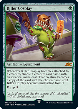
Killer Cosplay is a card that's a little more subtly an acorn card. Like Richard Garfield, PhD, the card that inspired it, it's broad in scope, messing with mechanical space that's difficult to balance for competitive formats. It's also a card that's hard to track for the opponent because few players have memorized all the mana costs in Magic. If we didn't make it an acorn card, it would have to be costed in a way that few would ever play with it. Because acorn cards can't be played in tournaments, we have more latitude to make the card that the casual player can enjoy. And yes, that is a Lhurgoyf costume.
Click here to see two Eternal cards from Unfinity
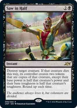
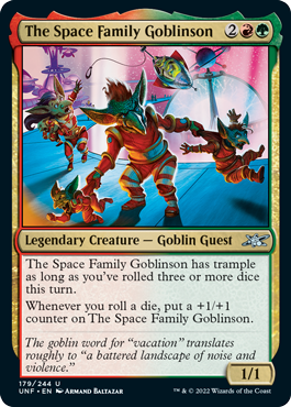
Saw in Half is an Eternal card because nothing the card does can't be done in black border. It's in this set because it's a top-down circus design. It's also a quirky card that we hope Eternal players can have fun exploring.
The Space Family Goblinson is an Eternal card because die-rolling is now something that Eternal cards can do. It's in this set because it's synergistic with the rest of the design and allows us to tap into another fun top-down trope. And yes, Guest is also a new creature type.
The Space Family Goblinson is also a legendary creature, which leads me to a different aspect of the set. There are 30 legendary creatures in the set, the majority of which are two-color and over a third of which are Eternal, allowing the Commander players a whole bunch of quirky commanders. Each of these 30 legendary creatures has a Booster Fun card treatment done in a retro-pop style. We have dubbed these cards the showcase cards of tomorrow.
As an example, click below to see the showcase cards of tomorrow card treatment of The Space Family Goblinson.
Click here to see the showcase card treatment
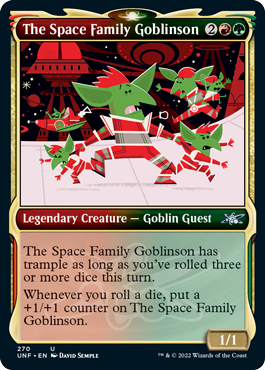
In each case, the traditional card was done by an artist. That illustration was then given to a second artist who reinterpreted it in a retro-pop style. The resulting cards are quite cute.
While I don't have pictures today, Unfinity also has two planeswalker cards that each have a borderless alternate art card treatment using the retro-pop art style in addition to their normal planeswalker versions.
But wait, the Booster Fun goodies don't stop there. One of the hallmark qualities of any Un- set is full-art basic lands. Unfinity does not disappoint. The set has a cycle of what we're calling the planetary space-ic lands, with each basic land type illustrated as a landscape of an alien world. The cards are full art, bleeding the art all the way to the edge. They show up in roughly seven out of every ten Draft Boosters (71.9% of the time, technically).
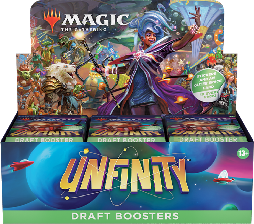
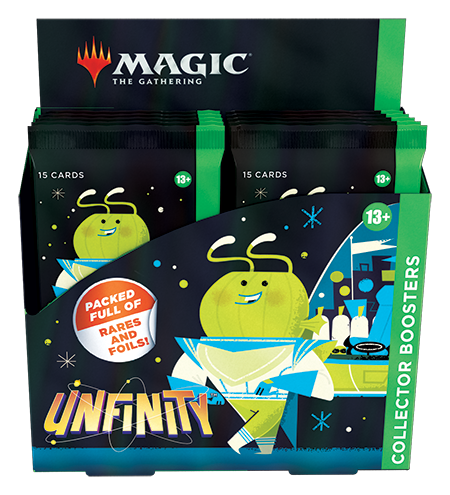
Note I said Draft Boosters. That's because for the first time ever in an Un- set, there's a second type of booster available—a Collector Booster. Collector Boosters have become a staple for Magic sets, and we didn't want to leave our latest Un- set out of the fun. I can't get into all the cool things appearing in the Unfinity Collector Booster today, but I can say we worked real hard to make it something that die-hard Un- collectors would want to purchase.
To explain how the basic lands show up in Collector Boosters, I must first explain two things. One, the Unfinity Collector Boosters are 100% foil. Two, besides having the traditional foils that every Magic set has, they're going to have a new unique foil treatment called galaxy foil (the foil looks like stars in space; we aren't showing it off today but will show it off as we get closer to Unfinity's release). We wanted something to capture the feeling of space, feel at home at a carnival, and get everyone's attention. The galaxy foil treatment is quite eye-popping; the perfect companion for our first-ever expansion set in space.
Twelve out of fifteen of the cards in every Collector Booster will be traditional foil, and three out of fifteen will have galaxy foil. You will have two shots at the planetary space-ic lands, once in traditional foil and once in galaxy foil. Each slot will have the same percentages as the one slot in a Draft Booster, so roughly seven out of ten for the planetary space-ic Lands.
Click here to see the planetary space-ic lands
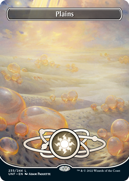
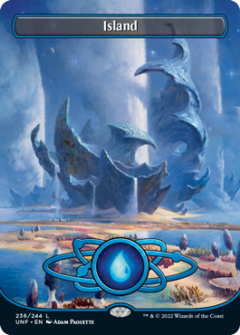
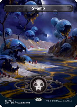
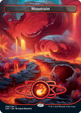
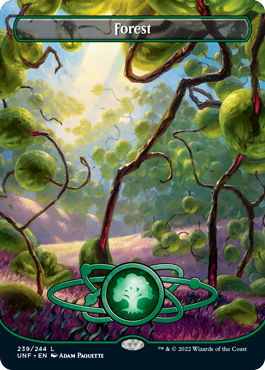
We didn't stop there. There's a second cycle of space-ic lands, called the orbital space-ic lands, this time from the vantage point of space. This treatment will show up in roughly one out of every four Draft Boosters (24% of the time, technically). The Collector Booster will have two slots, one traditional foil and one galaxy foil, that the orbital space-ic lands will show up in roughly 24% of the time.
Click here to see the orbital space-ic lands
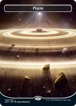
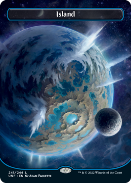
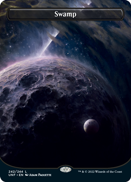
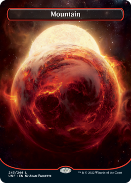
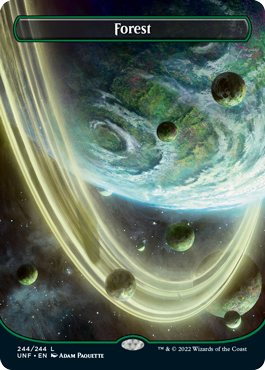
But wait, there's even more. We took the ten shock lands from the Ravnica blocks and made space card treatments out of them. Like the space-ic lands, the shock lands are also borderless.
Click here to see the ten borderless shock lands
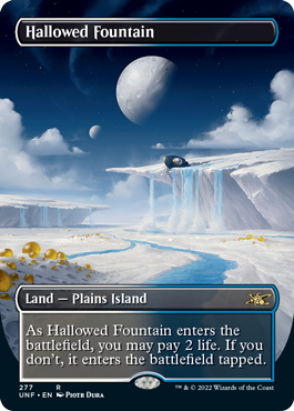
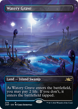
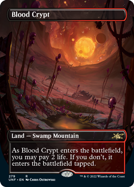
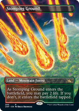
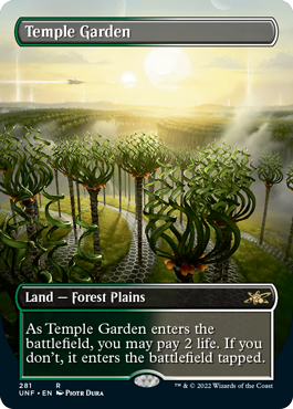
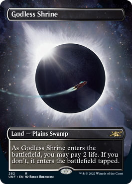
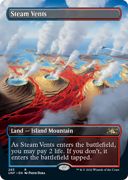
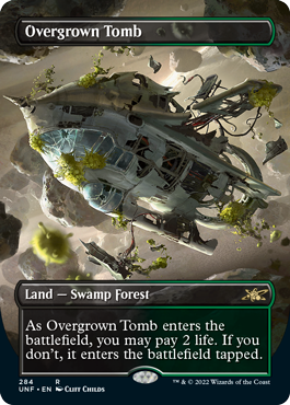
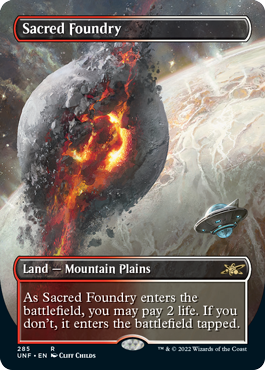
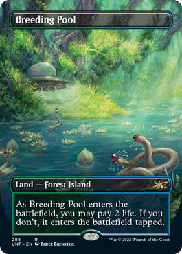
The borderless shock lands show up one out of every 24 booster packs in Draft Boosters and one out of 24 in each of the two slots, traditional foil and galaxy foil, in the Collector Boosters. Plus, each Draft Booster and Collector Booster display comes with a Box Topper booster that includes a traditional foil borderless shock land.
Finally, before I wrap up for today, I wanted to show you one last preview. We needed a participation promo for the release event, so I was asked if there was an old Un- card that we could reprint with a new image set within the world of Unfinity. The choice was obvious because we had previously turned a carnival game into an Un- card.
Click here to the participation promo for Unfinity
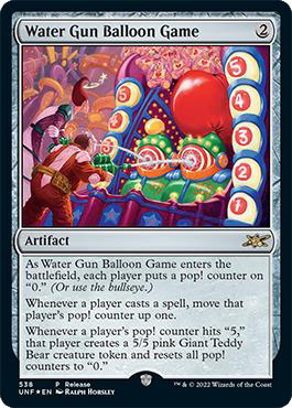
(Editor's Note: In a previous version of this article, this card's holofoil stamp was displayed with the oval shape security stamp when it should have been an acorn security stamp. This card has an acorn stamp with the same format legality as other acorn-stamped cards in this article.)
Yes, Water Gun Balloon Game was the one carnival trope we couldn't do because we'd already done it. I'm glad it got new art to show the Astrotorium's version of the game.
Un- Believable
That's all I'm allowed to tell you and show you from Unfinity for now. I hope this will whet your appetite for the full set, releasing on October 7, 2022. When we get to the official previews, I'll introduce all the mechanics, show off the galaxy foil, and tell you the full story of how the set was designed. It's a fun one. As always—and probably even more so than normal—I'm excited to hear what you have to say about today's article, any of the preview cards, and Unfinity in general. You can email me or contact me through any of my social media accounts (Twitter, Tumblr, Instagram, and TikTok).
Join me next week when I begin answering player questions about the design of Innistrad: Crimson Vow.
Until then, I hope I don't burst before we reveal the rest of Unfinity.
#889: Secret Lair with Mark Heggen
#889: Secret Lair with Mark Heggen
33:41
I sit down with Producer Mark Heggen to talk about the creation of the Secret Lair product line.
#890: Ravnica & RTR Storm Scale
#890: Ravnica & RTR Storm Scale
33:17
I go through all the guild mechanics from original Ravnica block and Return to Ravnica block to discuss what chance each has in returning to a premier set.
- Episode 888 Crimson Vow Design
- Episode 887 Crimson Vow with Chris Mooney
- Episode 886 Set Sizes

