Just for Ix(alan), Part 2
Welcome back to week two of Ixalan previews. Last week I talked about how the block mechanical theme evolved over the course of design. This week and next, I'm going to focus on the creation of all the mechanics in the set. As you'll see, they went through a lot of changes. Also, I have a preview card showing off one of the coolest parts of the set. Hopefully that sounds fun, so let's get started.
Ch-Ch-Ch-Changes
Some sets find the mechanics early on and most of design and development is about fine-tuning them. For example, both energy and Vehicles were first tested in the initial weeks of Kaladesh exploratory design. Ixalan, though, is an example of the other end of the spectrum, where the mechanics go through major changes throughout the process. Today and next week, I'm going to walk you through the mechanical evolution from the very beginning of the process and give you a front-row seat to what was a high-churn design and development.
To explain, I've decided to break up the process into four pieces:
Exploratory Design – This was where we started spit-balling about what the set was going to do mechanically. This lasted for about four and a half months (one and a half months of which was exploring the viability of the edge mechanic in two-player Magic. See last week's column for more on this).
First Half of Design – I co-lead the set with Ken Nagle. This section was the part of the design that I lead. This lasted for six months.
Second Half of Design – This is the part of the design that Ken led. This was also six months.
Development – After design, the set was handed over to development. Sam Stoddard was the lead developer for Ixalan. This stage lasted about nine months.
Exploratory Design
As I explained last week, we started exploratory design early to see if the "edge" mechanic from the Vampire: The Eternal Struggle trading card game could be applied to two-player Magic. Even though playtesting showed that it could, Conspiracy: Take the Crown needed the mechanic, so we gave it up. That meant we began the main part of exploratory design figuring out what the block wanted to be about mechanically.
Exploratory design spent a lot of time focused on the concept of exploration. As I explained last week, the working title for the plane was "Age of Exploration World," and it was clear as the story started to come into focus that there was a lot of exploring being done.

We also spent some time trying to figure out what each faction represented mechanically. At this point, there were three factions: Vampire conquistadors, Mesoamerican-inspired Warriors, and Pirates. Part of this time was spent trying to figure out what colors each of them wanted to be. The Vampires wanted to be about draining resources, as that was their driving force story-wise. This meant they wanted to be a slower controlling deck rather than a faster aggressive deck. The Warriors wanted to be more team-oriented and focused on a more go-wide strategy. The Pirates were more individual and wanted to be aggressive, but in some way that messed with the opponent.
Exploratory design had four important outcomes that would affect the design. One, we latched onto the theme of "exploration," which started us down the path that would lead to the double-faced cards I'll get to in a second. Two, I realized that we probably had a tribal set on our hands. Three, I started getting a sense mechanically of where the factions wanted to go. And four, I became skeptical that three factions was the correct number.
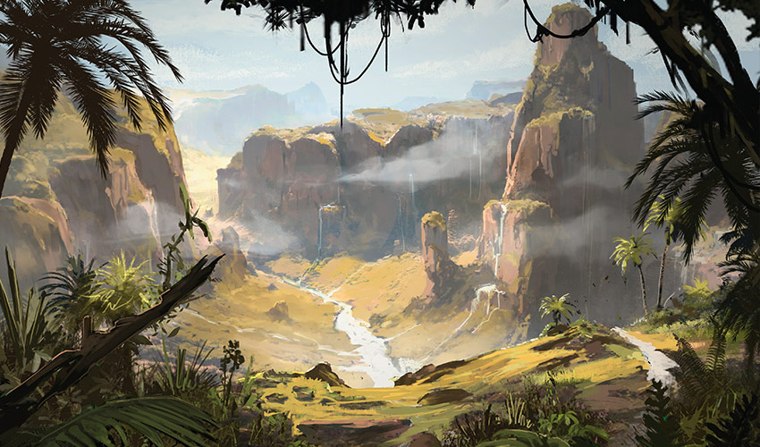
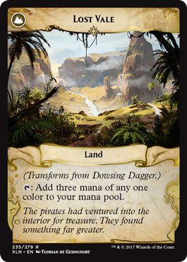
I'm not going to go too deep on the double-faced cards because Ken already wrote an article that went into great detail on that topic. (You can read it here.) The important point for this story is that we figured out pretty early on the larger concept for the cards. The front would be a non-land card that represented some element of exploration; it could be a device, it could be a method, it could be a story. Then the back of the card was a land, ideally a pretty exciting one to have on the battlefield.
The front would essentially give you a task to complete, and when done, you "discovered" the land (transforming the card into it). We spent a lot of time figuring out how best to do this mechanically, but the flavor of the idea never changed. It's the one mechanical element of the design that stayed constant throughout.
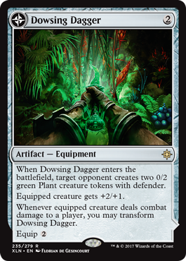
Speaking of cool and flavorful double-faced designs, I have preview card to show you.
Click here to see Dowsing Dagger and Lost Vale!


This card is a great example of this mechanic. We knew early on we wanted a "Black Lotus" land (although one you didn't have to sacrifice). Figuring out how to best get there went through numerous iteration, but eventually we ended up with this little gem.
Anyway, exploratory design ended. We had some direction but a lot of things to figure out.
First Half of Design
The first thing I did when design started was to shift us from three factions to four. Three factions had numerous issues, but the biggest one was that it's hard to do a tribal set with only three tribes. Four was on the low side, but doable.
Once I knew we had four factions, we adopted the 3/3/2/2 model (two factions with three colors and two with two colors) I had created during Khans of Tarkir before the fifth clan was added. The system allowed many different combinations, so the first thing we did was figure out what colors we wanted for each faction.
Of all the factions, the Vampires had the most distinct flavor. The Pirates and Warriors were more us matching expectation. The Vampires had a very specific take that included this strong religious element. It became clear they wanted to be white-black. Now, we had never done mono-white Vampires before (okay, technically Odyssey's Repentant Vampire turned white with threshold), but we had done numerous white-black ones. I talked it over with the creative team and got agreement that white-black was the correct choice. I like that it took Vampires in a different direction, allowing players to build new kinds of Vampire decks.
Pirates clearly worked well in blue, black, and red, and terribly in either green or white. As we knew Pirates were something that would excite players, we chose to make them one of the three-color factions. Once we had two factions locked in, it started dictating our other choices. The other three-color faction, for instance, could only overlap on one color and it couldn't overlap in black (as it was already in one of the two-color factions), which meant that we would have either a green-white-blue or a red-green-white faction. If it was green-white-blue, the other faction would be red-green, and if it was red-green-white, the other faction would be green-blue.
So what did the Mesoamerican-inspired Warriors want to be? A combat-oriented go-wide strategy sounded pretty green-white, so that had us leaning toward one of the three-color tribes. We went to the creative team and asked two things. Did the Warriors lean more toward blue or toward red? And was either red-green or green-blue more conducive to making another faction? Their answers were red and green-blue, so we had our factions:
- Vampires – white-black
- Pirates – blue-black-red
- Warriors – red-green-white (The Dinosaurs would join the Warriors and take over as the tribal element a few months into design.)
- TBD – green-blue (This tribe ended up being native elementalists, then beast masters focusing on Dinosaurs, and finally Merfolk. For more on how the tribes came to be, check out last week's column.)
Once I knew the color combinations of the factions, the next big challenge was how to flavor all of them mechanically without using too many mechanics. We knew coming off Amonkhet block that we had been slightly over par on mechanics, so I was trying to pull back a little. Plus, I knew that we were still going to do something splashy with the exploration theme and that Vehicles were going to make a comeback because how could you do Pirates without Pirate ships? This all meant that I didn't think each faction could have its own keyword mechanic.
My attempt to solve this problem took advantage of us having four factions. What if we used just two mechanics that showed up in two factions, but used each mechanic in each faction slightly differently? And if that difference could have a similarity between the two mechanics, we could connect the factions in a different way.
What we did was put the four factions on the corners of a square. The top and bottom pairs were connected by a mechanic. The Vampires and Pirates being more outsiders that were coming to take things from the others got a mechanic we called plunder based on bloodthirst, the original Gruul mechanic from Guildpact that we brought back for Magic 2012. When you cast these cards, if you had dealt combat damage to an opponent, the card received some kind of bonus. We made the bonus unique to each tribe to both add flavor and mechanical identity. The Vampires drained the opponent for 2 (they lose 2 life and you gain 2 life) and the Pirates looted (draw a card and discard a card).
For the Warriors and beast masters who represented the natives, we chose a mechanic called enlist. It allowed you to pay extra mana to create a creature token. Once again, we chose to have the tokens be different to differentiate between the two factions. The Warriors made a white 1/1 Warrior. The beast masters made a green 3/3 Dinosaur that couldn't block. We added the "can't block" rider because it allowed us to make the token slightly cheaper and force them to be aggressive as we felt that better matched the flavor of a Dinosaur. Because the Warrior creature token was smaller, it required less extra mana to create.
Next, we separated the four factions on the other axis. For each mechanic, one would show up exclusively on creatures as an enters-the-battlefield effect and the other would show up exclusively on instants and sorceries. This was yet another way we could help distinguish mechanics between tribes that shared them. It also allowed us to make some cards that linked the two factions together that cared about the same type of cards.

White overlapped on creature-based spells and thus encouraged creature-heavy decks. Blue overlapped on instants and sorceries and thus encouraged more spell-heavy decks. (The token making of enlist helped up the number of noncreature spells in the deck). Black overlapped on the plunder mechanic and was more focused on dealing combat damage to the opponent. Green overlapped on the enlist mechanic and was more about ramping up to have enough mana to constantly be making creature tokens. Red, the one color that overlapped the two three-color factions, was given tribal cards that let you choose the tribe—allowing you to mix and match elements of different tribes. Locations, the double-faced exploration mechanic, was separate from this grid. As white-blue was one of the two-color factions that didn't overlap any tribes, we made it the location-matters combination. (Black-green, the other two-color pair that didn't overlap tribes, was given its own theme as well.)
And that is where the design was when I handed off the reins to Ken.
Second Half of Design
When you stepped back and looked at this grid, everything looked wonderful. Each color had a focus, and each tribe had a relationship with the others (well, except the two-color tribes, but they didn't overlap in colors at all). There was balance and synergy and differentiation between both the factions and the individual colors. It was a thing of beauty. Unfortunately, it didn't work.
There were both design-space issues and gameplay issues (especially with plunder), and the entire structure was basically invisible to the player, so what seemed so nice and orderly on the page came across as far less elegant. This meant that Ken had to try something different.
The first thing he did was get rid of plunder. It was too narrow and didn't capture the flavor as well as we'd hoped. He did like enlist, though, so Ken came up with an idea for how to do all four factions using only one mechanic. Here's how he did it. For each faction, he came up with a unique resource payment and a unique creature token:
| Tribe | Payment | Creature Token |
| Vampire | Pay 2 Life | 1/1 with lifelink |
| Pirate | Discard a card | 2/2 with menace |
| Dinosaur | Pay 3 mana | 3/3 with "can't block" |
| Merfolk | Bounce a land | 1/1 with prowess |
If you played a Vampire enlist spell, for example, you could pay 2 extra life to get a 1/1 white Vampire creature token with lifelink.
It only took one playtest for Ken to find the flaw in his design. Four different types of enlist each with its own input and own output significantly increased complexity instead of decreasing it. Having all four versions share a singular word just meant that you never knew what any one card was doing and were always forced to read it.
This led Ken to try something different. Maybe the way to only use two keywords was to just give a keyword mechanic to the two three-color factions. We had already moved them around so they were the two factions we were focusing most on: Pirates and Dinosaurs. Vampires and Merfolk could have mechanical themes; they just wouldn't have a keyword. This meant he had to find one keyword for Pirates and one for Dinosaurs.
This was around the time that "devign" started. Devign is a period at the end of design where development starts looking in at the file and giving notes. For a large set, devign is two months.
Ken and his team tried a whole bunch of different Pirate mechanics and a whole bunch of different Dinosaur mechanics. The main goal was to get a mechanic for each faction that was flavorful yet had good gameplay. The most interesting fail for the Dinosaurs was a mechanic called "call." A Dinosaur with call was usually a bigger Dinosaur, but one with a very cheap mana cost. The catch was that if you had call, you couldn't attack or block until you paid a one-time activation cost. Most of the creatures had enters-the-battlefield effects, and there were ways to use the giant body even if you couldn't attack or block. (For instance, you could use the creature to fight with.)
Call was greatly disliked though because it was mostly a feel-bad. You have this big, exciting Dinosaur (good!) that you could play cheaply (good!) and then you couldn't use it for many, many turns (bad!). Players wanted an exciting Dinosaur mechanic, not something that felt like downside.
Interestingly, at the same time the team was messing around with call, they started making little riders to go on some of their spells. The rider was nicknamed "landtrips," as they let you reveal the top card of your library and put it into your hand if it was a land and at the top or bottom of your library if it wasn't. Mark Gottlieb would later suggest moving the rider from spells to creatures, add getting a +1/+1 counter if it wasn't a land and keywording it. It was called "explore," as the idea was the creatures with it were explorers finding you new lands or buffing themselves up while searching.
Devign ended without a Pirate or Dinosaur mechanic that the team liked, although explore was kept as it polled really well with the players. It would now be up to Sam Stoddard to crack this puzzle and get both a Pirate and a Dinosaur mechanic.
Let's See What Develops
That's all the time we have for today. Next week, I'll continue with the story of Ixalan's design as we see how all the mechanics came to be. As always, I'm curious about how you're enjoying the story of the design so far. You can email me your thoughts on either the column or the set or contact me through any of my social media accounts (Twitter, Tumblr, Google+, and Instagram).
Join me next week when we raid and enrage.
Until then, may you keep plugging along until you find the answer you're looking for.
#468: Poison
#468: Poison
30:22
In this podcast, I talk about the history of poison counters in the game.
#469: Starting a Design
#469: Starting a Design
36:42
I'm often asked questions about how best to start a design. In this podcast, I go into detail about how to do just that.
- Episode 467 Multicolor Blocks (22.4 MB)
- Episode 466 Generation Decks (19.6 MB)
- Episode 465 Tweaks (22.1 MB)

