State of Design 2018
Almost every year since I became head designer, I have written a yearly article based on the US president's State of the Union speech where I look back at the last year of Magic and analyze how I felt the design went. This is my fourteenth "State of Design" column. (I started in 2005 because I didn't evaluate the design until the part I oversaw had started coming out.) Here are the links to the first thirteen columns:
As always, let me start out with a few caveats. First, in the past, with a clear delineation between design and development, I was able to focus my review mostly on the work I was overseeing directly. With the change over to the new system (which I'll talk about below), I'll still mostly be focusing on what I oversee, but there's going to be a bit more blurring of the lines than in past "State of Design" articles.
Second, I decided to change this column around a little. For the last few years, I just talked about the Standard-legal expansions, but this year, I want to touch on every booster product with new designs. For each, I will talk about the highlights and the lessons. Before I get to that though, I'll start by talking about the year as a whole.
So, let's get to the question that begins every State of Design article: how was the last year of Magic design?
More than anything else, I think this last year has been a year of huge change, luckily in the right direction. The year started under the old system where, as I'll explain below, I feel we strayed into some bad territory. But we end under the new system, which I'm very optimistic about. That said, let's talk about how we did.
Overall Magic Design
HIGHLIGHTS
- The new system is a huge improvement.
We made two major changes between Ixalan block and Dominaria. First, we overhauled the behind-the-scenes process through which we make cards. Rather than have a design and development for each set, we changed to a system where we now have vision design, set design, and play design. This new system greatly reduces the amount of work we're throwing away and allows us to better set ourselves up for success by having more integration at each level from the various concerned R&D parties.
Second, we shifted from a yearly structure of having two blocks each with a large and a small set to a structure with three large sets all drafted alone and the return of the core set. This new system allows us greater flexibility about how many worlds to have in a year, makes each set more approachable, allows for a more consistent process, and aids in helping us manage design resources.
I really can't understate how much of an improvement this is to the set-making process. While there are numerous factors to Dominaria's success, I feel this is an important one. The great part about this highlight is it means good things for all Magic sets moving forward.
- We had a lot of design innovation.
From sagas in Dominaria and the "exploration" double-faced cards in Ixalan to contraptions and host/augment in Unstable, to the entire concept of Battlebond, this year has been a good one for innovative design. Fine-tuning our processes is important, but so too is a willingness to keep pushing the boundaries of what design can do. Our job as the creators of the game is to keep surprising all of you, and to do that, we have to be willing to stretch boundaries where we can.
LESSONS
- The beginning of the year had significant room for improvement.
Above, I talk about change and how we improved as the year went along. I can't properly evaluate the year though if I only look at the end. Ixalan block had a lot of stumbles (which I'll talk about in depth below) and keeps this from being an overall stellar design year.
- We need to get better at properly setting expectations.
With the exception of the set that got accidentally leaked (Dominaria), I feel the only set that we properly set up ahead of time this year was Unstable. There was a big disconnect between what Ixalan and Rivals of Ixalan were and what the audience expected them to be. There was significant confusion about how Core Set 2019 was supposed to be different from past core sets. And we took too long to tell you what Battlebond was all about.
While some of this is a marketing issue, a good part of it is a design issue, because if your sets aren't meeting expectations, part of the reason is in the nature of your designs. Players got plenty excited about Dinosaurs and Pirates, but did we do a good enough job delivering on what fans were expecting? (I'd argue no, we did not.)
Ixalan Block (Ixalan and Rivals of Ixalan)
HIGHLIGHTS
- We had exciting themes.
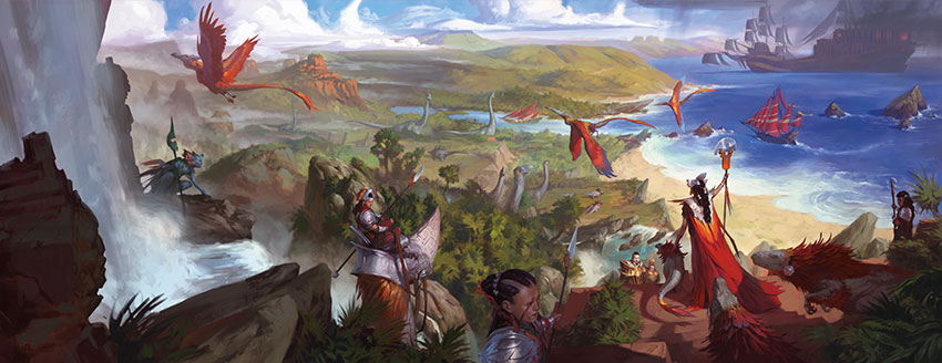
One of the things we measure is excitement on social media. Using various metrics, we can get a good analytical gauge on how excited about a set you all are. Two of the times we like to look at is right after you all know what's in the set but before you're able to buy it and about a month after it went on sale. This lets us examine the hype for the set and then the reality as you all get to play with it. Ixalan's hype was off the chart. The concept of Dinosaurs, Pirates, conquistador Vampires, and a new twist on Merfolk along with a Mesoamerican influence was very exciting to a vast majority of players. As someone whose job it is to help find areas of player interest, having a high hype level means we were tapping into something you all wanted. That's not easy to do, especially with a world that's less archetypal, aka a world that's not easily describable in only a few words. (Ixalan didn't have the simplicity of an "Egypt World" or a "Gothic Horror World.")
- The "exploration" double-faced cards were popular.
Ixalan block was able to take a popular component (double-faced cards) and give them a new identity. The combination of lands on the back along with a mechanical challenge on the front gave the cards a cool "exploration" feel and made them play differently than the transform cards that came before them. They were the one standout new "mechanic" in the block.
LESSONS
- We needed to "cross the streams" of the tribes.
This is the mistake I personally feel the most responsible for. I was the one who made the call to give Ixalan a tribal theme. Early on, we talked about trying to create cards that either could be played in more than one tribe or allowed you to play various tribes together, but it flew in the face of the creative identity (Dinosaur Pirates didn't make any sense, for example), so I let it go. Interestingly, I'm the one who created Changeling as an answer for many of the similar problems we were having in Lorwyn (the last block to lean as heavily on tribal themes). I point this out because it demonstrates that I should have known better.
Without the cross synergy, the set had less depth and made the play more repetitive, especially among the two-color factions (Vampires and Merfolk). I'm not sure exactly what the solution would have been, as I understand the creative needs, but I wish we'd spent more time trying to solve this problem in a way that worked for the world.
- We overcompensated on simplicity.
One of the lessons from the last two years' State of Design articles in the "Overall Design" category was "we were too complex." Well, our desire to fix that problem caused us to overcompensate in the other direction. We created a bunch of new rules at common (such as "creatures that change their power or toughness at common have square stats") which seriously messed with the development team's ability to add depth to Limited. (We have since backtracked from many of these new rules.)
- Having unequal factions (and only four) added more stress to the system than we'd anticipated.
The reasons behind the 3/3/2/2 color breakdown made a lot of sense. We wanted to create a faction set that didn't step on the toes of Ravnica, which we knew was coming the following year, and we wanted to put more emphasis on the new tribes (Dinosaurs and Pirates) as we knew there was going to be more focus on them. Much like the new common simplicity rules, I don't believe we understood all the developmental issues the unequal tribes created. It caused balance issues, it made cycles extra hard to create and then communicate to the public, and it pushed too many players toward playing three colors in a set where that wasn't a major Limited theme. I'm not sure we'll ever do such a breakdown again, but if we do, we'll walk into it with a much better idea of the cost of doing it.
Unstable
HIGHLIGHTS
- There was clearly an audience for the product.
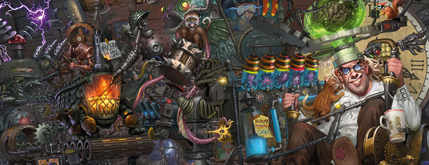
One of the biggest hurdles in getting this product made was convincing the Powers That Be that there was an audience for Un- sets. Well, that debate's over. Unstable had three printings and looks like it's going to be one of the best-selling non-Masters supplements of all time. Apparently, some of us enjoy a little silliness in our Magic. And yes, this greatly increases the chances of a fourth Un- set.
- The product was very fun to draft by itself.
Both Unglued and Unhinged were created to be mixed in with black-border product for Limited play. Recognizing that we couldn't get players to actually do this, Unstable's design team chose to make an environment designed to be played by itself. This ended up making the product more parasitic, but resulted in a Draft experience that has been getting high marks.
- The mechanics were all received well.
Players have been asking for contraptions since Steamflogger Boss premiered in Future Sight, so there was worry that nothing could live up to the expectation of the mechanic that was created with the idea that it was never actually going to happen. That turned out not to be the case. The contraption mechanic was much beloved. Host and augment were also a huge hit with the audience. Even dice rolling, which Unhinged chose not to do based on feedback from Unglued, turned out to be a popular. Finally, the "outside assistance" cards that had caused big debates internally ended up getting big thumbs up from the players.
LESSONS
- The product could have used a little more development/play design.
We don't normally do a lot of advanced playtesting of Un- sets as their exclusion from normal tournament play keeps anything horrible from happening, but the fact I, as Un- rules manager, had to emergency errata a card (Ordinary Pony) is a ding on the set.
- The product shouldn't have made the variants so hard to tell apart.
Having variant versions of cards was a cool idea. Not telling all of you until right before the set came out was also pretty cool (even if it did cause a little chaos for a few days). Not giving you an easy way on the cards to tell which variant was which was not cool. If I had to do it again, I would have had all the variants have information in the collector number as to which variant they were.
Dominaria
HIGHLIGHTS
- The set correctly figured out how to return to Dominaria.
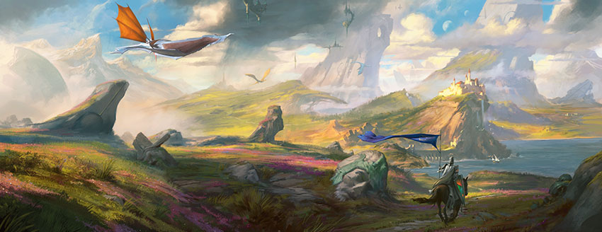
The big challenge of the design was trying to create an identity for Dominaria consistent with the other worlds we've made over the last fifteen years, but in a way that stayed true to the history of the world. The idea of Dominaria being "archeology world" where the present is shaped and defined by its extensive past proved to be a big success.
- The legendary theme was done correctly.
Champions of Kamigawa block tackled a legendary theme and failed pretty badly at it. Dominaria wanted to see if it could revisit the theme but execute it better. Raising the as-fan of legendary creatures along with adding one to every booster pack helped make the theme more ever-present and noticeable. The historic mechanic also helped tie the theme mechanically to the history feel of the world.
- The mechanics were all successes.
Sagas were a smash hit. Everyone enjoyed seeing kicker return. Historic had a few skeptics early on, but as people played with the set, they started to understand how it was the glue that held everything together.
- The set properly figured out where to put its complexity.
None of the mechanics were particularly hard to understand. Instead, the design team chose to use its complexity allowance to make uncommon legendary creatures that in most sets would have been rare. This helped make the legendary creatures have a stronger mechanical identity and feel more special. The success of Dominaria has R&D discussing whether we want to up the amount of complexity we allow at uncommon.
LESSONS
- The legendary spells should have been tweaked or left out.
The biggest complaint I get about Dominaria is the cycle of legendary spells. They are harder to use than they look and often get caught in your hand. Some players are also unhappy how they work differently than the legendary permanents (although I should note that there's no way to make legendary spells work like legendary permanents). If we had this to do over again, I'd spend some more time looking at other options of how to do them or possibly leave them out of the set altogether.
- Kicker could have been more engrained into the set.
One of the ways you can tell this design is pretty good is that I'm stretching a bit for lessons. I really enjoy how the mechanics all gel together into a larger cohesive whole. Kicker is the one component that, while doing important work for the set, doesn't mesh as nicely with everything else. I wonder if we could have found a way to make it a bit more organic to the set and lean a little less on "this mechanic originated on Dominaria" for how it ties into the history theme.
Battlebond
HIGHLIGHTS
- It's a cool concept for a product.
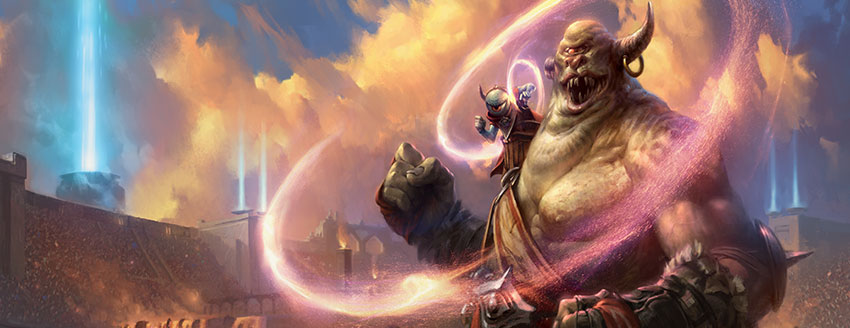
Teaming up with other people is fun and it's something Magic doesn't do enough of. I enjoy when products from our innovation line (things like Conspiracy, Archenemy, and the Un- sets) allow new ways for people to play the game.
- I like how it repurposed an old mechanic.
Partner with could have easily been a new mechanic, but I like how the design team found a way to incorporate the old mechanic into the new one to make the product more Commander-friendly.
LESSONS
- The partners should have been ally colors.
I suggest this for two reasons. One, the idea of partners being allied creatures is a better thematic tie to the color pie. Two, and more importantly, it would have allowed the design team to build the set around enemy color drafting, which would have resulted in more enemy color designs. Design has a bad habit of making ally color themed sets and not enough enemy color ones. Making the partners enemies sounds like it's making the set more enemy colored, but in reality, it makes the set all about playing ally color decks (at least in Limited, which is how most people experienced this product).
Core Set 2019
HIGHLIGHTS
- The set has enabled the best beginner products.
With former core sets, we would make the Welcome Decks, Planeswalker Decks (formerly Intro Decks), and Deck Builder's Toolkits after the fact, after the set was built. Core Set 2019 turned this on its ear by making the Welcome Decks, Planeswalker Decks, and Deck Builder's Toolkit first and then incorporating all the necessary cards into the core set. The feedback we've gotten is that this has resulted in the best beginner suite of products we've ever made.
- The set's theme, while light, helps give the set some mechanical identity.
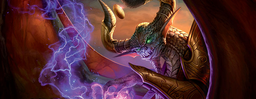
The use of the Nicol Bolas theme, along with designs like the cycle of Elder Dragons, has helped the set have a distinctive feel while not unnecessarily complicating it.
LESSONS
- There's probably space for more lenticular design.
One of the challenges of a core set is making the best on-ramp for new players while still creating a set that more established players can enjoy. I think Core Set 2019 does a great job with the beginners. The thing I would like future core sets to examine is if there are ways to add more depth to the set without upping the complexity for the beginners. To do this, we have to tap into what I call lenticular design, the act of finding ways of hiding complexity such that beginners can't see it (you can read more about this concept here).
I think Core Set 2019 made some good use of lenticular design, but there are ways to sneak even more of it into the set.
Year's End
I think this year will be looked back on as a transitional year. The old ways made a not-so-auspicious farewell while the new ways made a bold entrance. I'm optimistic though that we're heading in a good direction.
I feel the year averaged out to a slightly better than good year, with all the successes of the later part of the year overshadowing the failures of the early part.
As always with my State of Design, I'm eager to hear what you think about both this last year of design as well as your thoughts on my take of it. You can email me or contact me through any of my social media accounts (Twitter, Tumblr, Google+, and Instagram).
Join me next week as I take a journey back to original Ravnica design.
Until then, may you enjoy the highlights but heed the lessons of life.
#563: 20 Lessons - It All Connects
#563: 20 Lessons - It All Connects
This is the 20th and final installment in my series "20 Lessons, 20 Podcasts" based on my 2016 Game Developers Conference speech. In this podcast, I talk about how the 20 lessons all connect.
#564: GP Las Vegas
#564: GP Las Vegas
46:49
To celebrate Magic's 25th Anniversary, we had five birthday Grand Prix around the world. I attended one of them, GP Las Vegas, and this podcast is all about my trip to the event.
- Episode 562 Vision, Set, Play Design Retrospective
- Episode 561 GDS3 Final Day
- Episode 560 Tuesday Magic Meeting

