Raising a New Banner
Great warriors, adventurers, and explorers distinguish themselves on the battlefield and on conquered lands by raising banners that display their colors and symbols. These are flown proudly—sometimes to instill awe, sometimes to instill fear. But like the seeing eye of the Jeskai or the horned harlequin mask of the Rakdos, the mark always represents something that is true to the land, the stronghold, or the hero that stands beneath it.
Over the course of Magic's history, there have been points where a gap opened between what is true about the brand and what is represented on its "banner"—the brand logo. Last year we felt that gap widening, so we set out to close it, committing ourselves to designing a new logo that respects our rich history while amplifying the qualities that make the brand strong going forward. This would mark the third evolution in the Magic logo. Like the other two, this change affects the full spectrum of the brand's product and promotional expressions, with one notable exception—the paper Magic card back. There is no current or future plan to change printed card backs, or to take away your ability to collect and shuffle up cards from all sets and eras.
A logo redesign rings hollow when it's made solely to stir up interest in a stale brand. A logo change is warranted and has substance when it's made to reflect what is evolving or what has already evolved about the truth of the brand. With each change in Magic's logo, the new design has been a response and a reflection of the evolution of the brand.
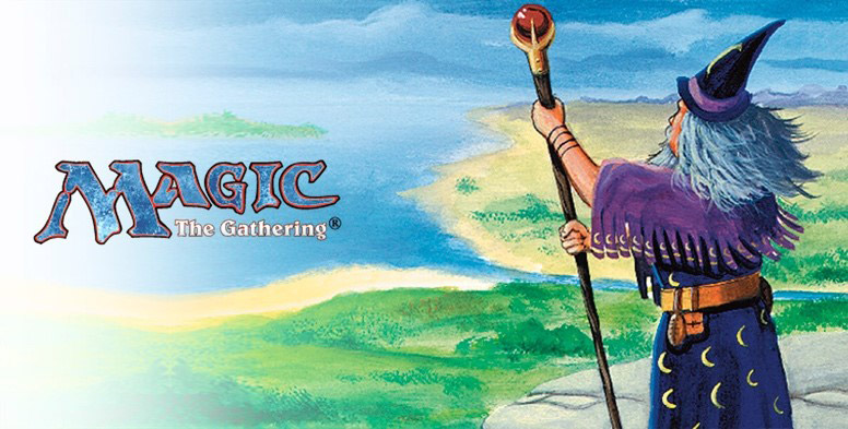
At its beginning back in 1993, the brand and its banner were very much in sync. Magic began as a card game with eclectic, traditional fantasy visuals and a hand-drawn logo to match.
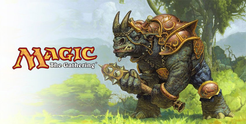
Not many years later, Magic was rising to the top of the new game category it had established. During this time, the game design and the visual design were reaching new heights as well. The rustic blue logo was no longer reflecting the pride or polish of the brand. In 1999, the logo had its first update: a tighter and more vibrant version of the high-fantasy original.
By the early 2000s Magic was arguably the best strategy game in the world, but it was still aiming higher. It was solidifying new and ownable brand territory— building up the mystique of its enduring characters and worlds, all delivered with world-class art and a modern fantasy aesthetic. In 2015, the logo was refreshed again, this time to reflect an evolved visual fit and finish, and to adopt a new brand element that signals excitement and power: the color "Mythic Orange."
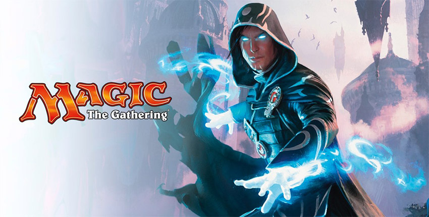
But the 2015 refreshed logo wouldn't hold up for long. In a number of ways, it didn't zero in close enough to the brand's modern fantasy core. Magic's visuals draw inspiration from many cultures and wonders from our world, as well as from wild imagination, reaching well beyond the medieval high-fantasy aesthetic from which the original logo was drawn. Additionally, Magic was centering itself around ownable features like Planeswalkers and high-concept worlds—the building blocks of a brand that can see itself not only as a game, but as an entertainment property.
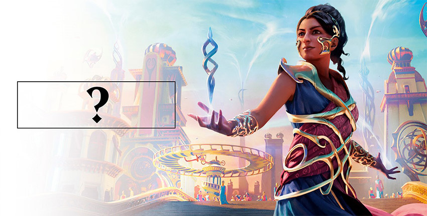
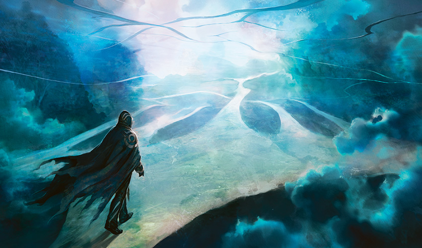
A banner was needed that could fly proudly over all of Magic's worlds and themes, in the tabletop card game as well as in digital games, apps, narrative entertainment, fashion and lifestyle products, animated and live-action entertainment, and anything else that the future could hold. This would require a bolder step forward than another refresh of the original logo. With one eye on the original and the other on the future, we took that step . . .
We're excited about the powerful tools this new logo provides, the most prominent of which is the Planeswalker symbol. It has played a developing role for us since its inception, from secret handshake to deputy brand icon to its current official position in the branding family. You'll continue to see it featured as a standalone on products that need more stylish branding, like the San Diego Comic-Con exclusives and apparel. Most often you'll see it paired up with the logotype as seen above.
You may have already been introduced to the new logo's fraternal twin, the Magic: The Gathering Arena logo. Together they showcase some of the flexibility that the new logo system provides, with the Planeswalker symbol as an anchor and a secondary expression of the logotype. Keep an eye out in the future for when this alternate logotype gets paired up with the Planeswalker symbol to form an endorsement mark that will accompany logos designed for new game and entertainment expressions based upon the worlds of Magic.
Expect to see the new Magic: The Gathering Arena logo from this point on in all the places where the game is officially represented. The new Magic: The Gathering logo is slated for a full product and promotions rollout in March of 2018 with the release of Dominaria. Early 2018 also marks a turning point in Magic's 25th anniversary celebration, switching its focus from reflection on the highlights from our history to an introduction of the bold steps we will take into the future.