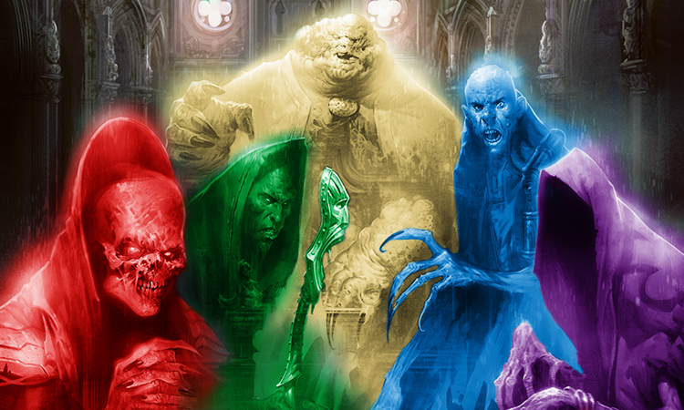
The Council of Colors

Today I'm going to introduce you to the Council of Colors. All of you should now be saying to yourself, "The Council of Colors? I've never heard of that." And you haven't because until right now I've never publicly talked about it. In fact, no one has ever publicly talked about it. This is something the design team created over a year ago, yet it is a completely unknown entity to the public. Well, I plan for that to change today because this group is doing good work and I want the world to know about it.
Pie in the Sky
When Richard Garfield first created Magic: The Gathering, I believe it was the combination of three genius ideas. I have long ago dubbed these three ideas "the golden trifecta." They are the ideas of a trading card game, the mana system, and the color pie. Part of the health of Magic is making sure we monitor each of these three concepts to ensure that we keep them relevant and functional.
To maintain the trading card game, we must keep asking ourselves if we are maximizing the medium we are working in. Over the years we have fiddled a lot (adding mythic rare, shifting set sizes, instituting New World Order, etc.), but we've managed for the game to always hold tight to its roots. Magic is just as dynamic a trading card game today as it was when Magic first released in 1993.
To maintain the mana system, we work hard to keep it balanced. We have to be wary of doing things that circumvent it. We have to watch our mana curves and power level. This is a lot of work, but it's something mostly done by Head Developer Erik Lauer and his team.
To maintain the color pie, we have to strike a balance between allowing some flux for gentle evolution while also being ever vigilant of drift. In a vacuum, it's very easy to make lots of small card-by-card decisions that can cause you to steer wildly off course without realizing it.
Many years ago I wrote an article called "The Value of Pie" where I explained why the color pie is so important. The article's old and a few points I make are a touch out of date, but overall it does a good job of explaining the importance of the color pie. I more recently (a few years ago as opposed to over a decade ago) recorded a podcast about why the color pie is so valuable. (It was actually a three-part podcast series on the golden trifecta—trading card game, color pie, and mana system.) The podcasts are more recent and go into a lot more detail on this topic (as I had a whole podcast to talk about it), so if you have a chance, you should listen to that if this is a topic that interests you.
I firmly believe that the color pie is the center of the game. It's what the flavor and all the mechanics are built around. It's the ethos of the game. It's what gives it its personality. It's the most core part of its identity. I have written many articles about the color pie, the individual color philosophies, the colors' relationships with one another, their overlaps and their conflicts. I've written pages dedicated to each of the colors individually (white, blue, black, red, and green), with many more articles in the color pie archive.
Because of this, I have made it my goal over my 20-plus years of working in R&D to be the protector of the color pie. When someone tried to make a card that did something a color just wasn't supposed to do, I would step in. But over the last few years, I started having a problem. We've increased the number of products we're producing, many of which have new content. We've also proverbially sped up our treadmill of new product with our changeover to the Two-Block Paradigm. I'm busier than I've ever been and we're making more products than we ever have. I was falling down in my job as protector of the color pie.
Knowledge Is Power
I decided the first step to solving this problem was education. For example, I mentioned above that maintaining the mana system was something development was more in charge of. Erik had figured out all the details of how he wanted to handle costs and power level. He then worked to educate his development team to make sure that each member was able to answer questions about it. So if, for instance, I needed a card costed, I didn't have to go to Erik, I could go to any developer. What if I handled the color pie in the same fashion?
The design team has weekly meetings, so I used some of those meetings to walk through the color pie with the design team. We talked in depth (usually one color per meeting) about what each color could do and how that was reflected mechanically. We talked about color philosophy and how each of the mechanical decisions about which color gets what was tied into matching those philosophies. We talked about what each pair of colors had in common and how we differentiated between mechanics that did similar things. (For instance, black more often gets "cannot block" while red gets "must attack"; green's Giant Growth effects tend to be bigger boosts, whereas white's are smaller and more about being combat tricks that help a creature fight better.)
The goal was simple: I wanted all the designers to be as proficient at the color pie as the developers were at costing. Then I let R&D know that I was no longer a bottleneck for color pie questions. If someone wanted to know whether something was okay, they could ask any designer. In theory, this idea sounded like a good solution to the problem. It turns out, though, that I hadn't realized something important that would cause all sorts of problems.
Bends and Breaks
One of the things I like to say is that design leans toward art and development leans toward science. What that means is that the beginning part of the process, where you're making something from scratch, you tend to tackle issues that are more similar to what an artist does when they first approach a blank canvas. Making something from nothing requires a lot of intuitive leaps. In contrast, the end of the process is a lot more about crunching numbers. Balancing an environment requires a lot of heavy math and leans toward systems that more resemble science.
I bring this up because the color pie is a bit more art than science. It's more psychology than math. Whether or not something makes sense is very much a feel thing and less of a number-crunching thing. What this meant was that the designers had a wider range of opinion about the color pie than the developers had about costing. If I asked every developer to cost the same card, for example, all the answers would probably be within one of each other. If I asked the designers about brand-new mechanical space, the answers weren't as tight.
Another problem is how the color pie is used. The costing system isn't bent all that much. Yes, they'll push cards from time to time, but the variance in how costing is treated is pretty narrow. The color pie, in contrast, is constantly being bent. Part of what happens is we choose a theme and then we bend design toward that theme. But not every color naturally does whatever we are leaning toward, which means that certain colors have to be bent a little to stay in theme. For example, let's say we do a graveyard-themed set. Black, green, and white all normally mess with the graveyard, but blue and red do it far less. But in a graveyard-themed set, we have to find something for blue and red to do, so we push them a little out of their normal range.
In addition, every set explores new spaces that we haven't previously covered, meaning we're constantly trying to figure out where new things lie within the color pie. This happens a little when we mess with new costs or cost reduction, but not nearly as often. A lot of color pie questions are much broader in scope and much more often occur in space we haven't experienced before. The net result of all of this was a higher variance of answers than I was happy with. I would often see cards in file that I would question, only to learn that another designer had signed off on them. Things had improved, but we had some more work to do.
Birth of the Council
To the best of my memory, Mark Gottlieb suggested the idea of subdividing up the responsibilities for each color. Here was his thought process: Monitoring all the new cards is a lot of work. The design team, at the time, aside from Mark and myself, had five people. Hmm, five colors, five people. Also, Aaron Forsythe, the senior director of Magic R&D and my boss, had been hammering me to free up more time to concentrate on future Magic stuff. Taking color pie monitoring off my plate freed up a bunch of time.
Mark came to me with the idea of a creating a team to monitor the color pie. I wanted to figure out some of the structure, but I liked the idea. I gave my blessing and we discussed the topic during our next weekly design team meeting. The loose structure we started from was this. Each of the five designers would be assigned a color. They would be responsible for doing the initial monitoring. They would then bring any concerns they had to a future meeting where all of us, including Mark and myself, would hash over the details. Our thoughts would then get conveyed to the lead developer of the set in question so they could adjust problematic cards. Larger ongoing issues would be brought to cardcrafting meetings (a weekly meeting with all of design and development, along with representatives from other sections of Magic R&D) as topics to be discussed. (More details on this in a bit.)
The next big thing to figure out was who would be responsible for each color. Here are the five designers:
- Ken Nagle
- Ethan Fleischer
- Shawn Main
- Gavin Verhey
- Jackie Lee
The way we handled it was to have each designer stack rank the colors, with No. 1 being the color they most wanted to represent. The secondary factor was seniority. If two people wanted a color equally, the person who had worked in design the longest got the edge. Here's how it turned out (in order of seniority):
Ken Nagle—Green

If there was any certainty in this process, it was that Ken was going to end up the green mage. For those who might not know, Ken loves green. Ken embodies green. Other designers had interest in green, but none of them matched Ken's interest. In fact, if we had allowed him, Ken's list would have been No. 1 for green and No. 5 for the other four colors. As Ken was also the most senior designer, he essentially had first choice.
Ethan Fleischer—Blue

Ethan and Shawn started on the same day, but Ethan's internship—having won the second Great Designer Search—was in design while Shawn's was in digital, giving Ethan the edge on design seniority. Luckily, the two were interested in different colors, so it didn't end up mattering. Ethan wanted to be the blue mage.
Shawn Main—Red

Shawn, meanwhile, was interested in red. Red had shown up high on everyone's list, but Shawn was the most senior person to have it at No. 1.
Gavin Verhey—Black

Gavin was interested in a few different colors, one of which was black. As the other colors had been taken already, Gavin ended up the black mage.
Jackie Lee—White

As the newest designer at the time, Jackie had the final pick. Luckily, she had ranked white higher than everyone else and ended up the white mage.
Jules Robins—Colorless

This last assignment didn't happen until a couple meetings later. Jules had just started as our summer intern (he has since managed to transition that into a full-time design job) and he was interested in being involved. He noted that there was a gap, as only the colors were covered, so Jules volunteered to monitor the colorless cards, most often artifacts and lands—but we did have some sets with Eldrazi coming up at the time.
My memory is that the name "Council of Colors" was coined at the first meeting where we discussed putting the team together.
The Council Is in Session
How exactly the council works has been evolving since its creation. In fact, we just had a meeting last month where we made another big leap forward in how to structure the work the team does. I'm going to explain in broader terms how exactly the Council of Colors currently monitors the color pie and what a meeting is like.
Step 1: The Council of Colors Is Assigned a New Set
At a certain point in development, late enough that the set is mostly settled but early enough that changes can still be made, the council is asked to officially review a set. For each card within their color (multicolor cards are reviewed by multiple council members), the team assigns a rating from 1 to 4:
1—In Color
This card is perfectly within the normal color pie for that color. Cards in this category can stay as-is in the file.
2—Acceptable Color Bend
This card is doing something outside its normal color pie, but within acceptable range. Usually, this involves taking into account the theme of the set and how this color is adapting to things within it. Normally cards in this category are doing something that matches color philosophy, but are doing it mechanically in a way that's not how the color traditionally does it. Cards in this category can stay as-is in the file.
3—Unacceptable Color Bend
This card is doing something outside its normal color pie, and also outside of acceptable range. Usually the card is trying to work within theme, but pushing on some area that makes the card not quite feel right in the color and/or is playing into an area that the color isn't supposed to play in. Cards in this category need some tweaking to get them back into the second category.
4—Color Break
This card is doing something the color is not supposed to be doing. Normally to get into category four, the card is either undermining a weakness in the color or is flying in the face of color philosophy, making it stick out like a sore thumb. Cards in this category need to be killed or radically altered.
Step 2: The Council of Colors Looks at Each Other's Work
Once all the cards have been labeled, a file is made of every card that is rated 2 or higher. Each council member is then asked to rate the cards outside their color. This is done so that we can get a broader sense of whether or not cards need to be changed.
Step 3: Hold a Council of Colors Meeting
At the meeting are all the council members along with Mark Gottlieb and myself. We then review all the cards that rank above 2 (meaning at least one council member believes it shouldn't be printed as-is) starting with the most egregious (the highest average ranking). We also look at any card that has a high delta between its initial ranking and the team. This usually happens because the council member responsible for the color sees a problem no one else sees.
We talk through each card. The council, as a whole, makes one of two recommendations: either we declare the card acceptable to print as-is, or we explain what about the card is unacceptable and needs to be altered. Often for the latter, we will provide some suggestions about how the card can be tweaked. This information is then passed along to the lead developer of the set in question.
Step 4: Council of Colors Presents to Cardcrafting
While the meetings are about dealing with specific card-relevant issues to help sets in late development, often during our discussions we will come across larger color pie meta-issues. The plan is also to hold the occasional Council of Colors meeting where we just discuss meta-issues. Once we have enough meta-issues, we bring them to a cardcrafting meeting where we can walk through them with all of design and development.
The issues fall into a few categories:
New color pie design space
We're interested in adding something new, usually something that we plan to do on a regular basis, and we want to clarify what color(s) the effect belongs in. A good example might be the recent addition of "impulsive drawing" (exile N cards and you can cast them this turn from exile) to red.
Adding an effect to a color/removing an effect from a color
We want to either move an effect from one color to another or simply add it to a new color (or remove it from one). An example of this was when we decided to move */* creatures that care about how many creatures you have (what R&D has nicknamed the "Keldon ability" from Keldon Warlord, the first creature to do this) from green to white.
Adapting how a color does something
We want to tweak how exactly a color does something mechanically. Philosophically it's doing the same thing, but the mechanics around it are changing slightly. An example of this would be us trying to have blue rewrite power/toughness rather than replace the creature with a token.
Separating colors
We want both colors to do something, but we want to slightly differentiate how they each do it to create a contrast between the colors. An example of this would be blue looting (drawing a card and then discarding) drawing first and red looting discarding first.
Evergreen status
We want to either add an ability to evergreen status or remove one from evergreen status. An example of this happened in Magic Origins when menace, prowess, and scry became evergreen and intimidate, landwalk, and protection lost evergreen status.
Usually the Council of Colors will have a recommendation, and we try to seek consensus on the change from the rest of design and development. A thumbs up means the change happens and a thumbs down means it doesn't. Sometimes a thumbs down will lead us to going back and coming up with an altered proposal.
Introductions Complete
And that, my faithful readers, shows what the Color of Councils is and what it does. I hope today has given you some insight into an important process that we haven't previously shined a spotlight on. As always, I'm eager for your feedback both on today's column and on the Council of Colors. You can email me or contact me through any of my social media accounts (Twitter, Tumblr, and Instagram).
Join me next week for this year's "State of Design."
Until then, may you take a little time of your own to think about the color pie.