Gatewatch Me Work, Part 1
We're done with Oath of the Gatewatch previews, so it's finally time for card-by-card design stories. I have a lot of stories to share, which means this is going to be a two-parter. That also means I don't have time to waste with my opening paragraph, so let's get started.
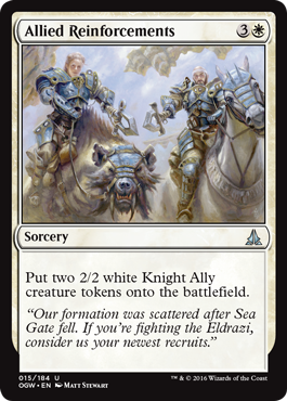
White is the color of small creatures banding together in an army to take on threats. As such, we have focused small-creature-token-making (defined as 2/2 or smaller) in white, and larger-creature-token-making in green. You would think only being able to make 1/1s and 2/2s (we most often make creature tokens have square stats—having power equal to toughness—to make them easier to track) would limit how many types of different spells we could make, but a few key things have helped us to have more variety:
- Creature type—Magic has a lot of tribal components, so we can often make the creature token maker matter by selecting the right creature type. Allied Reinforcements is an excellent example. By being Allies, the tokens get to trigger all the cards that care about an Ally entering the battlefield and work with the cards from the original Zendikar block that specifically only work on Allies.
- Instant versus sorcery—Instants have more surprise value but tend to cost more. Sorceries are less sneaky but allow you to get out more creatures for cheaper. We like making use of both.
- Number of creatures made—The advantage of making smaller creatures, especially 1/1s, is that a single spell can make multiple creatures. As some formats are very sensitive to how many creatures you have, this allows you to get a creature count higher than the number of cards needed to cast those creatures.
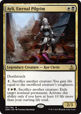
One of the things that always amazes me is how often something that you assume must have been done before wasn't. For example, if you had asked me if we made a white-black legendary Cleric before, I would have said absolutely. White is the number-one Cleric color, and black is second. Cleric is a class that we use in almost every set, and we have made numerous legendary Clerics. Surely, one of them must have been white-black.
It turns out we hadn't made one. Before Oath of the Gatewatch, Magic had eighteen legendary Clerics. Seven of them are mono-white. Two were mono-black (Legendary Liliana and Zombie Mikaeus). Two were black-red. Two were green-white. Two were green-white-blue. One was white-blue. Two did have white and black, but one was white-black-red and the other was white-blue-black. But none of them were just white-black.
This is a good example of why it's important to let us know things that you want that we haven't made, because often we have no idea that such a card doesn't exist yet.
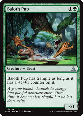
In my card-by-card design articles, I often spend a lot of time talking about the creation of splashy cards, but I think it's also important to talk about what I call "structural designs." That is, we have to make nice, simple cards that look elegant and are easy to understand at low rarities that help support one or more themes of the set. Baloth Pup is a fine example. One of this set's mechanics is support. It allows you to put +1/+1 counters on other creatures. Now, that ability is fine in a vacuum, but it's nice to add a few cards that players drafting that theme can prioritize for synergy.
This works in two different ways. First, if you're already in a theme, for example you've drafted a bunch of support cards, then Baloth Pup is slightly better in your deck and thus you might pick it a little sooner than other players. A 3/1 for 1G is playable in Limited, but it's not something that necessarily gets taken early. Second, if you pick up a Baloth Pup, you now have more incentive to draft cards with something like support.
One of my recurring themes is that design is about a lot of little details that you have to account for, because the overall feel of a set is dependent on many smaller aspects all working together.
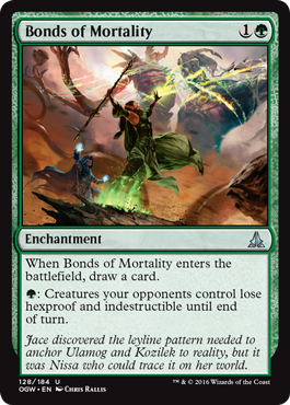
This is one of those cards that seems like an easy thing to make. In fact, I'm pretty sure the first version of this card was something like "All creatures controlled by other players lose hexproof and indestructibility." This card is an excellent reason why, in design, we have check-ins with the Rules Manager and the set's editor. You see, there are many mechanics that seem super simple in concept, but when you actually get into the nitty-gritty of making them work, things get a lot uglier. Bonds of Mortality is a great example.
If you read the original version of the card, I think most players would assume that all hexproof and indestructibility on creatures controlled by your opponents would just disappear. The problem is it wouldn't necessarily. You see, the game has something called layers, which helps determine what happens when more than one card affects other things. If Bonds of Mortality were a static effect, then there would be times where something could grant hexproof and/or indestructibility after Bonds of Mortality took it away.
The goal of templating is to figure out ways to make the card do what the original design intended (or at least get as close as possible) while also making a card that can be understood. By turning the hexproof and indestructibility removal into an activated ability, we were able to make a card that acts how players think it will act a greater portion of the time.
I spend a lot of time in columns like this focusing on how ideas get made, but how ideas get executed—especially in some of the more crunchy parts of the game like the rules and templating—is equally important.
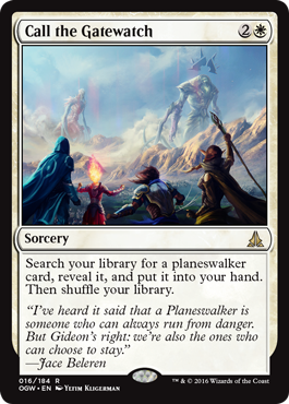
R&D works in a section we call the Pit. Everyone has a cubicle, but the walls are low and there is lot of space to playtest. The Pit exists as it does to help foster a lot of communication among the members of R&D. Ian Duke, the lead developer for Oath of the Gatewatch, sits kitty-corner from me, so he and I will often discuss things. One common topic is the color pie. Whenever Ian wants to mess around in a space that we haven't touched before, he'll always ask me my opinion of what color a new effect should be. One day during Oath of the Gatewatch development, Ian spoke up. "Mark? What color is planeswalker tutoring?"
Many times when I'm asked a color pie question, there are some precedents I can look at. "We did such a thing before and here's the color(s) we used." When it's a brand-new ability though, I have to walk through the paces of figuring out what feels right. Off the bat, we let every color have some tutoring. The key is that you have to be tutoring for something your color cares about. Planeswalkers are tricky, though, because all five colors have them and all care about them.
When mechanics don't clearly spell it out, I usually start thinking about color philosophy. What exactly does tutoring for a planeswalker mean from a flavor sense? Well, you're calling for help. That felt more like white to me than anything else. And yes, there are ways to spin it to other colors if we wanted. Black, for example, could be flavored as if you were blackmailing a planeswalker to aid you. But Oath of the Gatewatch has a flavor of banding together, and this card felt like it wanted to be a nod to the Gatewatch, so white, to me, was the correct choice.
I told Ian white. Ian said, "Great," as he had wanted it to be white. And that's how Call the Gatewatch ended up in white.
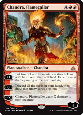
This is the seventh Chandra card. To be honest, our track record with making powerful Chandras isn't particularly good. Also, we've been working on finding more effects that feel on-flavor for the character but allow her to do different things.
Her first ability is unique for Chandra, in that it makes a token creature—something Chandra has never done before. To stay true to her character, they are small Elementals that only last for a short while (but have haste to get their damage in quickly).
Her second ability is a means to rummage (discard then draw), albeit your whole hand rather than a single card. The ability allows you to go up one card, which is the cap we usually allow when red draws cards. I like how this effect has a very impulsive feel, thus staying in line with Chandra's character.
Her last ability, which we traditionally refer to as the planeswalker's "ultimate," is different in that it's an X ability, meaning she can use it right away and doesn't have to build up to it. As it's an X, though, you can spend time building up if you want a larger effect.
Mechanically, these abilities are a little less connected, but they flavorfully tie together and happen to give Chandra's owner a lot of flexibility. I think Chandra, Flamecaller stands a good chance of finally giving Chandra fans a card with a power level worthy of her character.
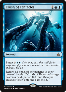
Surge is an interesting mechanic, in that there are different ways to use it. One, the spell can be cheaper if you've already cast a spell. Two, it can generate an effect if you've previously cast a spell. Crush of Tentacles is a case where it does both. The mana-cost decrease is not that much (although five mana is usually several turns away from six), but the effect is huge—an 8/8 Octopus is quite the bonus effect. This is my favorite surge card. My only regret is that there was too much text, thus preventing the Kiora flavor text that this card is dying to have.
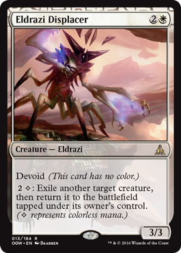
One of the big questions I got regarding Battle for Zendikar was "Where are the white Eldrazi?" The answer was that design had intended on having white Eldrazi and had designed several, but as the file evolved through design and into development, white ended up more Zendikari-focused and less Eldrazi-focused. As such, by the time the set saw print, no white Eldrazi remained.
Going into Oath of the Gatewatch, the design team was aware of this. Our goal wasn't to make a lot of white Eldrazi cards, but to make at least a few with the hope that one would make it to print. Eldrazi Displacer is the one that did it. This block might not have a lot of white Eldrazi, but at least it has one.
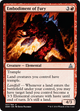
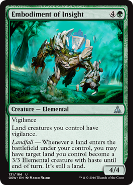
I believe this originally started as a cycle. Battle for Zendikar had landfall, and we wanted to have some kind of landfall for Oath of the Gatewatch, so we played around with different types of tweaks. One we liked was landfall triggers that animated a land for a turn. We then gave each a static ability that affected land creatures, to help tie this cycle together. The reason you wanted to play different Embodiments was to beef up your land creatures as you played lands. The cycle had a bit of a Sliver feel to it.
This cycle might have made it all the way through if the set weren't trying to do so many other things. There was a component of capturing the feel of Kozilek. There was a component of trying to conjure the feeling of teamwork and the Gatewatch coming together. The Allies needed some mechanical cohesion. The "colorless matters" theme needed cards. There were so many different mechanical elements that needed space that everything got too pinched.
The decision was made that we should keep the Embodiments that were in the colors that wanted to do what the Embodiments did, and that was red and green. The red-green deck in Battle for Zendikar Limited was focused on landfall, so we decided to continue that focus in Oath of the Gatewatch and knock the cycle down to two cards.
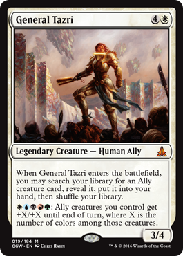
When we first sat down to make Battle for Zendikar, we made a list on the board of everything we thought players wanted to see when we returned to Zendikar. Some were returning things that we felt players would expect to come back. Others, though, were things we didn't make the first time we were in Zendikar that players had been unhappy about. One of those things was a five-color Ally commander.
The Allies had been a very popular deck among the casual crowd, but if you wanted to play them in Commander, you were forced to choose a five-color commander that had nothing to do with Allies. I believe Ethan Fleischer, the lead designer for Oath of the Gatewatch, made a few cards in Battle for Zendikar design, but the focus was too much on how the Allies were losing to make the five-color commander feel right. Ethan was determined to have Oath of the Gatewatch deliver.
The big jump Ethan made in the design was the idea of making it a monocolored creature in its mana cost and then having a five-color activation, which would allow it to have a five-color identity and thus work as a five-color commander. This design would also allow the deck to be more playable in Limited because the card only required one color and didn't demand a five-color deck—something that's very difficult to accomplish in Limited. Ethan chose white as the color, as it seemed like the leader of the Allies made the most sense in white. The tutoring ability was chosen specifically because it would work well in Limited and in Commander (100-card singleton decks love tutoring).
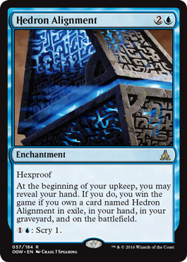
Top-down design is always fun, because you end up with designs that you might have never made had you just started from scratch. This card began, to the best of my knowledge, as someone trying to design to the name "Hedron Alignment." The hedrons play a major role in the Gatewatch's fight against the Eldrazi, so it seemed only right to have a card nodding to them. The flavor we were trying to capture was that if you align the hedrons correctly, you can create powerful effects that will help you win the fight against your opponent.
Well, what if winning was actually winning? Battle for Zendikar had reprinted Felidar Sovereign, but the block didn't have a new alternative win condition. What if winning with the hedrons involved getting them into the right position? The game has five zones (hand, battlefield, library, graveyard, and exile), three of which are public (well, mostly for exile). What if you had to get a copy into four different zones, as you can have four different copies in your deck? Library is the most problematic and the easiest to actually do, as cards start the game in that zone, so drop that one out.
And voila, we have a new win condition: something for Johnny to solve with some creative deck building.
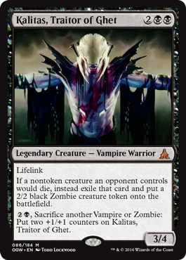
I like the design of this card for a number of reasons, some of them coming from the Vorthos in me, and the others from the Mel side. The Vampires on Zendikar are split in their feelings about the Eldrazi. Some have thrown in with the giant titans and their brood, while others have joined the Allies. Drana is an example of a Vampire who is trying to stop the Eldrazi, while Kalitas is an example of one who is not.
I love how this is a card that is both Vampire and Zombie tribal, but gets there believably from a place of flavor. Kalitas makes use of Zombies to fight for him, so everything he kills gets to strengthen his forces. The card also shows how he is willing to sacrifice not just the Zombies but any of his own Vampires if it helps strengthen him.
From a Mel side, I love how this card has lots of pieces that all work together. Kalitas is a Vampire, so the lifelink is a perfect fit. He is then able to turn any death of an opponent's creature into another Zombie. The Zombies can then be sacrificed, as well as the Vampires you're playing in your deck, to make Kalitas bigger—which strengthens the lifelink, which forces your opponent to block, which makes more creatures die, resulting in even more Zombies for Kalitas. All in all, a wonderful design.
Gatewatch Out
That's all the time I have for today. As always, I'm eager to hear your feedback on either this article or on the Oath of the Gatewatch set. You can send me an email or write to me through any of my social media accounts (Twitter, Tumblr, Google+, and Instagram).
Join me next week for part two.
Until then, may you have fun bringing your team together.
"Drive to Work #294—Dragons of Tarkir, Part 6"
This is the sixth and final part of my series on the design of Dragons of Tarkir.
"Drive to Work #295—Chicken Rabbit Donkey"
Three different times during my 20 years at Wizards, I had to dress up as an animal for work. This podcast tells those three stories.
- Episode 295 Chicken Rabbit Donkey (22.1 MB)
- Episode 294 Dragons of Tarkir, Part 6 (25.4 MB)
- Episode 293 Dragons of Tarkir, Part 5 (15.5 MB)
- Episode 292 Dragons of Tarkir, Part 4 (18.2 MB)
- Episode 291 Live Life Like a Gamer (14.9 MB)

