Looking Back, Part 1
When Standard-legal sets come out, I always do an article or two where I talk about design stories of different cards. Modern Masters 2017 Edition has cards from Eighth Edition through Magic 2014, so I thought it might be fun to go back and talk about designs from cards throughout the game's history. I tried whenever possible to either talk about cards whose story I haven't told or tell different stories for cards I have talked about before. That said, let's talk about some old (and new) cards.
Abrupt Decay
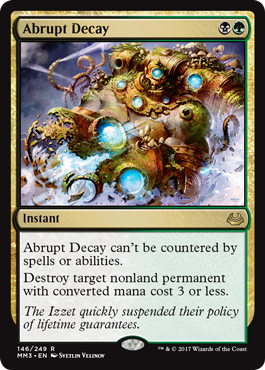
Multicolor cards are tricky to design. I'm going to talk in terms of two-color design, but obviously there are three-, four-, and five-color designs. You can have two effects, one from the first color and one from the second. You can find an area where the two colors overlap. (We do less of this nowadays as we save this design space for hybrid cards.) You can have a thematic connection as with guild mechanics, or you can directly reference both colors. You can even just make up a brand-new effect and assign it to the color combination. (I go into more detail on this in my column on multicolor design.) Abrupt Decay, though, is a more complicated example.
What's going on in this card is that we've taken things each color can do and woven them together. The first ability is just a green ability; nothing too exciting to see there. The next ability is where things get interesting. The card destroys a nonland with converted mana cost 3 or less. That means it can destroy artifacts, creatures, enchantments, and planeswalkers. Interestingly, neither black nor green can destroy all four. Green can destroy noncreature permanents, while black can destroy creatures and planeswalkers. By combining the colors, you can hit all the possibilities and thus condense the effect down to "permanent."
Avacyn's Pilgrim
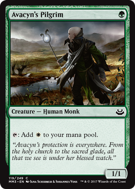
When I started Innistrad design, I knew I was going to have some amount of tribal. I wanted monsters, and I was expecting that we'd make cards that let players make monster-themed decks. In the beginning, that was Vampires, Werewolves, and Zombies. I like to put creature types that we plan to mechanically care about in at least two colors because it opens up the number of different ways to build decks with that theme. I ended up with Zombies in blue-black because I realized that it let me have both necromantic-style Zombies and Frankenstein-style Zombies made by science (or magic). Vampires then ended up in black-red to capture a wilder style of Vampires. Werewolves ended in up in red-green. I soon realized I wanted ghosts, and Spirits naturally fit in white-blue. That left Humans, which at the time were primarily just white.
I realized if I added Humans to green (there were already some because of the Werewolves), I could have an ally-themed tribal component to the set. The problem was that Humans showed up in all five colors, so how could I pull the focus to just green and white? We put some Human tribal rewards in white, but that just led playtesters to make monowhite Human decks. The key to getting green played was to put some of the Human tribal rewards in green.
This helped some, but we realized we were missing something. We needed something in green that you only wanted to play with white. Was there a way to take something iconically green and with just a little tweak make it relevant to white? We searched for answers for weeks and in the end we found it in the unlikeliest of places—Limited Edition (Alpha). Our inspiration was Llanowar Elves. With one simple tweak (just changing one mana symbol), we could give the card the focus we needed. The final touch was to make the card a Human so that it would play nicely with the Human tribal we had put in green.
For those trivia buffs out there, with Avacyn's Pilgrim, there are now one-drop 1/1 green creatures that tap for three different colors of mana—Avacyn's Pilgrim (white); Elves of Deep Shadow (black, at the cost of 1 life); and Elvish Mystic, Fyndhorn Elves, and Llanowar Elves (green)—and one that taps for colorless, Boreal Druid. Viridian Acolyte and Orochi Leafcaller let you filter for any color mana, and there are a number of 1/1 green creatures that allow you to tap other creatures to produce colored mana (Birchlore Rangers, Heritage Druid, and Loam Dryad).
Battle-Rattle Shaman
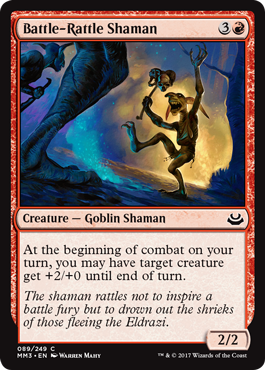
Let's say you want to design a creature that has some ability. Since we're talking about Battle-Rattle Shaman, let's say you want to give a creature +2/+0 until end of turn. Magic design gives you three choices on how to this. You could make it an activated ability:
"1: Target creature gets +2/+0 until the end of the turn."
This requires the player to spend some resource, often mana, to use it. If you don't want it used more than once, you can require a tap. A tap can also allow you to not require mana to use it.
"T: Target creature gets +2/+0 until the end of the turn."
You could make it a triggered ability:
"At the beginning of your combat on your turn, you may have target creature get +2/+0 until end of turn."
This requires you to have a chosen thing that will make the effect happen.
Or you could make it a static ability:
"Attacking creatures you control get +2/+0."
Static abilities can't be targeted, but you can restrict who gets affected by limiting the effect to just a subset.
"Attacking Goblin creatures you control get +2/+0."
Battle-Rattle Shaman is a good example in that each of these choices was available. The key to picking which one to use is figuring out which mechanical execution you like the best. For example, I believe the triggered option was chosen for a few reasons. First, we wanted Battle-Rattle Shaman's ability to be used the turn it was cast. This knocked out the activation version, because either it would require extra mana and thus not be usable if you cast it on turn four or it would require a tap and thus have summoning sickness and not be usable.
Second, we only wanted it to affect one creature. This made the static ability harder to use.
Third, we wanted it to be able to affect itself. The second and third restrictions together basically knock out the static ability, leaving the triggered one as the best option.
Blood Moon
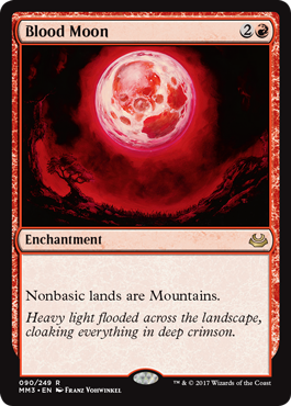
From what I understand, this was a top-down design from wanting to have a card represent a blood moon (a real thing, for those unaware). The Dark was designed by Jesper Myrfors, Magic's first art director, and his vision was a set that captured the darker sides of all the colors. As an artist, Jesper was very visual in how he thought about the set, so many cards came about because he had an image he wanted and designed the card to match.
Blood Moon got made red because the image was going to be primarily red, and it felt odd for that image to go on a non-red card. What would being bathed in red light do? I think the mechanical inspiration for this card came from Alpha's Sunglasses of Urza, which allowed you to tap plains for red mana. If red could turn lands to red, maybe Blood Moon could be transformational. Not wanting to completely shut down all mana, it was decided to just affect nonbasic lands.
I'm often asked if Blood Moon is in today's part of red's color pie and the answer is no. Red can destroy lands, but the color that does land transformation is blue and not red. Red might be able to do transformation if it was temporary or had a random element where you didn't control the transformation.
Call of the Conclave/Advent of the Wurm
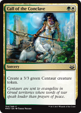
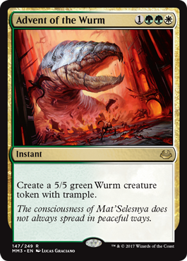
Would you believe that these two cards were considered contentious when they were designed? Let me explain why. Often in design, some aspect of the environment pushes us to do things a little differently from normal. In the case of Return to Ravnica block, it was a mechanic, specifically populate, the Selesnya mechanic. When you populated, you got to make a copy of a creature token you had on the battlefield. (The original version copied all the tokens, but playtesting quickly showed us how broken that was.) This led us to make more effects that created tokens.
Call of the Conclave was a tweak on the card Watchwolf from original Ravnica. It was a 3/3 for GW, but instead of being a creature, it was a sorcery that made a creature token. Now if this were a normal set, we would have just made the card a 3/3 creature. Using a creature token just makes it more complex for no gain. The issue at hand though was in this set with this mechanic, there was a gain. The problem was a bunch of people in R&D didn't think it had enough gain to justify doing it. The same was true of Advent of the Wurm in Dragon's Maze. It could have just been a 5/5 trampler without making a creature token.
Here's a fight I actually had about Call of the Conclave:
Them: This card is excessively complex. We shouldn't make it.
Me: Okay, I have a different card. Assume it has the right mana cost and it's green and white. It's a 3/3 creature that when it enters the battlefield makes a 3/3 creature token. Are you okay with that?
Them: Yes, that's a card we would make.
Me: Now I'm going to take away part of the card. Rather than making a creature and a creature token, I'm just going to have it make a creature token. The first card did two things. The new card only does one of them. It is, by definition, simpler. Just doing Thing A is simpler than doing Things A and B.
Them: But now players are going to get confused about why this isn't just a creature.
Me: No, what they're going to say is, "Wow, this a bit different. I'm curious to find out why." And then they're going to see populate and say, "Oh, that's why."
It took a lot of debating, but I finally managed to convince enough people that doing things a little differently was okay if there was a payoff for it in the set. And then when we went to print Advent of the Wurm, I had to have the same arguments all over again. Luckily I was stubborn enough to stick with it and make sure both cards were printed as they needed to be.
Cruel Ultimatum
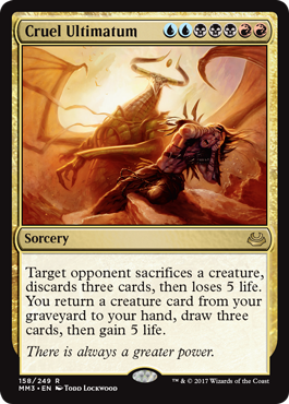
The Ultimatums came about because the Shards of Alara design team was trying to come up with different ways to capture the three-color theme of the set. One idea was to make a big spell in each shard that captured the essence of that world. Because we wanted the spells to feel centered in one color (as the shards were all focused around the color whose enemies were missing), we had a choice between having four-mana spells (MNNO with N being the central color) or seven-mana spells (MMNNNOO with N being the central color). We ended up going with seven to get bigger effects.
Cruel Ultimatum was centered on Grixis, so we wanted to capture the essence of that shard. Grixis, being the black-centered world, was all about gaining at others' expense. Because the spell cost seven mana, we decided to have three effects where you, the spellcaster, would gain the very thing you were making your opponent lose. Life was obvious and life drain is a staple ability in black. Because we were playing around with blue (and to a lesser extent red), card drawing seemed appropriate. I think we picked three cards because that made the upside for you Ancestral Recall, a classic powerful spell from Magic's past.
The most logical effect would be some kind of creature kill, as Grixis was the deadliest of the five shards (with Jund being a close second). The question was what was the opposite of killing a creature. How about getting a creature back from the graveyard? I believe the original spell reanimated a creature (put it from the graveyard directly onto the battlefield) as that is the true opposite of sacrificing a creature, but playtesting found that too good and it was downgraded to a Raise Dead (graveyard to hand).
There's one other subtle aesthetic thing that not everyone picks up on. The first effect kills one creature, the second forces the discard of three cards and the third makes the opponent lose 5 life. 1-3-5. Design loves little patterns like this because they give the spell a sense of balance, even if only subconsciously.
The art also had a big Easter egg in it because the villain of the Shards of Alara story wasn't revealed until the next set, Conflux. (For those that don't know the Shards of Alara story, it was Nicol Bolas. You can see his shadow in the art. Read all about it here.) Cruel Ultimatum would go on to be the most powerful and popular of the Ultimatums.
Damnation
The Time Spiral block was my second full block after I had become head designer (I started in the middle of the Champions of Kamigawa block, but too late to change the general direction chosen for the block). My first block had been original Ravnica, and I designed the guild model (four guilds in the large fall set, three in the small winter set, and three in the small spring set—all seasons northern hemisphere). For the Time Spiral block, I was interested in trying a different way to tie the block together.
The mechanics were connected through a time theme, so I was interested in finding a way to use the theme of time as the thing that connected the block. I ended up realizing that past/present/future was a clean way to divide up something into three parts in a time-related way. Here was the big problem. Being from the past meant something. We could bring back cards and mechanics and characters. Being from the future meant something. We could preview things that someday we might do. But what did being from the present mean? Isn't every set from the present?
Bill Rose was to be the lead designer for Planar Chaos, and he told me that he didn't understand what the set was supposed to be about. I asked him to give me a few weeks and I'd give him a detailed explanation. Here's the thing: I hadn't figured it out yet.
The key, I believed, to cracking Planar Chaos was figuring out what was supposed to be on the timeshifted sheet. I knew Time Spiral would have actual cards from Magic's past. I knew Future Sight would have weird cards from the game's future doing things that Magic had never done, but I wasn't sure what Planar Chaos's timeshifted sheet had to offer. Looking for answers, I turned to pop culture. How did TV and movies make the present different? And that's what led me into the idea of an alternate present. A world where things didn't quite go the way they went in our world.
This idea led me to the concept of what might have happened if the color pie had been executed a little differently. The color identities and philosophies would stay constant, but we could explore a different way they could have been mechanically represented. This meant that our timeshifted cards could be Magic cards from the past but shifted into a different color. This led me to try and find as many Magic cards as I could that existed in one color but philosophically could have existed in a different color.
The first card I latched onto was Memory Lapse. White had always had a theme of delay; it was the protective color that slowed down the opponent's assault. What if we had allowed white access to some counterspell technology to help slow down the opponent? Having dealt a lot with Bill, I knew I needed one more example of a color-shifted card. I wanted something iconic and splashy.
I decided to go back and look at Alpha because I wanted to find something that had been part of Magic from the very beginning. Remember, the godbooks (a printout of all the cards in a set) are in alphabetical order, meaning I was almost near the end without finding what I needed and was a little despondent. I then turned to the very last page and under w was Wrath of God.
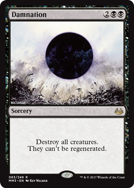
Black was the creature-destruction color. Yes, we more often let white do mass creature kill, but I was exploring an alternate reality and there's no philosophical reason black couldn't have been the number-one mass creature kill color. I realized then and there I had my second card. Armed with these two cards, I went to Bill to explain my concept. He liked white Memory Lapse, but I believe it was Damnation that sealed the deal.
White Memory Lapse got killed by development, so Damnation ended up being the poster child for the set. So much so that the way we announced Planar Chaos was as such: One day when people showed up to the website, a graphic took it over. The screen split apart as the sun from Wrath of God filled up the screen and then turned black as it morphed into Damnation. The effect then shrunk into a card frame showing off Damnation for the first time. This is what we call a day-zero preview, meaning it's a preview no one knew was going to happen and it occurred before the official previews began.
Looking back, I have a lot of issue with Planar Chaos in that I believe it caused a lot of confusion about what the color pie actually is, but I was always happy with Damnation. It served its job as poster child for the set excellently, and I'm excited to see it finally reprinted in Modern Masters 2017 Edition. (Read Adam Prosak's article for why it took so long to come back.)
More to Come
That's all the time I have for today. I hope you all have enjoyed the peek back at designs from over the years. As always, I'm eager in your feedback—on today's column, or any of the cards I discussed, or Modern Masters 2017 Edition. You can email me or write to me through any of my social media account (Twitter, Tumblr, Google+, and Instagram).
Join me next week when I'll tell a bunch more stories about the cards of Modern Masters 2017 Edition.
Until then, may you get a chance to make some stories all your own with these cards.
#414: Ravnica Cards, Part 5
#414: Ravnica Cards, Part 5
40:36
This is the fourth part of a five-part series on the cards of original Ravnica.
- Episode 413 Ravnica Cards, Part 4 (26.1 MB)
- Episode 412 20 Lessons: Loved Not Liked (27.0 MB)
- Episode 411 Ravnica Cards, Part 3 (27.5 MB)

