Mining the Past
It's Preview Week for Modern Masters 2015 Edition, so it's time to start talking about the follow-up to the very successful Modern Masters, which came out in 2013. I'm going to introduce you to the design team, walk you through its design, and then talk a little about some of the challenges of designing when you can only use pre-existing cards. Also, I have a cool preview card to show off along the way. Sound fun? Good, then let's get started.
The Masters Behind the Masters
As is tradition, I want to start by introducing you to the design team.
Erik Lauer (lead designer)

I first heard Erik Lauer's name when I interviewed Randy Buehler after he won his very first Pro Tour. Randy referred to him as the Mad Doctor and explained that Erik created the Necropdeck Randy had just won with. I would later get to know Erik Lauer from interacting with him at Pro Tours. Years later, when Randy was the Director of Magic R&D (the position currently held by Aaron Forsythe) he hired Erik as a developer. Erik proved very useful and has since worked his way up to head developer, the equivalent to my job in development.
Erik took on the role of lead designer for Modern Masters 2015 Edition because he wanted to get a better sense of what a lead designer goes through. Erik told me that when the design was done he realized that while it had given him a little taste, there were two big reasons why it failed to give him the insight he was after. One, he didn't truly have the ability to do "blue sky" design because the inability to make new cards meant he was exploring more what was there, rather than what he wanted the environment to be. Second, his years of experience as a developer gave him knowledge that kept him from truly feeling what a first time lead designer would feel. Erik has designed (or had designed for him) hundreds, possibly over a thousand, of new cards over the years. And thus he was missing some of what he felt was the thrill of leading your first design.
All that said, I think Erik did a great job (more of which I'll talk about below) and created a very fun set for you all to draft and play.
Ken Nagle

As Erik knew he was leading his first design, he wanted to make sure he had an experienced designer on the team. Ken has been with Wizards for eight years now and has matured into one of my team's top designers. Ken is a huge fan of looking back at old Magic sets and digging around in them to see what cool things he can rediscover. Ken's expertise (he was on many of the design teams of new sets being added) was put to good use.
Ben Hayes

Every design team normally has a development representative on it and Ben played that role on this team. Ben has a very critical eye and has proven valuable on the numerous design teams I have worked with him on. Ben, like many of the developers, has a background playing competitive Magic but also did game design before coming to Wizards. That gives him a unique mix of skills. Ben, like Ken, was a valuable addition to the team.
Everything Old Is New Again
At the very first meeting, Erik explained that they were making a "previous world order" set. Instead of limiting themselves to modern complexity restrictions, they set out to create something a little more challenging. Modern Masters 2015 Edition is aimed at more enfranchised players, and thus it was decided it could aim for a higher level of complexity. This change was important because the constraints of sticking to a limited card pool (cards in Modern up through New Phyrexia) was already restrictive. Having to hold to a normal expansion-level of complexity might have made the task impossible.
The design team started by listing all the cards they wanted for Constructed reasons. Many of the cards were unanimous choices, including the preview card I will be showing you later in the article. There was discussion of whether or not to reprint powerful cards from the original Modern Masters. Erik felt strongly that if the card was in need of reprinting, they should include it in the set. There was no better place to put Tarmogoyf, for example, than in Modern Masters 2015 Edition.
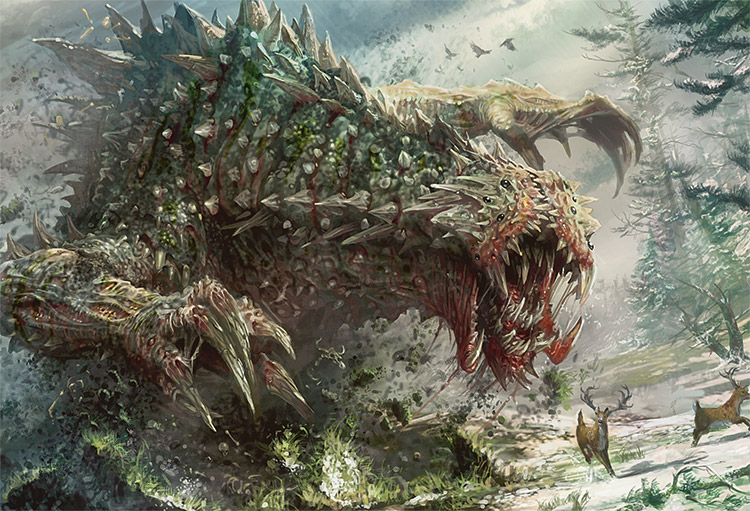
Tarmogoyf | Art by Ryan Berger
Design's next step was to figure out what mechanics they wanted to focus on in the set. A few mechanics were dictated by cards they wanted to reprint. Other mechanics were initially chosen because they were synergistic with those mechanics and each other. This set was aimed at a higher complexity level, so they were going to test out just how complex it should be. A large percentage of the cards were chosen so they'd fit into two different color pairs, each with its own justification.
The first playtest went horribly. Deck building was too complex. There were so many options and so many synergies that building a deck proved very problematic. The number of choices was simply overwhelming. It didn't get any better when they got into the playtest. The number of choices and things to track made game-play cumbersome. It led to too many triggers and uninteresting choices. Erik described it as "less like playing a game and more like following the instructions of the game rules".
Erik and his team started iterating, to figure out which mechanics were worth their complexity and which ones were leading to games feeling cumbersome. In addition, Erik wanted his team to figure out the typical deck strength they were aiming for. It was important to figure out because some mechanics would not reach the bar if set too high.
Epic Struggle | Art by Greg & Tim Hildebrandt
A quick aside. I should point out that Erik was definitely using a lot of developmental tools in his design. Typically, for example, design doesn't set power level; but as Erik was working with a locked card set to choose from, these development skills were key to figuring out what could and couldn't be done. This is yet another reason why Erik was a good choice to lead the design.
Using a lot of development skills to balance the different mechanical themes chosen, the design team iterated until they ended up with the mechanics they wanted. As the two new blocks entering were Zendikar and Scars of Mirrodin blocks, they leaned slightly on choosing themes from those two blocks. The team did, by the way, try out infect as a theme. But it wasn't playing nicely with the other chosen themes and was dropped.
The design team then did a pass to make sure the decks had a variety of different styles. Erik felt the most interesting choice was what they chose for blue-red. Traditionally blue-red tends to be the "spells matter" color combination, but the available cards didn't really support this theme. So Erik and his team got creative choosing to give blue-red a theme of Elementals. The base of them came from Lorwyn block; but they are a creature type supported by numerous blocks, giving the design team plenty to choose from. Erik liked Elementals because it came with a neat tension between trying to race your opponent and wanting to build some kind of engine.
Once the design team had themes they liked, they playtested some more now inviting the development team to join them. The development team gave notes and the design team made changes based on the feedback. Erik then handed off the set and got to experience watching as a separate development team worked on the set he had designed. Erik said he enjoyed the experience of leading the design and was glad to have the opportunity even if it didn't give him as much of the experience of understanding what it feels like to lead a design as he had hoped.
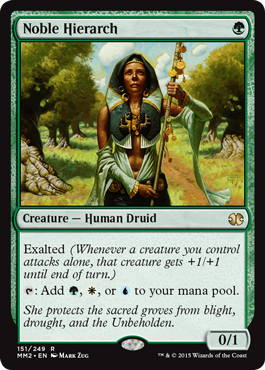
So what's my preview card, unanimously chosen by the design team to be included? I'll give you a few hints and see if you can guess.
Hint #1: The card is a creature with 0 power, but is capable of damaging the opponent.
Hint #2: The card has three mana symbols in its text box, but the mana isn't used in an activation.
Hint #3: She protects the sacred groves from blight, drought, and the Unbeholden.
Know what the card is?
Building Not From Scratch
Not being on the design team greatly restricts my storytelling ability (and thanks to Erik Lauer for helping me with the above section) and we're only halfway done with the article, so I thought I'd use the second half of today's column to explore some of the lessons that come from designing using only pre-existing cards. Note that this skill is not just relevant to products like Modern Masters, Vintage Masters or Tempest Remastered (a lot of mastering going on) but also to building Cube decks or building Duplicate Sealed pools. (For more on my advice about how to build for these type of environments, you can read an article called "Building a Better Mousetrap" I wrote on the topic; more on Duplicate Sealed below.)
Lesson #1: You Control the Environment
The first lesson of building from pre-existing cards is that while you don't have the ability to make things that don't exist, you do have the ability to pick from what does exist. For example, back when I ran the Magic Invitational, I used to always run two formats: Duplicate Sealed and Solomon Draft, where I would hand select the cards used by all the players. And by that, I mean that all sixteen players would use the identical card pool.
Duplicate Sealed is a sealed format with the one twist that all the participants get the exact same card pool. Usually, the card list is hand-crafted to ensure that there are a lot of options available. The key to the format is figuring out the optimal deck build in an environment where everyone has the exact same choices as you.
Solomon Draft is a draft format where each player comes with the equivalent of three booster packs. All the cards get shuffled together (without being looked at). Then one player reveals the Top 8 cards of the pile and divides them into two piles. The other player then chooses one of the piles to take, leaving the divider the other pile. Players go back and forth, taking turns dividing the cards until everything has been drafted. Solomon Draft can be done with normal booster packs, but for the Invitational I chose the cards being drafted and then made sure all the players got the same pile of cards in the exact same order. The identical nature of the Solomon Draft was done more for spectator novelty than game-play impact, as players would do a different draft with each new opponent.
Evil Twin | Art by Greg Staples
I bring this up because a lot of what I did in Duplicate Sealed and Solomon Draft was to shift the environment by choosing what did and didn't exist. For example, one Duplicate Sealed event I held involved all the cards in the pool costing one mana. I likewise did a Solomon Draft where all the cards were multicolored (or land). They were all pre-existing Magic cards, but with one focus I radically changed the value of each card. It's very easy to feel as if the restriction of not being able to make new cards keeps you from being able to have a huge impact on your environment, but that is simply a false assumption. Yes, you are restricted in some ways but that doesn't mean you can't have a large impact.
I should jump in here and say that just because you have the ability to wildly change things doesn't always mean you should. My formats at the Magic Invitational were designed to have maximum spectator appeal and only needed to be played once. That allowed me to take some liberties that I wouldn't recommend if you're crafting a format to be played multiple times.
Lesson #2: One of Your Most Important Tools Is Volume
This lesson is an offshoot of the first. You can only include things that Magic has done, but you get to choose which things and at what volume. Often, for example, when I am crafting a Limited experience, I will either eliminate or greatly reduce some component to help push the environment in the direction I want the design to explore. One of the most potent tools available to a designer is picking how often something happens. I often talk about "as-fan" and that is just a more technical way of tracking how often the player is going to experience some facet of game play.
Also, think about not just what the volume is as a whole but what the volume is through various subsets, colors being the biggest issue. It's possible that you remove something but only from a few colors or only from a particular card type. A big part of giving identity to the different sections of your set is to make sure that they vary from one another and one good way to do this is control who gets to do what. The color pie is exactly this process. Remember in the subset of cards you choose, you are making your own version of the color pie.
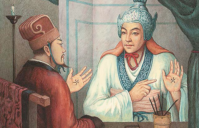
Brilliant Plan | Art by Song Shikai
Lesson #3: You Are Most Restricted by What You Don't Have
The biggest problem with the inability to make cards is that you don't have the ability to supplement. The best example of this comes from the design of Modern Masters 2015 Edition. Erik was trying to figure out which themes he wanted to support. He and his team set a deck level for the strength of the themes. If a theme was too strong, Erik and his team could easily remove one or more of the powerful spells with that theme, but if something was too weak, there was nothing Erik could do to make it any stronger. This kept him from using certain themes.
This is an important point because, as I often talk about, part of early design is understanding your restrictions and building your structure to accommodate them. It's very important, when building from a known set of cards, to know what you can't do and to use that knowledge to help define your vision for the design.
Lesson #4: Things Don't Have to Be as They Were
Another important thing to keep in mind is that cards have no responsibility other than doing what their rules text says. A card might have played some role when it was first introduced, but you are not beholden to using cards as they were used before. A very common thing we like to do in design is to bring back cards that play a completely different role when they get reprinted. As an example, Mulch was first printed in Stronghold as a means for green to get access to land. We reprinted it in Innistrad, not as a way of getting land (although it could still be used that way) but as a green way of getting cards into your graveyard; since one of green's themes in the Innistrad block was caring about cards in the graveyard.
Another way this plays out is rarity. When bringing back cards (especially in a booster product like Modern Masters 2015 Edition) you have the ability to change their rarity. This is especially important when trying to craft a limited environment.
Lesson #5: Look For Synergies between Cards from Different Sets
One of the easiest ways to craft something new when using pre-existing material, is to find cards that work well with each other but did not previously coexist. Erik's Elemental story from above is a fine example. Elementals are a creature type that we support in many worlds. The crux of the theme came from Lorwyn block where Elemental tribal was a thing. But Erik was able to search through other blocks to find other blue and red Elementals that would play nicely with the theme. This allows Modern Masters 2015 Edition to revisit a theme from the past, but change it enough that it's a new play experience.
One of the things that makes this relatively easy is that there are certain recurring themes that Magic uses again and again. Tribal, graveyard, artifacts, multicolor—certain themes have been visited multiple times and even exist at a lower level in most sets. Usually the key is to find a subset that a few cards care about and then find many more things that fit that subset. Note the theme doesn't even need to be something Magic has focused on before, just something that has been done enough times on a card-by-card basis that you can reach the volume you need.
Lesson #6: Playtest, Playtest, Playtest
A common misconception is that because you have played with cards before, you understand them. As soon as you change the environment cards appear in, it changes how and how well they function. There's no way to understand how cards will work without playing with them. And be prepared for things to occasionally be different from the way you remember, because changing the environment will quite often change how a card behaves.
Design is about iteration, and iteration is contingent upon you learning new things. This will primarily come from playtesting your set and should be treated just as you would a design where you have the liberty of making up new cards. It's very hard to over-playtest a set and very easy to under-playtest it.
A House of Cards
I hope you enjoyed the peek at Modern Masters 2015 Edition design as well as a few thoughts about the kinds of things to think about when building an environment out of only pre-existing cards. As always, I am interested in hearing your feedback be it through my email or any of my social media (Twitter, Tumblr, Google+, Instagram).
Join me next week when I talk about a set you all will never get to play.
Until then, may your cards mix and match in new and interesting ways.
"Drive to Work #222—GDC 2015"
For the first time in my twenty years of working at Wizards, I attended the Game Developer's Conference in San Francisco. This podcast talks all about the trip and some of the things I learned at the conference.
"Drive to Work #223—10 Principles"
This podcast is based on an article I wrote based on the "10 Principles of Good Design," by Dieter Rams, a German industrial designer. How does a man who designed lamps and radios provide insight into Magic design? I explain.
- Episode 223 10 Principles (14.2 MB)
- Episode 222 GDC 2015 (18.8 MB)
- Episode 221 Innistrad Cards, Part 5 (15.3 MB)
- Episode 220 Innistrad Cards, Part 4 (16.3 MB)
- Episode 219 Green-White (17.2 MB)
- Complete Drive To Work Podcast Archive

