Over the Moon, Part 1
Welcome to the first Eldritch Moon Preview Week. Today, I'm going to introduce you to the set's design team, talk about one of the mechanics from the set and its long history to print, and then show off a couple new cards. Hopefully that sounds like fun. Let's get to it.
The Men in the Moon

Ken Nagle (lead designer)
Before there's a design team, I sit down with Mark Gottlieb, the manager of the designers, and he and I work out who should be on any particular design team. The conversation started with Gottlieb saying that Eldritch Moon was going to be a tricky one. Shadows over Innistrad was a mystery, and Eldritch Moon had to be the payoff to that suspense. Whenever I hear a design is "tricky," my mind always goes to the same place: let's put Ken on it. Ken got his foot in the door many years ago as the runner-up in the very first Great Designer Search. He's gone from intern to team member to team lead to design veteran over the years, and he's become a designer who I know I can rely on. There were a lot of challenges in this design, but I knew Ken would find a way to solve them.
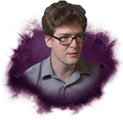
Kelly Digges
I first met Kelly when he asked me out to lunch. Kelly had been doing coverage for events and was interested in a job at Wizards. He asked me out to lunch to get advice on how best to approach Wizards. Our lunch went well and I came back and put in a good word for Kelly. He ended up working on the website and part time as an editor. Over the years, Kelly has moved around a bit in the company. At one point he was the editor-in-chief of DailyMTG, and at others he was a full-time Magic editor. A few years back, Kelly moved over to the creative team. He oversees the short stories for the Magic website as well as doing card concepting and world/story writing. Kelly was the creative representative for Eldritch Moon. As I said above, this set had a lot of story to cover—the mystery had to get solved and the story resolved—so Kelly was on the team to make sure the mechanics were properly reflecting the story and world. As you will see, Kelly did a wonderful job.

Bryan Hawley
Bryan started in R&D working not on Magic but on our Japanese TCG Duel Masters. Eventually a slot opened up on Magic development, and Bryan shifted over to work on Magic. Bryan has a number of responsibilities, but one of the biggest is being the content lead for Magic Duels. This involves him designing the card sets and overseeing the rest of the card content that goes in the game. Bryan is also one of the most active developers in the Future Future League—the internal playtest group that plays Standard about a year ahead to properly balance future card sets. Eldritch Moon was Bryan's first time on a normal expansion design team (as I mentioned a few weeks ago, he was on the design team for Eternal Masters), but it would have been hard to tell that by watching him work. Bryan was another great addition to the team.

Ben Hayes
I believe Ben was the official development representative on the design team. I've had the pleasure to work with Ben on several design teams. While he's technically a developer, his design skills are quite good. It's just a matter of time before he leads a design team. As a developer with design chops, Ben has a good perspective on what makes cards play well not just casually but also in tournaments.

Shawn Main
Shawn was on the design team as another core designer. (And hey, the second Great Designer Search needed some representation.) Shawn has an uncanny ability to see parameters and then find ingenious ways to fit the parameters that no one else has thought of. Eldritch Moon had the delicate task of continuing what Shadows over Innistrad had set up while also introducing the influence of Emrakul. Shawn's design chops will be further on display later this year, as he and I worked together to lead Kaladesh.

Mark Rosewater
I was only half on this team. Literally. One of the effects of moving to the Two-Block Model was there were now four expert expansions a year instead of three (I used to sit out of the core set designs). To solve this problem, I started showing up to the small sets half the time. We normally meet twice a week for design teams, so I just showed up for one meeting. I did manage to see enough to learn the challenges this team faced and how they stepped up to meet them. I even designed a few cards.
"I love it when a card comes together"
Our story today starts way back in 1996. I was asked by then–Head Designer Joel Mick to lead the design of a weird supplemental product. It was going to have silver borders and the cards wouldn't be legal in tournaments. I could do anything I wanted, provided that I wasn't using design space that black-bordered sets would normally use. I, of course, turned this product into Unglued.
My motto at the time was "Do what normal Magic can't." To embrace this, I decided to set up meetings with different people involved in making Magic cards and ask them "What isn't Magic normally allowed to do?"
One day I had a meeting with members of CAPS, the group responsible for physically producing the cards, both making the layout and getting them printed. These aren't people I normally had much interaction with, but I was eager to figure out where I could break rules, and the layout seemed like as good a place to look as any.
I sat there as the group was figuring out which rules in layout they could break. Dan Gelon (the person who handled graphic design layout for the Unglued cards) spoke up: "Here's one—cards don't have to have borders. You can run art up all the way to the edge of a card. We have to do a special cutting process, but this set was already doing that anyway.
"And things that run off one card can run onto another card. For example, you could have a creature half on one card, half on another. You just have to make sure the two cards are physically next to each other on the printing sheet. Players can then take the two cards and place them together to see the full creature."
The group went on to make many other suggestions, but the idea of cards having the art run to the edge and then onto another card fascinated me. The first idea we executed can be seen on two cards, Free-for-All and I'm Rubber, You're Glue.
On Free-for-All, the leprechauns and pink elephants are having a fight. One leprechaun is being punched so hard that he's being knocked off the card. Now look at I'm Rubber, You're Glue. That's where he's being knocked onto.
But the Free-for-All/I'm Rubber, You're Glue gag was merely visual. I wanted to find a way to take advantage of this technique to do something mechanically unique. So I asked myself, why would you need to have art on two cards in a way that would matter in how you played them? After some thought, the answer finally hit me. What if the two cards were put together to make one giant card?
I examined all the possibilities for a giant card. As I wanted it on the battlefield so you could put the two pieces together, that meant it had to be a permanent. Land didn't make sense, so I was left with an artifact, creature, or enchantment. (Planeswalkers, as a card type, didn't exist yet.) Whatever I chose would have to explain why it needed two cards. It was then I came up with the idea of making a big creature. Not just a little bigger than we had done, but way, way bigger. Something that would justify why it had to be two cards.
The biggest creature we had done at that point was a 12/12, so I decided to next-level it and make it three digits rather than two. I figured a 100/100 creature was big enough that it felt like it could need a giant card to contain it. I cost it at fifteen black mana (knowing that the giant card would allow me to have a cost that would never normally work). For some reason, at the time, we were avoiding putting trample on entry-level products, and Unglued had strangely been deemed one. The creature got a slightly wordier line of text making it hard to block. It essentially had super menace, meaning it required three creatures to block it.
The final touch was the art description that I wrote. I had the giant creature wearing as earrings what were previously the two biggest creatures in the game: Polar Kraken and Phyrexian Dreadnought. I then wrote extra-long flavor text explaining how big it was. The flavor text was a parody of the flavor text of Polar Kraken. At the last minute, Bill Rose asked me to change it from a 100/100 to a 99/99. I'm not sure why. I think he wanted to save three-digit creatures for a future time. All of this led to B.F.M. (Big Furry Monster).
For each set, we do market research. In Unglued's market research, the number one card (okay, cards) in the set was B.F.M. and by a wide margin. I knew this was something we'd have to revisit in the future.
What's Easy and What's S.N.O.T.
B.F.M. inspired the split cards in Unglued 2 (the Un-set that never saw print), but today's tale is more interested in the multi-card aspect. That takes us to Unhinged, the next Un-set (well, the next one to make it to print). I was trying to think of a different way to take advantage of two cards working together. The idea I came up with led to S.N.O.T. (It's just dawning on me right now that both my stick-together Un-cards had initials in their titles. Never noticed that before.)
S.N.O.T. took a slightly different approach to the problem. Rather than having a right and left side like B.F.M., S.N.O.T. was designed to combine with itself, and not just once but multiple times. Visually we accomplished this by running art off both the right and left side and then making sure that the two fit together. Unlike B.F.M., S.N.O.T. could work as a single card, but as you drew more cards you could attach them to S.N.O.T., which would grow over time. Having its power and toughness be the square of its number of cards meant that it would grow exponentially. (People have told me stories of how, with clones, they've managed to get S.N.O.T. up to insane sizes.)
What S.N.O.T. added to the mix was the idea that the cards didn't have to be locked into a single location like B.F.M.; S.N.O.T. could be as many cards as you wanted. This idea of modularity would come back.
Meanwhile in Japan
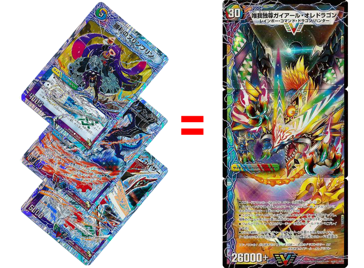
As I mentioned above, Wizards R&D also worked on a second trading card game called Duel Masters. Duel Masters didn't have the tournament issues Magic has, and as such was much more willing to try novel and weird things in their main sets. Inspired by B.F.M. themselves, the Duel Masters design team made cards that you had to put together to make larger cards. They didn't just stop at two cards, though.
Shadowmoor or Less
From time to time, we would bring up the idea of doing a B.F.M.-style creature in black-border Magic. The problem we kept running into was that the official rules had a problem with what half a card meant. We're a bit hand-wavy in silver-border sets, but the tournament rules don't have lots of leeway for fuzziness. For instance, what is the converted mana cost of the left side of B.F.M.? Is it 15 because that's what the cost of the card is, or is it 0 because the left size doesn't have any mana cost? S.N.O.T. introduced a slightly different way to think about the problem. What if cards could individually exist but then snap together when two or more were on the battlefield? That was the path we went down during the design of Shadowmoor.
We called the concept "link." The idea was simple. Imagine you had a 2/2 with flying. Now imagine you had a 3/3 with trample. The idea behind link was that these two creatures could glom together to make a larger creature that combined all their components, in this case becoming a 5/5 creature with flying and trample. Because each creature could exist by itself, it solved some of the B.F.M. issues of what half a card meant. Shadowmoor already had a hybrid theme, so the idea of things blending together felt thematically connected.
Shadowmoor had a lot of mechanical balls in the air, and it became clear early on that link was going to have major rules issue to deal with, so I chose to abandon it. The last important piece of this story was that Shadowmoor was the very first design team that Ken Nagle worked on. No one was more upset than Ken when I decided to shelve link.
Everything Old Is New Again
A number of years later, Ken was leading the design for New Phyrexia. This was the third set of the Scars of Mirrodin block, and it needed to show the outcome of the war between the native Mirrans and the invading Phyrexians. (Spoiler: the Phyrexians won.) The Phyrexians have a flavor of adapting and changing things, so Ken thought this would be a great chance to finally do link.
Ken brought link in pretty early in design, and struggled with it throughout most of the design process. Link was the perfect example of an idea that is simple in concept but troubling in execution. When we explained the basics to playtesters, they had no problems playing with the cards. The problems were more about how exactly the cards interacted with the rules and whether there was clear templating language to communicate it effectively.
Link went through numerous iterations as Ken and the New Phyrexia design team tried tackling all the various issues. Even as the problems seemed to grow, Ken was determined to find a way to make link work. At the very end of design, right before the set was to be handed off to development, Aaron Forsythe, in both his role as senior director of Magic R&D and as New Phyrexia's lead designer, stepped in and killed link, replacing it with Phyrexian mana. Aaron understood the allure of link, but it just had too many problems at that stage to stay in the set.
Double-Face the Music
We finally get to Eldritch Moon design. Ken and his design team were faced with finding a way to bring the influence of Emrakul to life. In addition, as this was an expansion set on Innistrad, Ken had to figure out what to do with double-faced cards. I'm not sure if this is 100% what happened, but if I ever have to write a movie about it, here's the scene in my head:
During world building for Shadows over Innistrad block, someone came up with the idea that two of Avacyn's Angels merge together as one of the effects that Emrakul has on the plane. One of the artists drew a picture, which for this scene you have to imagine Ken holding in his hand. We start with a shot of Ken looking at the picture. We zoom in on his head, as we're going to start seeing his memories. Cut to the design team from the week before, where we decide we like using the double-faced cards as a means of showing Emrakul's influence on the world. Cut to Ken gleefully playing with B.F.M. years before coming to Wizards. Cut to me telling the Shadowmoor design team that I've removed the link cards. Cut to Aaron informing Ken that link has to be removed from New Phyrexia. Cut back to Ken in the current Eldritch Moon design meeting. He stands up and a light emanates from the ceiling, illuminating him. "That's it, " Ken cries out. "We can do it!"
The answer to our problem was this: What if you could play with each card individually, but then when both are on the battlefield at the same time they transform? You could have a card made up of two cards, but that single card would only exist on the backs of the two other cards. Double-faced cards would be the missing piece to the puzzle.
My preview card is one of these meld cards. "Meld" is the name for this "transform into two halves that fit together" mechanic. Note that the set only has three of them (more on this in a second).
Let me introduce you to Midnight Scavengers and Graf Rats.
Click to reveal
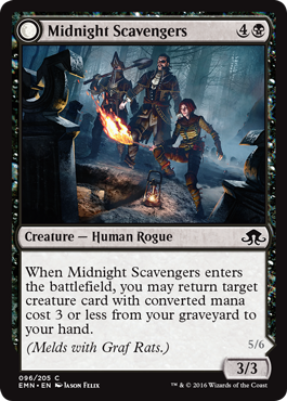
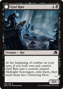
And here's what they meld into—Chittering Host.
Click to reveal
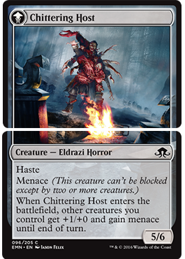
The design team was instantly enamored with the meld cards, but it took some time to convince all of R&D. We experimented with different numbers of meld cards before deciding to have three. We even fooled around with meld cards using more than two pieces, but decided that we should first walk before we ran—and if meld was a success, future design teams could figure out what new things could be done with the mechanic.
Moonset
Our time's up for today and I only got to one mechanic. Fear not, for in Part 2 I will introduce you to the other two mechanics in the set as well as the other themes. As always, I'm eager to hear your feedback through my email or any of my social media accounts (Twitter, Tumblr, Google+, and Instagram).
Join me next week for Part 2.
Until then, may you know the join of making two cards become one.
"Drive to Work #342—Urza's Saga, Part 2"
This is part two of my four-part series on the design of Urza's Saga.
"Drive to Work #343—Urza's Saga, Part 3"
This is part three of my four-part series on the design of Urza's Saga.
- Episode 343 Urza's Saga, Part 3 (16.7 MB)
- Episode 342 Urza's Saga, Part 2 (15.7 MB)
- Episode 341 Urza's Saga, Part 1 (17.7 MB)
- Episode 340 Subtypes (17.0 MB)
- Episode 339 Supertypes (22.5 MB)

