State of Design 2020
Every year in the United States, the president gives what is known as the State of the Union speech, where they talk about the state of the country. When I became Head Designer back in 2003, I decided I wanted to do something similar for Magic, so each August, I write a column that analyzes how the last year of design went. This is my sixteenth "State of Design" column (I started writing the articles in 2005, as that was the year that the first set I oversaw was released.)
Here are the links to the last fifteen columns:
Here's how this article is structured. I'll start by talking about last year's Magic design as a whole, detailing both highlights and lessons of the year. I'll then talk about each booster release (with new content), in order, also giving highlights and lessons.
As always, I begin by asking the same question: how was the last year of Magic design?
It was definitely a roller coaster year with many highs and lows. I think the design went to some cool new places and thrived, but also experimented some and struggled. I call a year like this last one an instructional year in that I walk away from it feeling we learned a lot of important lessons (many of which you will see below) that if implemented properly will improve Magic in the long run.
Overall Magic Design
Highlights
- A lot of Magic was purchased and played.
As someone who's active on social media, listening to the day-to-day feedback of the players, it's easy to get caught up in the minutiae of details and miss the big picture, so I'd like to start there. This last year, more people played Magic than ever before. More Magic product was purchased than ever before. More Magic digital play happened than ever before. Magic, as a game, is thriving. This doesn't mean there aren't issues to address (and I promise I'll get to those), but I do want to take a moment to appreciate that Magic is being embraced and enjoyed by so many people.
- There was plenty of design innovation.
One of the things we always strive to do in design is make sure we're not just repeating what we've done before but finding new ways to innovate the game. This last year has been successful in this venture. From new mechanics like Adventures or mutate to new themes like fairy tales or monster world and new products like Jumpstart, I feel we've done a good job of pushing in new directions and finding new ways for our audience to enjoy the game.
- Booster Fun and collector packs were a hit.
Throne of Eldraine was the start of two new big things. First was Booster Fun where we started making alternative versions of cards—everything from showcase cards with frames that played into the set's themes to borderless planeswalkers that took our most popular card type and made it look extra cool—that players could collect. This initiative has been wildly popular with players embracing the new cards with gusto. We also introduced the Collector Booster, which made collecting all the hard-to-get cards much easier. These have also been a big hit, selling out in every set. It's nice to know that even after 27 years, there's still ways to create extra excitement when players crack boosters.
Lessons
- We had balance issues.
Let me start by stressing that this isn't my area, so I'm not going to dig into the why of what happened. (As I do touch upon below, there are things that vision design did that made balance particularly challenging this year.) Obviously, any year where we have the number of bannings that we've had this year isn't ideal. All I can really say to this lesson is that we're working hard to correct the issues that led to this year's mistakes.
- We need to get better at thinking about the ramifications on all the different formats.
For much of Magic's life, R&D could design cards for Standard and Limited and call it day. Times have changed. From Commander and Pioneer to Best-of-One Standard, Modern, Historic, and all the other formats being played, it has become a much more complex meta-environment for design than it's ever been. We need to adapt how we design to better reflect this new reality. This isn't to say we haven't made a lot of changes, but there's more changes we need to make.
- The year could have been more mechanically cohesive.
We're still adapting to a blockless world. Having a year where every set occurs on a different plane and has a unique set of mechanics is a challenge to creating mechanical flow throughout the year. That is, we want you to have the ability to build decks that can evolve as new sets come out. We experimented with having a couple of themes (monocolor and enchantments, for instance) weaved in through the various sets, but it's still something that I acknowledge needs more work. There are a lot of advantages to not having blocks, but there are also a number of challenges, and this has been the biggest one for me. While we're slowly improving, I feel we still have a long way to go.
Throne of Eldraine
Highlights
- The top-down fairy-tale design was a hit.
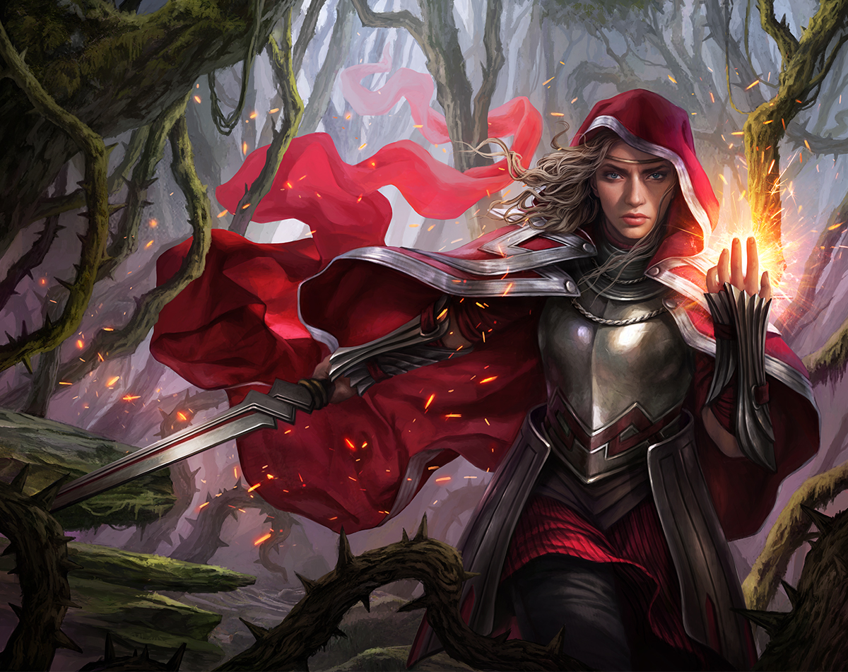
There was some skepticism inside Wizards that a fairytale-inspired set was a good idea. Well, you all proved them wrong. The set was a big hit not despite the fairy-tale designs, but because of them. (The Camelot-inspired stuff was also well liked; it just got less focus from the audience.)
- The audience enjoyed the softer tone.
Part of the worry of doing a fairy-tale theme was that lighter-toned sets did not historically have a good track record. The success of Throne of Eldraine really demonstrated that Magic's audience is growing and embracing a wider appetite for variety, especially things further away from Magic's core of more hard-edged fantasy.
- Adventurer cards were loved.
The mechanic accomplished a number of different things. One, it was fun to play. Two, it was flavorful and allowed a lot of lovable cards. Three, it stretched the design space of how we can do multiple effects on a single card, giving us new areas to explore in future design.
Lessons
- Too many elk
It's hard to talk about Throne of Eldraine without talking about Oko. One of the challenges of making a planeswalker card is designing something that is exciting and evocative without becoming overbearing in gameplay. Oko obviously failed in that regard. The big takeaway from Oko's design is the need to be careful with what kind of effects we do with a positive loyalty cost. We can limit negative loyalty effects, but positive ones can just be done turn after turn. Making things into Elk, for example, needed to be a negative loyalty.
- Adamant was forgetful.
If you ask players to list the mechanics of Throne of Eldraine, everyone will list Adventures, but a lot of people will forget adamant. It's not that it was bad or didn't have a use, but it just wasn't something that inspired any kind of excitement. Looking back, I wonder if we could have found a mechanic for the Camelot side that helped the monocolor theme, but possibly in a slightly more flavorful way.
- Limited was kind of slow.
Another common complaint I got was that the Limited format could get a bit sluggish. Part of this was that Food played a big role and allowed you to gain a bunch of life. A related complaint was that the Witch's Oven/Cauldron Familiar combo involved two uncommon cards, so it showed up a decent amount in Limited games.
Theros Beyond Death
Highlights
- Players enjoyed returning to Theros and liked the things we brought back.
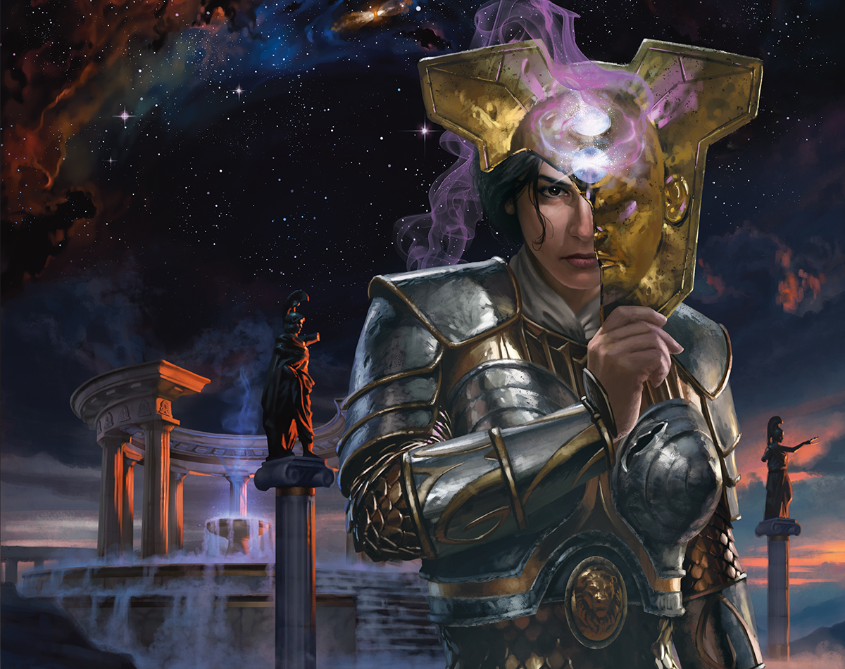
One of the reasons we do returns is many of the players like revisiting worlds they loved in the past, and Theros proved to be no exception. The players enjoyed the mechanics, devotion and constellation, we chose to return. They were excited to see many of their favorite Gods back. They loved seeing Elspeth again. They enjoyed new takes on old legendary creatures. They liked seeing familiar place names in titles and creature types in card type lines. All in all, it seems we did a pretty good job in selecting what you all wanted to see again. (That's not to say we didn't get complaints about what was missing, but more on that below.)
- They also liked the Underworld and escape.
While the players were happy to see us return to familiar territory, they also enjoyed that we explored a facet of Theros that we hadn't during our last visit—the Underworld. The most criticism I got about the Underworld was from players that wanted to see even more of it. In turn, the Underworld mechanic escape was also well liked by most players.
- Sagas were a big hit.
While all the other returning elements were from Theros block, we chose one from a different source, Dominaria. Sagas represent stories, and a top-down world inspired by Greek mythology has lots of stories to work with. Add in the fact that Sagas are enchantments and Theros is an "enchantments matter" world, and they proved too perfect a fit not to use. We ended up giving the enchantment subtype a tiny tweak (some Sagas had four chapters rather than the usual three), and you all were very happy to see and play with them.
Lessons
- We missed some returning things.
The two biggest complaints were the absence of bestow and the fact that we didn't make new versions of all fifteen (well, fourteen—Xenagos died) of the Gods. This is one of the byproducts of a single set returning to a world previously seen in multiple sets in a block. There's only so much space. Did we make the right choices? It's hard to tell as every element has its fans. I am curious to hear feedback (I have links at the end of the article) in what you think we got right and wrong in our choices.
- The rest of the Titans were missing.
Not only were the players unhappy about some of the things that didn't come back, they were also unhappy that something new didn't have everything. The set introduced two Titans (Kroxa, Titan of Death's Hunger and Uro, Titan of Nature's Wrath) that were in enemy colors. That, and the flavor text, implied that there were at least three more. Where were they?
- The story was underwhelming.
When we announced that we were returning to Theros, there were a number of players very happy because it meant the return of Elspeth. When the Theros block ended, Elspeth was killed by Heliod and sent to the Underworld. A return would mean the continuation of her story. Everyone kind of knew she'd get out of the Underworld, but how? That they wanted to see. No book was released, so the weight of the storytelling fell to the cards, and while the story was reflected in the set, it just wasn't a compelling presentation for the audience that had waited so long for the story.
Ikoria: Lair of Behemoths
Highlights
- Players liked the monster theme.
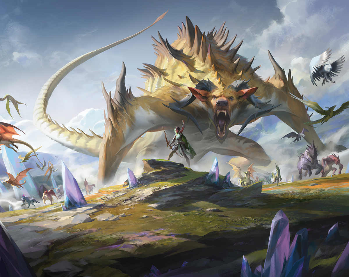
Ikoria wore its monster theme with a badge. There was no missing it. Luckily, the players really enjoyed it. Magic normally has its share of monsters, but it was fun to ramp it up and let the players have the ability to take on the role of the monster with the mutate mechanic.
- Players embraced higher complexity.
We used Ikoria to run an experiment where we ramped up the complexity to a higher level than we'd done in many years. Would players embrace it, or would they reject it? The answer is, for the most part, they embraced it. Mutate, for instance, was complicated, but it was flavorful and it was fun, and the feedback was that while we shouldn't do this type of thing all the time, if we did it on occasion, and tied it strongly to an enjoyable flavor, it was something they'd want to see again.
- Players enjoyed the Limited gameplay.
Of all the sets that came out this year, this was the one I got the most positive comments about the Limited gameplay. The games played out differently from game to game, and there was just a lot of fun things going on.
- Players fancied the tie-in.
Our Godzilla tie-in promotion with this set was us also experimenting with something. (I guess monster sets are fun to experiment on.) How would the audience feel about us reskinning some of the cards with an IP from outside Magic but still something thematically connected to the set? The answer was a pretty positive one.
Lessons
- Companions
This wasn't just the biggest mistake of the set, this was the biggest mistake of the year. We made something that was so environment warping (and not just in one format, but in almost all formats), that we had to errata how the mechanic worked. That's a pretty big mistake. The big lesson here is that while I do want to make sure design has the opportunity to try new and bold things, we have to think about the scope of what we're asking the rest of R&D to sign up for. For example, I think both mutate and companions are things we should have done, but in hindsight, it shouldn't have been in the same set. Part of the job of design is not overtaxing play design, and I believe in Ikoria, that's what we did. We were experimenting with raising complexity for our players. I think we didn't realize we were also raising the complexity for ourselves. While the first was successful, the latter was not.
- Confusion over what kind of monster set it was
While the Godzilla tie-in was well received, I think it had one drawback. Ikoria was designed as a set that played with many different monster tropes. Yes, Godzilla, and his ilk, was one vein of trope space, but it wasn't all we were doing. The focus on Godzilla in the beginning of the previews made players think that we were doing something similar to Rise of the Eldrazi, where the set was all about giant creatures. In reality, it was more about mutating creatures into monsters and bonding with monsters (playing into other monster tropes) than it was about smashing giant creatures into one another. This miscommunication did cause some player dissatisfaction, as they felt we didn't deliver what we promised them.
- Unhappiness about the disconnect with the story
Another common complaint I got was that the cards and the book contradicted one another on several occasions. In the past, we'd had elements in the book missing in the card set, or vice versa, but this was the first set in a while where the book said one thing and the cards said the opposite. We are looking into ways to help avoid disconnects like this happening in the future.
Core Set 2021
Highlights
- Players enjoyed the terminology changes.
The two things that I got the most comments on were Hound changing to Dog and milling finally getting the keyword for which enfranchised players have been begging over a decade. So, yay for the ability of words to excite people.
- Players loved the reprints.
Another big source of positive response was all the exciting reprints in the product (Grim Tutor; Ugin, the Spirit Dragon; Azusa, Lost but Seeking; Solemn Simulacrum; Scavenging Ooze; Containment Priest; etc.). A common reply I got was "do more of this, please."
- Players liked planeswalker vertical cycles and frames.
One of the things we've learned from our Booster Fun initiative is how much players like it when you can imbue a frame with feeling. So, I guess it shouldn't have been a surprise when we took the cycle of five planeswalker cards and made frames to match them that they'd be a big hit. Players also really enjoyed that we made a vertical cycle of the planeswalkers and their spells, which all used that same frame.
- Shrines were a hit.
The most common request I get on my blog is for us to return to Kamigawa. While that's a tall ask, I was happy that we could at least give Kamigawa fans a taste of the plane by creating a brand-new cycle of Shrines. I'm not sure whether they were Kamigawa fans or Shrine fans, or both, but I got a lot of positive feedback on them.
Lessons
- Issues with Teferi
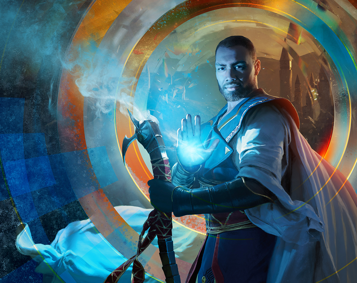
When we first announced last fall that Core Set 2021 would have Teferi as the face of the set, I got a lot of worried comments from the players. You see, there are a number of powerful, but annoying, Teferi cards, so the players were worried that they were in for a bunch more. Part of this was tied to the fact that Chandra, the face of Core Set 2020, had three different planeswalker cards, and there was expectation that we'd do the same thing again.
- Players expected more mechanical ties to the face of the set.
Teferi has one planeswalker card (albeit with a lot of different variants), a cycle of five monocolor legendary creatures thematically tied to him, and a vertical cycle of spells (as do all the monocolor planeswalkers). A lot of players expected more than that. Again, part of it seemed to stem from a belief that there would be three different planeswalker cards of Teferi. (Yes, players were both anxious about and disappointed by there not being three Teferi planeswalkers.) Others compared him to Nicol Bolas when he was the face of the core set. It's led to some interesting discussions about what exactly is the right amount of interconnectivity between a face of a core set and the cards in it.
Jumpstart
Highlights
- Players loved the concept.
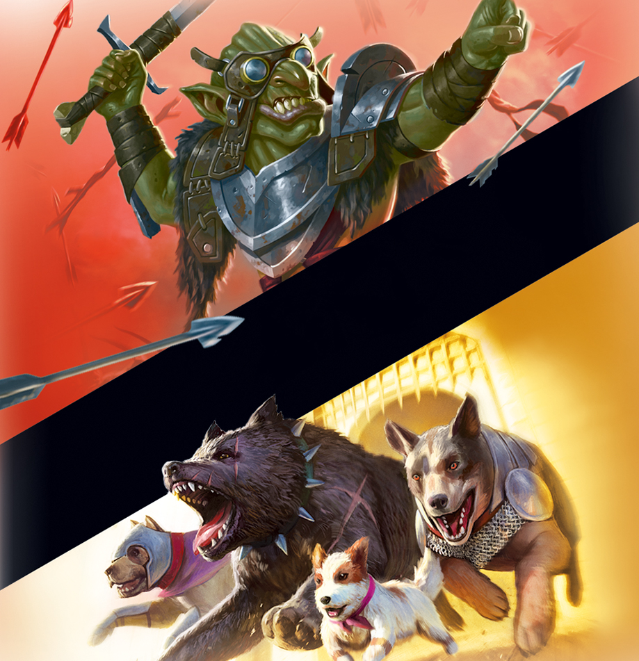
This year has had a lot of successes (and its share of failures), but no single thing has produced more positive comments to me than Jumpstart. I loved the concept the first time I heard Doug Beyer pitch it, and you all seemed the same when you got your hands on it. The newest question I've been getting about Jumpstart is "are you going to do another one?"
- Players enjoyed the variety of themes.
Doug, Yoni Skolnik, and their design teams went the extra length to make a potpourri of cool themes for the product, and you all seem to love talking about them. It's been fun watching the players get a chance to mix and match all the cool themes.
Lessons
- There's not enough of it.
Because of pandemic issues, the first print run of the set was smaller than expected. (There's more coming.) This was the biggest complaint I got about Jumpstart.
- The themes you wanted weren't there.
Magic has a lot of themes, and there were only so many slots. Also, the theme decks have certain requirements that not every theme could meet. That said, I'd love to hear what themes we missed this time around that you all feel should definitely go into another Jumpstart product, if we make one.
A Critical Look
That wraps up my look at this year. From my vantage point, I'm glad we pushed some boundaries and designed a whole of bunch of cool stuff, but I also learned that design has to be careful about when and how it does so.
I'm eager to hear feedback on any column, but especially so from my "State of Design" columns. Do you agree with my take? Do you disagree? If so, about what? I want to know. You can email me or contact me through any of my social media accounts (Twitter, Tumblr, Instagram, and TikTok).
Join me next time for yet more futureshifted cards.
Until then, may you look back at your own year with a critical eye.

