Twenty Years, Twenty Lessons—Part 3

This last March, I went to the Game Developer's Conference in San Francisco and gave a design talk. These last two weeks and today, I've turned this speech into a series of articles (read Part 1 and Part 2 here). This is the third and final article. Obviously, if you haven't read the first two, I'd do that first, as this article assumes you have. That said, on with the lessons:
Lesson #14
The story for this lesson takes us back to April 2010 and the expansion Rise of the Eldrazi. This set was the third in the Zendikar block, but was a large set that rebooted the mechanics. The big reason for this was a major event in the story where the three Eldrazi titans—ancient, mysterious beings—had escaped their prison and now were wreaking havoc on the world of Zendikar. A big part of this set's design was trying to capture the feel of the Eldrazi and their brood. The three attributes that we wanted to convey were that they were giant, alien, and hungry.
One of my Magic truisms is "If your theme isn't at common, it isn't your theme." This meant that we wanted to make sure that the qualities listed above came through on our common Eldrazi creatures. Our story is about one of them named Ulamog's Crusher.
Ulamog's Crusher was giant. It was an 8/8 at common. Normally a creature that size would be uncommon, rare, or mythic rare. It was alien. The card was a colorless creature without being an artifact. It had a brand-new see-through frame and the creature in the art looked quite strange. It was hungry. It had the annihilator mechanic, which caused the opponent to sacrifice two permanents each time it attacked. It was pretty brutal in play. We were convinced we'd made a common Eldrazi that would set the tone for what the Eldrazi were like.
With all sets, we do playtesting where we take Wizards employees from outside R&D who have never seen the cards and watch what they do. Time after time they would get Ulamog's Crusher onto the battlefield and not do anything with it. In fact, this was true for all the Eldrazi. Remember, the colorless ones were all pretty big and had annihilator. They were made to be quite devastating, but the playtesters weren't attacking with them.
Why? Less experienced players tend to be more afraid of making poor choices that cause them to lose their creatures. As such, they're usually more hesitant to attack. Because the Eldrazi are larger, they tend to cost more, meaning that by the time they get out, there's a lot of creatures on the battlefield. It's intimidating to attack with a creature, even an 8/8, that could just be blocked by a lot of creatures and die. But we thought that wouldn't be a problem because attacking with large creatures with annihilator tended to be to the advantage of the attacker. If only the players understood that.
After a bunch of thought, I came up with a solution for our problem. I added a line of text to Ulamog's Crusher.
I made it so the player was forced to attack with Ulamog's Crusher. Now there was no decision. Then, when they attacked, they could see firsthand how powerful it was, and it educated them that is was okay to attack with Eldrazi. The key to getting them over the hump was to force their hand, which leads us to the next lesson:
Lesson #14: Don't be afraid to be blunt
I often talk about how I think of Magic design as art. Artists tend to prefer subtlety. They're taught to show and not tell, that part of what makes art special is that it has a lighter touch. Here's the problem: sometimes subtlety doesn't work. People can often miss the obvious.
As a Magic example, we use keywords as a way to shorthand how players think about mechanics. It helps players know where to focus. Back in October of 1999, we put out the set Mercadian Masques. The set had Rebels and Mercenaries that could tutor creatures out of your deck and Spellshapers that could turn any card in your hand into a particular spell, but in both cases we used creature types as a way to categorize them and didn't give either a keyword. The end result was that players complained that Mercadian Masques didn't have any new mechanics. The association between keywords and mechanics was so strong that when we separated them, the players couldn't see an aspect of the set right in front of them.
Sometimes, to get your audience to understand something, you have to be willing to embrace bluntness. There are a lot of times and places where allowing your audience to figure things out for themselves works wonderfully, but you have to realize that it doesn't always work. Playtesting is key because it helps you understand when your message isn't getting across. I like to think of my creative tools as a toolbox and accept that sometimes I just need a hammer.
Lesson #15
To help you understand the next story, I need to start by talking about the player psychographics. When I first came to Wizards, R&D was very math-centric. They tended to think of the game in terms of numbers and combinatorics. I was interested in approaching game design from a perspective of psychology. What exactly were players seeking to get out of the game? Using a device I learned about in an advertising class, I created three player psychographics to explain why people play Magic. I named the three psychographics "Timmy," "Johnny," and "Spike." (Years later I would make female equivalents—Tammy to go along with Timmy and Jenny to go along with Johnny; I actually knew more females with the nickname Spike than males.)
I've written multiple articles on this topic (the original and the follow-up), but here's the short version:
Timmy/Tammy plays the game to experience something. That might be the adrenaline of playing a big creature, the rush of making something crazy and unexpected happen, or the joy of bonding with friends. Timmy/Tammy plays because of how the game makes them feel.
Johnny/Jenny plays the game to express something. Magic is a game that allows each person great freedom to choose how they play. Johnny/Jenny embraces this creativity because it allows them to use the game as a means to say something (or many somethings) about who they are. Johnny/Jenny plays the game because of how the game allows them to reveal an aspect of themselves.
Spike plays the game to prove something. Magic is a very complex game. It's the perfect vehicle for those who wish to challenge themselves as a means to demonstrate to themselves and/or others what they are capable of. Spike plays because it's a means to test and better themselves.
All of this is important because it's key to the next story, which takes place in October of 2005 with the original Ravnica. In it, we designed the following card:
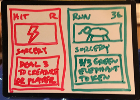
Let's take the three psychographics and look at this card. First off, this card just isn't for Jenny, so we're going to leave her out of it. Timmy looks and sees the coin flipping. Timmy likes coin flipping. It's random and fun and can create excitement. Spike looks and sees the two balanced outcomes. Each one is different but neither is necessarily worse than the other. Knowing when each choice is right requires skill. Spike likes cards that reward skill.
Now let's swap the two attributes. Timmy isn't crazy about the balanced outcomes. Timmy is looking for excitement when the coin is flipped. He wants drama, he wants variance. Spike, meanwhile, isn't crazy about the coin flip. She wants skill to matter and isn't interested in losing because of a random outcome.
So Timmy hated Molten Sentry because it was a coin flip card that didn't create a moment of excitement, and Spike hated Molten Sentry because it took what might be an interesting, skill-intensive decision and left it to randomness. In the end, it was a card loved by no one because in trying to make two different groups happy, it ended up making neither happy. This leads to the next lesson:
Lesson #15: Design the component for its intended audience
When you aim to please everyone, you often please no one. Not all your players want the same thing out of your game. It's important to understand what different kinds of things your players want, so that you can understand what kinds of different players you have. This means when you design any one component, you need to know which part of your audience it's intended for and then design that component for that audience. If other players don't like it, it doesn't matter. It's not for them.
There's a desire when creating something to try and please the widest audience you can, but this has to be done at the macro level and not the micro level. The way you make as many players happy as possible is to understand what audience segments your game has and then make components that speak to each of those segments. It's more important that each type of player enjoys something about your game than it is that they enjoy everything about your game. What this means is when you are working at the micro level on the components, it's crucial to understand who each component piece is for so that you can design it for that audience. Each member of your audience then gets a part of the game that makes them go, "That's for me!"
Lesson #16
The next story takes us back to August of 1999 and the supplemental set Unglued. Unglued was designed to be humorous and rule-breaking and was the first silver-bordered set, a set made specifically not for tournament play. The most popular card(s) in the set was this one:
This card was called B.F.M. (Big Furry Monster) and was so big that it didn't fit on one card. You had to get both cards in your hand and only then could you cast it. The two cards would then go together to make a giant card on the battlefield. A year later, I was working on Unglued 2 (a set that would never get released—you can read about it here and here). I decided if players enjoyed a card so big that it took two cards to make up a single Magic card, what if we went in the opposite directions and made Magic cards so small that two of them fit on a single card? I referred to them as split cards.
Unglued 2 got put on hiatus, and the split cards seemed like they were destined to be forgotten, but a year later I was working on the design of Invasion and it dawned on me that the multicolor block would be a great place to premiere split cards. I showed them to Bill Rose, the lead designer of Invasion, and he liked them so much he put them in the set. I also showed them to Richard Garfield, and he too thought they were interesting. Other than Bill and Richard, though, no one else in the entire company liked them.
On the first day of development, Henry Stern, the lead developer of Invasion, tried to kill them. Other members of R&D tried to kill them. Brand tried to kill them. I should stress that everyone had the game's best intentions at heart. People were worried that split cards strayed too far away from how a Magic card was supposed to look. Others were worried that it would be perceived as us trying too hard. In each case, the person against them truly felt that killing them was the right call.
Bill and I fought an ongoing battle to keep them in the set. Little by little, we won other people over, and by the time the set was ready for print, the majority of people at Wizards were in favor of making them. The split cards released to great fanfare. The audience loved them and in market research they were the most popular "mechanic" in the set.
This story leads to the next lesson:
Lesson #16: Be more afraid of boring your players than challenging them
In my 20 years at Wizards, I've done a lot of groundbreaking things. Every time, someone (usually many people) comes out of the woodwork, full of passion and purpose, telling me all the reasons why the unconventional new thing is a bad idea. "You can't do that!" "It's too risky!" "It will hurt the game!"
I've also created my share of boring mechanics. Yet very few people ever had the passion and purpose to stop me from making those mechanics. Why? Because people fear challenging the players more than boring them, but I think that's backward. When you try something grandiose and it fails, the players forgive you because they recognize you were trying to do something awesome. They respect the attempt. They stick around to see what you'll do next. But when you bore your audience, there's no such forgiveness, because making the same mistake is not the same as making a new one. When you bore your players, they resent you. Sometimes they stop playing.
So as game designers, I think we have it reversed. Challenging the players is not the bigger threat. The greatest risk is not taking risks.
Lesson #17
This story takes us back to October of 2005 and the block of Ravnica, the original one. I knew we wanted a second multicolor block, but it was important that it not be seen as just a repeat of our first multicolor block, Invasion, which had come out to much fanfare five years earlier. I had to find a theme that made sense for multicolor but went in a very different direction than Invasion.
I started by figuring out what the theme of Invasion was. It was "play as many colors as you can." Our first multicolor block had done a lot to push you to play four- and five-color decks, something players up to that time did very infrequently. Okay, I thought, what if I go in the exact opposite direction? What if instead of playing as many colors as possible, I play as few as possible? As I still wanted this to be a multicolor block, that meant pushing players to play exactly two colors (as one would be monocolor).
To maximize options, I made the decree that for this block we would treat all ten two-color pairs equally to allow us as much design space as possible. Brady Dommermuth from the creative team took the idea of ten two-color pairs and came up with the concept of the guilds. That led him to the idea of a city world. I loved the idea of guilds and ran with it, leading me to the four-three-three guild split where each guild only showed up in one of the three sets in the block.
Ravnica came out and was immediately embraced by players. They loved the guilds and the city world. Ravnica went on to be one of the most (and some would argue the most) popular planes we've ever done. And no one ever confused it with Invasion. This leads to our next lesson:
Lesson #17: You don't have to change much to change everything
My metaphor for this lesson is frozen peas. You see, I'm not a particularly good cook, but my wife, Lora, is. So most nights when she makes dinner, I make the vegetables. They're frozen and it's my job to put them in the boiling water. I make various vegetables, but for this metaphor I'm going to talk about frozen peas. You see, it always starts the same. There's a pot of boiling water and I have to put peas into it. I put peas in the pot already, but it's clearly not enough, so I put more in. Still not enough. I add some more. I then look at the pot of peas again and question whether I've really made enough. So I always add a few more in. And then I do it again. This happens more times than I'm proud to admit. In the end, I always make too many peas.
I think many game designers treat new game components like I treat peas. You're never sure if there's enough, so you keep sticking more in. Then, in the end, you have too much and it causes problems. You create extra complexity for your players. You muddy the message of your game. You waste resources you could use later.

So I've begun to approach game design with a slight change in perspective. Instead of asking "How much do I need to add?" I ask "How little do I need to add?" The change in perspective is important because the goal of any game designer (any artist really) is to remove everything they can from their game until nothing more can be removed, until the game only has the elements essential to making it work. In short, you want the right number of peas.
Lesson #18
Every week I write a column. As you're reading it right now, I'm going to assume you're aware of this fact. Some weeks are theme weeks when I write to match the theme. Other weeks are open-ended weeks when I can write whatever I want. Of the two, which is harder to write: theme weeks or open-ended weeks?
The answer is open-ended weeks. The theme weeks force my hand and make me explore options I might not otherwise. For instance, my favorite article I've ever done was called "To Err Is Human," and it was the very first of my Topical Blend articles, where I had the audience provide me with a Magic topic and a non-Magic topic, which I then intertwined in the article. For "To Err Is Human," the Magic topic was my ten biggest design mistakes, and my non-Magic topic was girls. (If you've never had the pleasure to read it, click here.) I would have never written that article on my own. Only by forcing myself into a new area did I create something unique.
This leads us to the next question. Which is harder to design, a themed set or an open-ended set? The answer is the same, the open-ended set. Themed sets push me in new directions that I've never explored before, whereas open-ended sets tend to lead to similar places, areas I've already visited. This leads to our next lesson:
Lesson #18: Restrictions breed creativity
Of all my lessons, this is the one I'm most associated with. In fact, if you're a longtime reader, you've heard me say it many times in this very column. This lesson is tied into a myth about creativity. Many people believe that the more options available, the more creative a person can be. This is a myth because it contradicts what we know about how the brain works. The brain is an amazing organ. It's very smart. When asked to solve a problem, most brains check their data banks and ask "Have I solved this before?" If the answer is yes, the brain solves the problem the exact same way it solved it last time.
Most of the time, this is efficient. It lets you avoid relearning tasks each time you do them, but it causes a problem with creative thought. You see, if you use the same neural pathways, you get to the same answers, and with creativity, that's not your goal. So here's the trick I've learned. If you want your brain to get to new places, start from somewhere you've never started before. That's why I make sure to begin each expansion from a new vantage point. This forces me to think in different ways and create new problems to solve, which results in new ideas and new solutions. What this means is that restrictions aren't an obstacle but rather a valuable tool. You can make use of restrictions to help you be more creative.
Lesson #19
One of my many jobs is acting as spokesperson for the game. I interact with various sources of media, including social media. I'm active on numerous platforms (Twitter, Tumblr, Google+, and Instagram) and have over 80,000 followers. I'm most active, though, on Blogatog, my blog on Tumblr. I've been active on it for four years and in that time I've answered over 60,000 questions. That's a lot of interaction, and it led me to my next lesson:
Lesson #19: Your audience is good at recognizing problems and bad at solving them
My metaphor for this lesson is a doctor's appointment. What does a doctor always do first? They ask you how you're feeling. Why? Because you're the expert on you. No one else better understands how you feel. However, the doctor doesn't often ask you how to solve any problems that you might have because they're better equipped than you to do that. The same is true in game design.
Your players have a better understanding of how they feel about your game than you do. They can tell easier when something is wrong and they're excellent at identifying problems, but they're not as equipped to solve the problems. They don't know the restrictions you're under or what needs you have to fulfill. They see the game from their perspective, but your job is to understand the perspective of all the players. So use your audience as a resource to help figure out what is wrong with your game, but take it with a grain of salt when they offer you solutions.
Lesson #20
For my talk, I put all my lessons up on the screen.
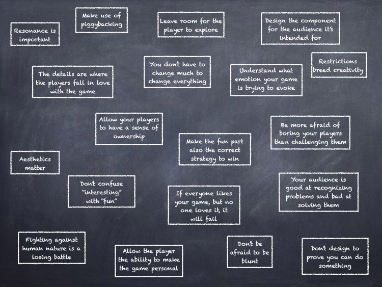
As I looked at it, I started to realize something important. These lessons didn't really stand alone. Thinking about one lesson often led me to thinking about another. Wasn't giving players a sense of ownership playing into basic human nature? Doesn't being more willing to challenge your players increase the possibility of making them fall in love with it? Aren't the details yet another thing for players to explore? If you stop confusing "interesting" and "fun," doesn't that make it easier to make the fun part the correct strategy to win? The more I looked, the more I found connections.
And that's when I realized my final lesson:
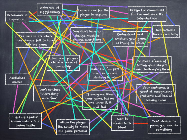
Lesson #20: All the lessons connect
As I examined each lesson, I began to see that they existed in relation to one another, and that's when I realized that they weren't separate lessons after all, but rather a large web of connected lessons. I thought of changing my panel name to "20 Years, One Very Complex Interconnected Holistic View of Game Design," but I decided it wasn't as catchy.
And that was the final lesson: that everything I've learned all clicks together.
20 Years in the Making
I hope you've enjoyed this column-version of my talk. As I said in the first part, my talk is freely available on YouTube, so give that a look if you're interested. Response to the talk has been phenomenal, but I'm still interested in your feedback. What did you think of it? You can let me know through my email or any of my social media accounts (Twitter, Tumblr, Google+, and Instagram).
Join me next week when Eldritch Moon previews begin.
Until then, may my 20 lessons help you learn some new ones of your own.