Scary Stories, Part 1
Every set I always like to have a column or two to share stories about individual cards or cycles. Usually when it's a set I lead, I have more stories which means this series of stories is going to be a two-parter. As I started to write this I realized I had one small problem: You're just seeing the full set today. To solve this, I am going to tell stories in Part 1 about cards that had already been previewed and then in Part 2 I'll tell stories about the rest of the cards. If this sounds good, read on. If not, perhaps I can interest you in perusing the complete Card Image Gallery.
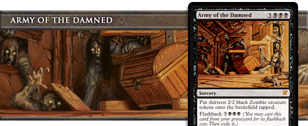

In my preview article when I introduced this card, I talked about how it got created, but I left off an important little factoid. When the design team made the card it created twenty Zombie tokens (and yes, it had flashback—I'm one of a handful of people who had the chance to make forty zombies with the card). We really liked the feel of it just spilling out a crazy number of Zombies.
The development team realized through playtesting that twenty was too many. Tom LaPille (who was on both the design and development team) came up with the idea of changing it to thirteen, as the number had become a little theme we had thrown in the design. (More on this in a bit.)
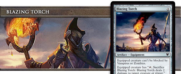

The key to finding a good reprint is to find a card that feels like you would have made it for the set if it didn't already exist. My favorite story about this card is this exchange of emails: (paraphrased because I'm horrible at finding old emails)
Email from Brady Dommermuth, Magic creative director: Would you mind taking the word "vampire" off of this card? The Creative Team has been fleshing out vampires, and we're not sure we want them to be vulnerable to fire.
Email from Me: You do understand that this card is a reprint.
Email from Brady: Well, crap. Okay, we'll live with it.
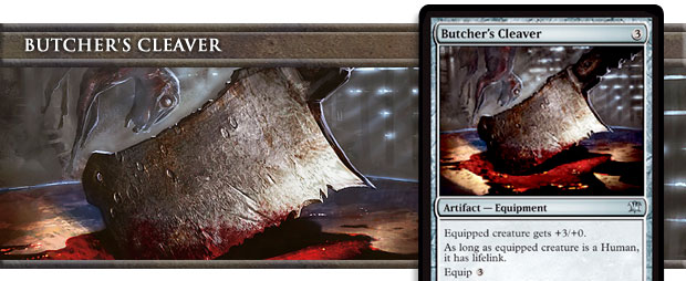

This card was called Butcher's Knife in design. The key we found to doing Equipment in Innistrad was that it mostly had to be things that had a purpose other than being a weapon. In horror stories, the person fighting the monsters seldom plans to fight them, so they always grab whatever thing they can find nearby to turn into a weapon. We tried hard to hit as many "ordinary object as a weapon" horror tropes as we could. Butcher's Cleaver was definitely one we knew we had to have.
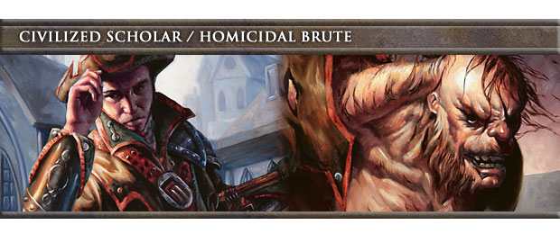
As soon as we committed to finding a way to do transformation, I knew we were going to do a Dr. Jekyll / Mr. Hyde card. The trick was figuring out how exactly to do it. I started with the following. Dr. Jekyll would be small and have a  activated ability. I wanted him to feel like a scientist. This also meant that he'd be blue. I wanted Mr. Hyde to feel like a brute, which meant that he was going to be about attacking. He would be much bigger and be red.
I knew I wanted Civilized Scholar's activated ability to give you the ability to transform into Homicidal Brute. I started with a looting ability because I knew the player would have the option to choose what to discard. The earliest version made you discard a land to transform, but that version ended up playing poorly. You were encouraged to throw away land early to get in 5 damage which often led to a frustrating game as you denied yourself mana. My first change was to change the trigger from discarding a land card to discarding a creature card. The change worked well, and we never went back.
The Mr. Hyde side pretty much stayed as its first incarnation (the stats might have been tweaked slightly). I liked the idea that what changed Mr. Hyde back into Mr. Jekyll was him calming down. (Perhaps some of my Hulk influence is showing—and yes, if you never got it, the Hulk is a Dr. Jekyll / Mr. Hyde trope.) The only change we made to Homicidal Brute was, interestingly made to Civilized Scholar: we added an untap to the transformation into Homicidal Brute so the Brute could attack that turn.
I'm very happy with how this card ended up.
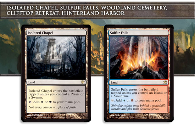
I have gotten quite a number of people asking what this cycle is doing in the set as the tribes are all allied colors. The answer is that Ramp;D has to think bigger picture than just any one set. Magic needed enemy-color dual lands, and the enemy versions of the M10 lands seemed like the right version. Erik Lauer is responsible for making sure that things work out through multiple sets, like distributing the right mix of lands across the sets. Erik had figured out that this cycle needed to go somewhere in Innistrad block.
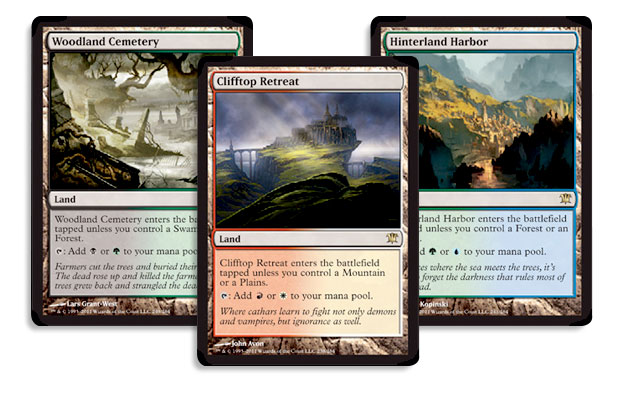
The problem, of course, was that the way the design ended up going was that it had a strong ally-color theme. Erik and I talked about it and came to the conclusion that the cycle was important enough that it had to go in even if it was an awkward fit. As the lead designer of the set, I handed over the set without the lands but identified what could be taken out to put them in. I knew development was going to swap them in, but I felt I should make the statement that design-wise the cards didn't belong.
To help out with this problem, Erik agreed to leave in another rare land cycle we had designed in the set.
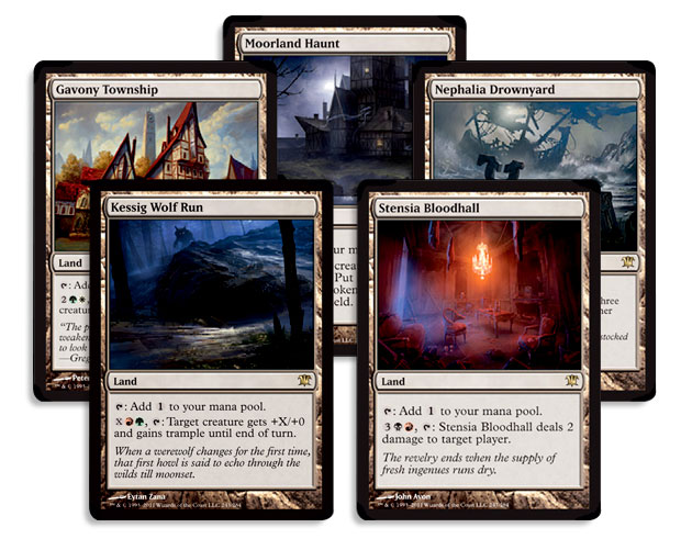
This cycle of lands was created specifically to show off the "home" of each of the tribes. The key to their design was that they each wanted to play well within their tribe but not be so parasitic that they couldn't be played outside the tribe. For example, the Werewolf tribe really needs something useful to do with its mana when it's not casting spells (to change the Humans into Werewolves). Kessig Wolf Run allows that, but in a way that could be useful to any generic red-green deck.
I was happy with the compromise, which allowed everyone to get what they needed and for the set to feel like a cohesive whole design wise. For those who have been asking if the enemy dual lands hint at some shift towards enemy colors later in the block, my answer is no.
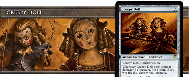

I'm not sure how many Magic cards have been inspired by a song, but I do know how many I've designed that have been: One. This one. "Creepy Doll" is a song by a singer named Jonathan Coulton. If you've never heard it, then you are in for a treat.
You can download the song as a free mp3 courtesy of Coulton, and head to his official site to hear more of his music. (Fair warning, though: it's not all work safe.)
It turns out that both Tom LaPille and I are fans of Jonathan Coulton, so when we started design, he and I agreed that we had to make a card called Creepy Doll. It's a horror trope and seemed like a great artifact creature.
I knew when I designed it that it had to be indestructible. A major part of the trope is that it's impossible to destroy the doll. In fact, usually the first part of the story is the protagonist trying every way imaginable to get rid of it only to have it keeping coming back. I knew I wanted the doll small, so I made it a 1/1. The reason it wasn't a 0/1 was that I added deathtouch to it to try and make it scary.
Deathtouch, unfortunately, made the card a little too daunting. How do you handle a creature that's indestructible and kills everything it fights with? You stop attacking. The key to solving the design was to go back to the trope. Creepy Dolls are very scary because they make everyone nervous. How could I create that nervousness on the card?
The answer ended up being to make the effect of the creature less of a known quantity. The unknown is scary. If you know when you attack that one of your creatures is going to die, you prepare for that eventuality. The acceptance makes it much less scary. But not knowing whether or not something is going to die? That adds tension. I really enjoy how this card does in the game exactly what it does in the trope: it makes you nervous.
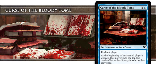

The big fight about this card is that it was the only curse that you clearly often want to enchant yourself with. Some people in Ramp;D felt none of the curses should do that, but we argued that the effect clearly feels like a downside even if there is a way to exploit it. The majority agreed with us, and the card stayed as design wanted it.
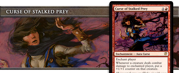

This curse was originally in green and was called Tastiness Curse. When development put the Slith ability (Ramp;D slang for getting a +1/+1 counter when the creature deals combat damage to a player) on the vampires, they moved this curse to red, because it felt like you were granting that ability to all the creatures of the enchanted player's opponents. While I understand the decision, this card will always be Tastiness Curse to me.
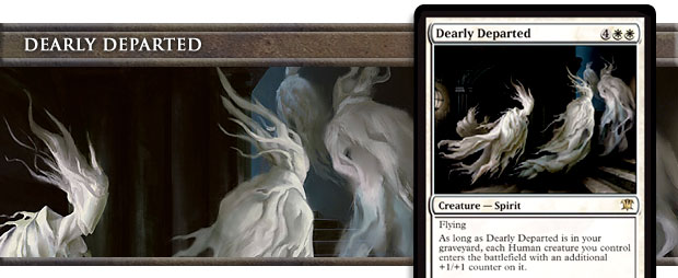

This card started out with us trying to make ghost tropes. I liked the idea of an ancestor (remember, white has the nice ghosts) that inspires those it left behind. Also, I wanted to have a few cards that had an effect while in the graveyard.

We knew we were going to have monsters in the set so we felt it was important to have monster hunters. To do this though we needed a way to reference the monsters. We toyed with the idea of a monster subtype but we felt it would be weird that vampires and zombies from this set were monsters but not from any previous set. In the end, we decided to just name the monsters. As I explained two weeks ago, ghosts (or Spirits) were added in as a tribe later so when we first made these cards, monsters were "Vampires, Werewolves, and Zombies." When ghosts were upgraded to a fourth tribe we decided to leave them out, partly because three felt like the right number and partially because half of the ghosts, the white half, were benign.
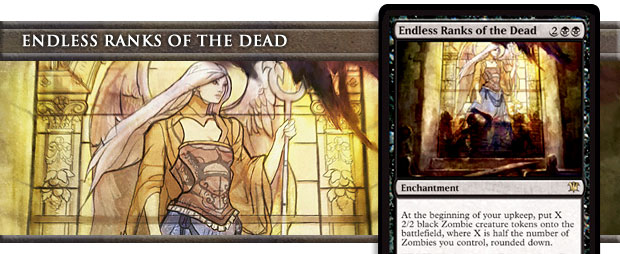

This is the Zombie card that I'm proudest of having designed. As I explained a few weeks ago, I very much wanted to create a Zombie deck that acted like the Zombies in the movies. To do this, we needed a lot of ways to have the Zombie deck grow with time. This card came from me wanting to cut out the middle man and bring on the Zombies.
The card stayed mainly as I designed it, with one big change: I created the card to be an uncommon. It was one of the "build around me" uncommons I created to encourage some tribal drafting. The idea was you opened this card and it said, "Hey, draft Zombies!" Unfortunately, the card proved a little too good in Limited and the development team had to move the card up to rare.
This card, by the way, has my absolute favorite art in the set.
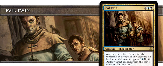

I don't remember which member of my team designed this. The very first time I saw this card, I just put it in the file. This is top-down design at its best.
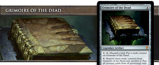

It's time to play "Guess this card's original design name?" also known as "Guess this card's horror trope?" Ready.
Click here when you have a guess.
Necronomicon, a.k.a. the Book of the Dead. This card was designed top down to capture the flavor of the Necronomicon. In the design, the counters were called insanity counters, as the Necronomicon was suppose to drive people mad. The discarding cards cost was playing into this madness theme.
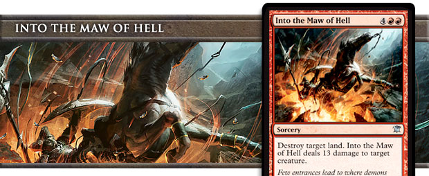

A number of people have asked me what's up with the thirteen theme in the design. The number thirteen has long been considered unlucky (there are a number of theories as to why), and as such has worked its way into many horror stories.
The cause of the thirteen theme began with this card, designed by team member Jenna Helland. The card was originally called Enter the Hellmouth. (The Hellmouth was the name for the entrance to Hell in the television show Buffy the Vampire Slayer.) The team loved the card, so I put it into the set. This card got us starting to think about the number thirteen, so whenever we found an appropriate place for a thirteen, we used it.
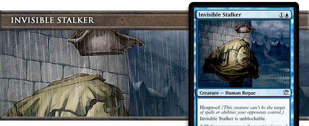

Yes, the Invisible Man was on our original brainstorming list.
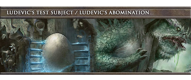
The original playtest name for the back face of this card was Mutant Octopus. It seemed like the perfect name for a 13/13 trampler.
A number of people have asked why we bled trampling into blue. My response is that trample has always been allowed on humongous creatures of any color, and that blue actually has a history of giant trampling serpents-like creatures.
Originally, the card entered the battlefield with five counters and you removed them. The idea was to pull the card away from the level-up mechanic from Rise of the Eldrazi. We ended up swapping the order because we wanted the card to work with proliferate.
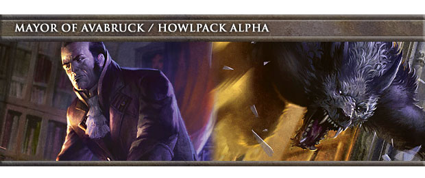
This card came about because I loved the idea of a Human lord that turned into a Werewolf lord when it transformed. The thing I love about this card is that it can help your Werewolves no matter what state they're in, as long as it's in the same state.
Exclusive Innistrad Prerelease card available while supplies last. |
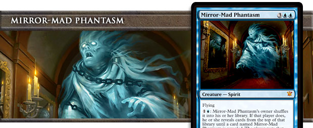

This is a Richard Garfield design. Richard's originally version triggered upon dying, but that caused some rules murkiness, so the development team changed it to an activated ability. I love that this card is very flavorful yet plays so different from anything else you've played—or did I already say that when I said this was a Richard Garfield design?
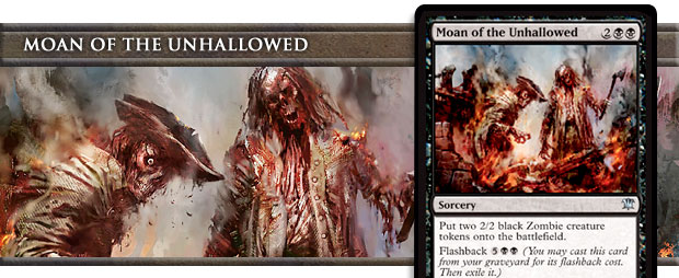

Let me answer the question I keep getting on this card. The card makes Zombies. Why isn't it a tribal sorcery – Zombie? The answer is because we decided not to use tribal (I'm talking about the card type here) in Innistrad. But if a set with a strong tribal subtheme doesn't use it, when would it ever get used? The answer is never. Yes, I am announcing the probable death knell of the tribal card type. (I could imagine a specific use, like the Eldrazi spells in Rise, that might pull it out of mothballs.)
So what happened? Let's flashback to Innistrad design. As I was doing a set with a tribal theme, I used the tribal card type wherever I could. Moan of the Unhallowed, for example, was a tribal sorcery – Zombie. The problem was that it's very hard to draw the line. If a set uses tribal then it wants to go on any card that has a definable flavor. As this set is top-down, that meant that a majority of the noncreature cards were using the tribal card type.
The end result was that the cards were getting wordier but it seldom mattered. Most tribal (theme) cards cared about creatures and so weren't applicable to be tribal (type) cards. The one big exception was Zombies as there are multiple ways to get Zombie cards out of the graveyard, thus I believe the reason that I keep getting asked the question on this card.
We playtested with tribal, and I kept getting the same note that it seldom seemed to matter. In the end, we made the call that it wasn't adding enough to the game play to offset its inclusion, which both made the cards wordier and caused more confusion.
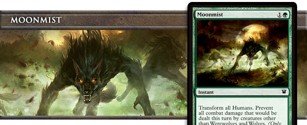

One of the challenges of designing Innistrad was making the tribal component relevant without making it mandatory. I didn't want this set to be like Lorwyn, where you were forced to pick a tribe, but at the same time I wanted someone who wanted to draft a tribe to have some ability to do that.
One of the keys to doing this was to keep the tribal cards out of common. We designed some very strong tribal cards and then put them at uncommon, the idea being that if you open them, they might lead you down a tribal path. I decided that I did want to do a little tribal at common, but I wanted to make sure the cards had uses beyond their tribal component.
This card came about because we were trying to find a way to help the Werewolves. I'm not sure exactly how the pieces all came together, but I needed a Fog variant, and it dawned on me that when the fog comes out it's a lot like night in that it gets very dark. I had wanted the Werewolf enabler in green, so everything worked out perfectly.
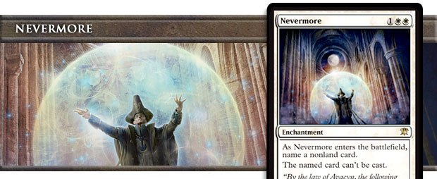

Most of my teaser clues about Innistrad have been solved, but one still seems to be causing discussion. Which card was inspired by a white Un- card? The answer is that Nevermore was inspired by this card:
During Innistrad design, I was making curses, and I thought it might be fun to turn Look at Me, I'm the DCI into a curse. I eventually removed the card from Innistrad because we decided at one point that to play up the plight of the humans against the monsters that we'd keep the "evil" parts of the design out of white.
Several months later, Erik Lauer is telling me that he wants to find a way to do in white what Cranial Extraction does in black. Cards like this are good safety valves to make sure that there are answers to environments if a particular card ends up too strong. I tell him that I have already made the card and that it's a 99 in the Innistrad file. (Cards that have been kicked out a file get their codes changed to 99 so that we can see what's been removed in case we want to put it back in.) Erik, as lead developer of Innistrad, put the card back in the set, but turned it from an enchant player (as all the curses are) to a general enchantment.
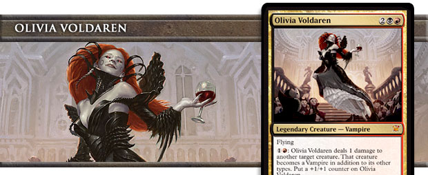

This card came about because we were trying to make awesome mythic cards for each monster type. This card was created because we were trying to capture the "feed on them or turn them" dilemma that vampires constantly face. There was a lot of debate on this card, but I'm happy with how it ended up.
Some people seem confused about the art of this card. Olivia is grabbing a piece of her dress and pulling it up with her fingers. The confusion is that you can't see the back fingers holding the cloth. The artist kept the visible fingers straightened, as a balled fist holding the fabric would not have been elegant. That's all that's going on.
For many years I worked at the Pro Tour running the feature match area. Often pro players would come up and ask me trivia questions (I used to run a trivia game show at the Pro Tour). I learned quickly that any time the answer to a trivia question was a pro player, the answer was always the person asking the question.
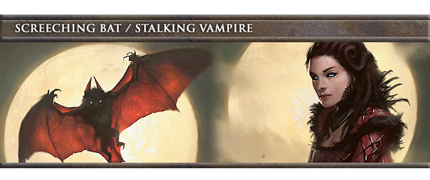
On an unrelated note, what was the first double-faced card to be designed? Yes, Screeching Bat / Stalking Vampire. While we knew we wanted Werewolves on double-faced cards, it took a while to figure out how exactly they would change back and forth. (More on this in two weeks.) As such, the first trope I made a double-faced card out of was the "vampire turns into a bat" trope. The key to the design was making sure that each side had something you wanted, because the card could change at will. The cleanest answer was to have one side be bigger but the other to have evasion. In the end, we settled on a 5/5 and a 2/2 flier.
Originally the card could change at instant speed, but that ended up making very complex game play as you had to always factor in what it could change into. We moved the change to an upkeep trigger to keep the feel that you controlled the change but make it easier to manage (and less powerful—turning your 2/2 flier into a 5/5 after the card wasn't blocked was a beating).
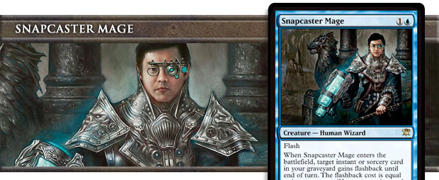

This card is Tiago Chan's prize for winning the last Magic Invitational. That event was held back in October of 2007; what happened? Why did it take so long to make it to print? There are a number of reasons. First, Tiago's original card submission didn't turn out to be printable:
Denying Channel
Land
T: Add 1 to your mana pool.
2UU, Discard Denying Channel: Counter target spell
It turns out an uncounterable counterspell that also doubles as a land is not even close to something we could make. We originally tried to get a variation of this land into Zendikar. We figured a cool new land would be right at home in the land block, but we never could get anything to work.
Tiago then moved to China for a while, where he was out of contact. When he returned we contacted him, and developer Zac Hill and I helped him come up with a new card idea. That card went through various changes, but at one point allowed you to cast an instant or sorcery from your graveyard. Realizing that we could accomplish this through flashback I put the card into Innistrad.
We try to make the Invitational cards good enough to see tournament play, so the card went through various changes in development (Tom might one day tell this story), but it made it out and finally has seen it to print. Tiago, congratulations! I hope you enjoy your card.
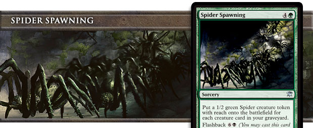

I made a list of token types we wanted in this set. While we didn't end up getting to make all the creepy crawlies I listed, I'm glad spiders made it. The original Spiders were black 1/1s, but everyone said that players would expect them to be green and have toughness greater than power and have reach. Sensing that this wasn't something we were going to overcome, I gave in to the "greater spider power."
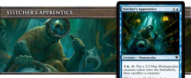

This card's design is my Johnny showing. I love making cards that seem weird but just have numerous ways to use them when you think about them.
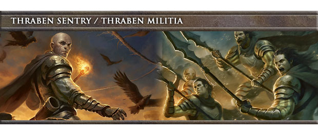
This is the only double-face card to change trope from design. The original version of this card was a bunch of villagers that turned into an angry mob when someone died. We had too many angry mobs, though, and this card got changed to a different concept.
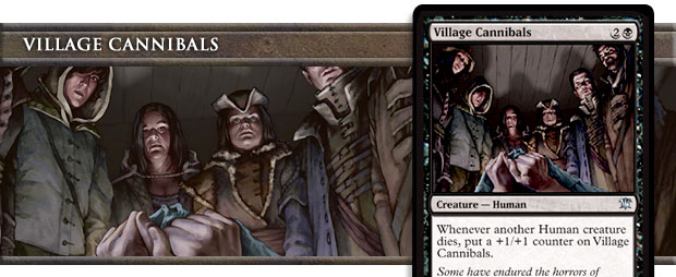

My vote for the creepiest art in the set. Once we knew we were doing Human tribal, this card showed up quickly thereafter. If you like it, odds are you're going to enjoy Dark Ascension.
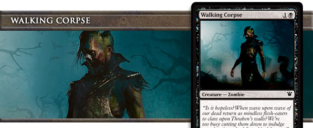

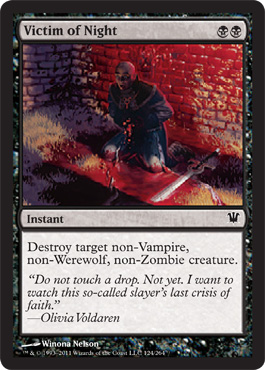
Another question I've gotten numerous times is why we didn't include Headless Horseman (originally printed in Legends). The card is not only a horror trope, but even a Zombie, one of the major tribes of Innistrad. The answer is we did put it into the set. The very first playtest included it and it stayed in for months. What eventually caused its demise was that the set was in desperate need of a two-drop Zombie. Other cards were examined for tweaking but Headless Horseman proved to be the easiest change, and thus Walking Corpse was born.
This card actually caused quite a bit of discussion for Ramp;D, as we've never done a black "Grizzly Bears" before. After much talking, it was decided that black should be able, some of the time, to get a two-drop vanilla 2/2.

- And Scene...
That's all the stories I have for today. Join me next week when I'll share some stories about the rest of the cards. Have a great time at the Prerelease!
Until then, may your job create as many interesting stories.


