Get It?

It's Unglued Week here at magicthegathering.com and I realized I had too many article ideas to fit into my column. So, I convinced our illustrious editor to allow me to write the feature article for this week. And I'll probably use some of the ideas for Magic Arcana. And perhaps some for Card of the Day. Maybe I'll even work some into Ask Wizards. Why am I doing so much for Unglued Week? Because I love Unglued.
Unglued is my personal favorite set. It was the set that allowed me to bridge my old life (as a comedy writer for those that haven't picked up my subtle clues) and my new life (as a Magic designer for those new readers to the site). And it's the set I'm proudest of from a design standpoint (although Tempest and Mirrodin will always have a warm place in my heart). But enough about the design of Unglued – that topic's for my column this week.
The feature article is about the humor of Unglued. You see, when I was putting together Unglued, I decided the following should be true:
- We needed to play with/make fun of every aspect of the game.
- Any aspect of the card was fair game to use to make jokes.
- We needed to cram as many jokes as we could on every card.
This meant everyone involved with Unglued was told to take every opportunity to add jokes to the cards. The designers, the artists, the creative text guys, the graphic designer . . . everyone. Everyone involved was stuffing as many jokes as possible into every card. The result was that Unglued was a set where players really had to study the cards. There are jokes pushed into every nook and cranny.
Flash forward to the design of Unhinged. One day, we (the design team – Randy Buehler, Brady Dommermuth, Brandon Bozzi and myself) were sitting around talking about Unglued cards. I don't remember the card, but I talked about some obscure joke on the card that I liked. And Randy went, “What?”
I explained the joke and Randy informed me that he had never noticed it. So I started mentioning some other obscure jokes and about half of them Randy had not realized. Then it hit me, while I'm sure every joke was noticed by someone, there are probably very few people that noticed all . So I thought it might be fun to do a feature article where I point out some of the more obscure jokes.
So here are 100 of the more obscure Unglued jokes. I've included some that might seem obvious, but I've learned that what's obvious to one person might not be obvious to the next.
- The flavor text for Ashnod's Coupon was copied (and modified) from actual contest rules text. Wizards of the Coast had not yet been bought by Hasbro (whose corporate offices are in Rhode Island), so the Rhode Island reference was actually not a joke about Hasbro. An interesting piece of trivia: the original illustration for Ashnod's Coupon had the card text written on the coupon. We removed it as the coupon was not supposed to represent the Magic card.
- The name BFM is an homage to the computer game Doom.
- BFM's earrings are Polar Kraken and Phyrexian Dreadnought, the two biggest creatures in existence at the time.
- The flavor text for BFM is a parody of the flavor text for Ice Age's Polar Kraken.
In the art for Blacker Lotus, the Black Lotus is pictured next to the Blacker Lotus to demonstrate how much bigger (and thus better) the Blacker Lotus is.
- Bronze Calendar is a parody mechanically (and in name) of The Dark card Stone Calendar.
- Bronze Calendar is really a Bronze Colander. This is a joke at the numerous times artists have misunderstood the art description and drawn the wrong item. The Hyalopterous Lemure (a lemure is a ghost, the picture shows a lemur) is the best example of such a real goof in Magic.
- Bronze Calendar's flavor text makes fun of a certain style of flavor text where we sound lyrical but aren't really saying anything. Also, it reinforces the calendar/colander joke.
- Bureaucracy's art is “held up with red tape."
- The seal on the desk in Bureaucracy's art is a maze.
- The text in Bureaucracy refers to Richard's Rules of Order. Robert's Rules of Order are a set of rules for parliamentary procedure. But Magic was designed by Richard Garfield, so it was changed to Richard's Rules of Order.
- The title Burning Cinder Fury of Crimson Chaos Fire is making fun of all the words we overuse on red cards.
The armor in the art of Cardboard Carapace is made of Magic cards. For some reason, a lot of people seem to miss this.
- Cardboard Carapace has errata stickered on the card. This is playing into the fact that R&D has errata-ed cards before they were even playable. The most famous example of this was the Mirage card Daring Apprentice that had errata after the prerelease but before the set's release (it needed to say the ability could be played as an interrupt – it made sense back then).
- The flavor text behind the sticker on Cardboard Carapace says something akin to: There's nothing all that exciting about the flavor text behind this sticker.
- One of the staples of comedy is what is known as "breaking the fourth wall," where the people telling the jokes make it clear that they understand that they are part of the joke and that they understand the medium in which they appear. In Unglued, we did this by featuring Magic cards in the art. Cardboard Carapace is one of four cards to do so. (The others are Chaos Confetti, Ghazban Ogress, and Jalum Grifter.)
Censorship has a censored art box, text box and artist credit. The art for Censorship was a cropped piece of art from the Exodus card Keeper of the Mind. Matt Wilson, the card's illustrator, was then Magic's art director and thought the use of censored art on Censorship would be funny.
- Chaos Confetti is referencing one of the oldest Magic urban legends. As the story goes, some poor Magic player was in a tough spot in the finals of a tournament. All looked lost until he drew his Chaos Orb. Everyone looked on as the player ripped his Chaos Orb into tiny pieces. He then tossed it over his opponent's cards and destroyed all his permanents. This, of course, allowed him to win.
- The illustration of Chaos Confetti is a parody of the card Chaos Orb.
- All the cards that require a player to put them on their body (Charm School and Volrath's Motion Sensor) have a card type of “Enchant Player.”
- Notice the chickens adorning the robe of the woman balancing the book on her head in Charm School's illustration.
- The Chicken a la King has a childhood picture of himself in the background: an egg.
The Chicken a la King's flavor text makes reference to the expression “running around like a chicken with its head cut off.” While this seems obvious to me, I've had questions about what it means. This is, incidentally, my favorite piece of flavor text in the set.
- Chicken Egg's illustration is a parody of the Arabian Night's card Rukh Egg. Both are illustrated by Christopher Rush.
- The flavor text for Chicken Egg references a very popular “flavor text” character: Ice Age's Jaya Ballard. This was the card by the way that caused the greatest schism in the flavor text team as the team fought bitterly over two pieces. The losing piece: The egg cracked. The colonel cackled. Years of secret lab work finally paid off. It was ultimately rejected for feeling too much like the cartoon The Far Side. My response was, “Far Side's funny. What's wrong with feeling like something that's funny?”
- Clam Session's mechanic makes you sing six words of a song each upkeep. Note that the flavor text is exactly six words long (and a parody of the song “Duke of Earl.")
- Clam-I-Am is a parody of Sam-I-Am one of the main characters of the Dr. Seuss book Green Eggs and Ham. The illustration by Randy Elliott is a parody of Dr. Seuss. The flavor text was also written in the style of Dr. Seuss. And no, neither “scootered” nor “skittled” are real words.
- The illustration and flavor text of Clambassadors is a parody of the Mirage card Reparations.
- A clay pigeon is a small round disk made out of clay used for targeting practice. Our Clay Pigeon is a pigeon made out of clay. If the card were made today, it would be Artifact Creature – Bird. If you're wondering why it was called Clay Pigeon, originally the card allowed the other player to throw cards in the air to try and keep you from catching the card (they were shooting down your Clay Pigeon). This text was removed when Mike Elliott demonstrated the “throw the card at your opponent's face as a means to distract them” technique.
- Note that the reference to Magic in the flavor text of Common Courtesy is bolded as the card has a pun involving the game of Magic: the Gathering. (Magic is also bolded when we reference it.)
The card Deadhead makes several subtle allusions to the band The Grateful Dead (note the capital D in the flavor text). Fans of the band are known as deadheads.
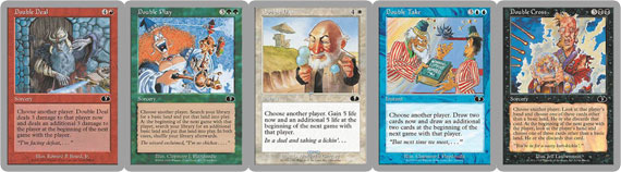
- The crystal ball in the illustration of Double Cross shows the wizard being hit a second time in the future.
- In the art for Double Deal, the wizard being attacked has injuries showing that he'd been attacked earlier.
- In the illustration for Double Take, the character on the right is being visited by a future version of himself. Besides giving him a book on winning lottery numbers, he is giving him a Black Lotus (a real one).
- The flavor text for Double Play manages to get the word “chicken” into flavor text.
- If you read the flavor text of the Double cards in the following order – Double Dip, Double Play, Double Deal, Double Take, Double Cross – you get the following limerick (note how the lines were chosen to match the cards they were on):
In a duel and taking a lickin'… (the figure in the art is eating ice cream – licking, get it?)
The wizard explained, “I'm no chicken…” (the figure appears to favor pigs and dogs)
“I'm facing defeat…” (the figure has already been beaten up)
“But next time we meet,…” (the figure is being visited by an older version of himself)
“You're in for a nasty butt-kickin'.” (the figure has clearly had his butt kicked)- The Elvises in the background of Elvish Impersonators are young Elvises. Elvish Impersonators' artist Claymore J. Flapdoodle (who I agree blatantly rips off Phil Foglio's art style) originally drew the art with a young Elvis. I made him change it to the older Elvis as I thought more Elvis Impersonators do old Elvis. Plus, old Elvis is funnier. He put the young Elvises in the background as a nod to his earlier version.
- Flock of Rabid Sheep's flavor text is making fun of yet another overused style of flavor text that explains a creature through sound (complete with onomatopoeias).
- Fowl Play's flavor text is one of the few non-Magic references. “I Feel Like Chicken Tonight” was the slogan for a brand of chicken sauces.
The leprechaun being knocked out of frame in Free-for-All is knocked into I'm Rubber You're Glue (the card next to it on the Unglued rare sheet).
- While many people notice the fight on Free-For-All, they miss the two sides fighting – leprechauns and pink elephants.
- The chicken in the art of Free-Range Chicken is just about to swing on a vine like Tarzan. The artist was trying to show that it was a wild jungle chicken.
- The name Gerrymandering was making fun of Magic's habit of occasionally using very obscure words as card names. Gerrymandering, according to dictionary.com, means “The division of a geographic area into voting districts so as to give unfair advantage to one party in elections. Gerrymandering began its life as a card called Eco Shift in the playtest for Alpha. The one difference is that the change of control was permanent with Eco Shift.
- Notice the hash marks behind the text box on the card Ghazban Ogress. She's keeping score of how the two ogres are doing in their games to see which one she wants to be with.
The flavor text for Giant Fan is making fun of a piece of flavor text from the flop TCG Super Deck. (See, I told you there were some obscure jokes you might not have gotten.)
- While everyone notices the Giant Fan blowing the people out of the art, some don't see that it's also affecting several other aspects of the card (name, mana cost, card type and expansion symbol).
- The flavor text from Goblin Bookie is referencing the flavor text from the Weatherlight card Firestorm: “Glok loved storms! He'd sit an' watch an' laugh through the whole thing. I miss him.”
—Squee, goblin cabin hand- The Goblin Bowling Team is a parody of the then Wizards of the Coast bowling team. (There were some jokes you just weren't going to get.)
- Goblin Bowling Team's flavor text is filled with bowling puns (league, alley, spare, split). My wife Lora, by the way, wrote this flavor text. (Her most famous piece is Robe of Mirrors – “Does this make me look fat?” )
- If you look at their shirts, you'll realize it's Mons's Goblin Bowling Team.
/> The signs in the background read as follows:
1) Leeg Rules
2) Chickens must wear shoes
3) One Wepon ???
4) No Orc Allowed
5) Aim for this (picture of a bowling pin)- Goblin Tutor was designed to answer the question, “Where's the red tutor?” Alpha had Demonic Tutor. Mirage had Enlightened, Mystical and Worldy Tutor. As a result R&D was constantly asked about the red tutor. So obviously, we had to put it in Unglued. While we were making this joke, “real” Magic had to go and destroy it by printing an actual red tutor (Gamble).
- In the flavor text for Growth Spurt, SEM and SEF stand for Single Elf Male and Single Elf Female.
- Notice the personal below the elf personal (“seeks atog prince”) in Growth Spurt.
- Gus is making fun of our practice to name cards that sound like an individual but aren't legends. My stock answer to why Gus isn't a legend is to say, “There are many Guses.” It's interesting to note that Gus and Temp of the Damned were art pieces that had been rejected from previous sets. I combed the file of unused art (called the graveyard) to find pieces we could use for Unglued. These two cards were designed around the art.
- Let's just say that Gwendlyn Di Corci was not chosen at random to be the voice of Handcuffs' flavor text. (I'd advise taking a look at her card in Legends.)
- For a long time, the flavor text team put a four-letter piece of flavor text in every set. Hungry, Hungry Heifer was the last card to do this tradition. It was raised to a giant font to give the tradition a big send-off.
Hungry, Hungry Heifer's name is a parody of the kids game Hungry, Hungry Hippos.
- Hurloon Wrangler's name and art are a parody of the Alpha card Hurloon Minotaur.
- Hurloon Wrangler's flavor text references an ad campaign for Calvin Klein jeans: “Nothing gets between me and my Calvins.” The name of the jeans Didgeridoos references the card Didgeridoo in Homelands that allowed you to put Minotaurs into play from your hand.
- I'm Rubber, You're Glue's name is a reference to an old child's taunt: “I'm rubber, you're glue. Anything you say bounces off me and sticks to you.” Note that the leprechaun from Free-For-All has been knocked into the art of I'm Rubber, You're Glue. When Flapdoodle first illustrated this piece, he just made it a continuation of the fight scene from Free-For-All. I explained that the leprechaun was supposed to be knocked into another card that had nothing to do with Free-For-All. Flapdoodle then drew the current piece of art.
- Note the boot prints behind the text box for Incoming!
- Infernal Spawn of Evil parodies the disconnect between card flavor and art that occasionally happens. The illustration for Internal Spawn of Evil, incidentally, was originally a sketch that illustrator Ron Spencer turned in as a joke for a real Magic card. I thought it was funny, so I designed a card around it.
- Infernal Spawn of Evil's creature type reads “Demon” but is scratched off and reads “Beast." This reflects Wizards' abandonment of the Demon creature type. (For more on this, see my column “Where Have All The Demons Gone?”)
- The Jack-in-the-Mox is wearing a five-pronged Jester's cap. Each prong is of a different Magic color and has the appropriate Mox hanging off it.
- Jalum Grifter is referencing then Magic Brand Manager Joel Mick. He was also referenced on the card Jalum Tome (Jalum is his initials J.L.M. – much like Jayemdae Tome was named after James Michael Davis, former head of R&D). Joel posed for the art.
The name, art, and mechanic of Jester's Sombrero combine to parody the Ice Age card Jester's Cap. Jester's Sombrero is one of the three pieces of Magic art that I personally own (the others being the original Maro and Look At Me, I'm the DCI).
- The Chihuahua from Jetser's Sombrero is a parody of the Taco Bell mascot and his catchphrase – “Yo quiero Taco Bell.”
- The name Jumbo Imp is a play on the phrase Jumbo Shrimp.
- Artist Kev Walker had to call us to illustrate Knight of the Hokey Pokey as the children's dance does not seem to be popular in England (where he lives). This gave us the idea of spelling out the dance in the reminder text. The flavor text references the song that goes with the dance.
- Krazy Kow is a reference to a very old cartoon character named Krazy Kat. The card was designed to be Mad Cow but there was concern that it was insensitive to the victims of the Mad Cow outbreak in England, so the name was changed. Note that Mad Cow makes the secret message of cards we couldn't print.
- The flavor text for Lexivore is as follows: “Plucking the chicken – Elvish expression meaning 'flinging the monkey.' " The flavor text is making fun of a flavor text convention overused in the Mirage block. Notice that neither end is an actual definition. Note this is another piece of flavor text to get the word “chicken” in it.
Look at Me, I'm The DCI was not illustrated by a 6-year-old (well, unless you count emotionally speaking). The brown liquid in the cup is not a soft drink. My technique for making this art incidentally is probably unique in all of Magic. I drew 60 copies and then picked the one I liked best.
- The art description for Mesa Chicken asked the artist to draw a “majestic-looking chicken."
- The wizard in the illustration of Mine, Mine, Mine is modeled on Unglued's graphic designer Dan Gelon (yes, the Magic artist). Heather Hudson, the card's illustrator, is Dan's significant other.
- Note the chicken on the back of the mirror in Mirror, Mirror's illustration. I really wanted the entire card to be in mirror image, but others talked me out of this idea.
- Once More With Feeling's name references an acting cliché. This is the note that a director gives an actor after the first take. Note that this name would go on to be the name of the musical episode of “Buffy the Vampire Slayer." Could Joss Whedon have been influenced by Unglued?
- Organ Harvest's flavor text is referencing a popular line from the sitcom “I Love Lucy:” “Lucy, you've got some ‘splaining to do.”
- Ow's flavor text was us making fun of how disconnected some flavor texts are from the card they're on.
- The text box for Prismatic Wardrobe is made up of all the text boxes of all five colors and artifacts.
- The Paper Tiger walks on rocks, the Rock Lobster walks on broken pieces of metal, and the Scissors Lizard walks on paper.
- Poultrygeist's name is a play on the word poltergeist. (See, it's a chicken ghost.)
The name Psychic Network is referencing a psychic pay-service.
- Notice what the different psychics are up to in the art to Psychic Network. The witch is taking a break. The man with the fez is playing Tetris. The man with his hair slicked back is predicting a volcanic explosion. The fortuneteller in using an 8-ball. And the man in the back – let's just say he's providing a different kind of pay service.
- The name of Sorry is referencing the game Sorry (produced by Hasbro). The mechanic though was inspired by the game Uno (not produced by Hasbro).
- Spark Fiend's mechanic is essentially the game Craps. Spark backwards is Kraps.
- Spark Fiend was also making fun of cards where we use too much rules text. As Unglued does everything to the extreme, this card had to shrink the art to make the text fit.
- The hieroglyphics to the left of the Spatula of the Ages in its illustration has a frying pan, two eggs, and several strips of bacon.
- The “bible” verse in the flavor text quote for Squirrel Farm is by Chip, a reference to the famous Disney squirrel (of Chip and Dale fame).
- The illustration for Strategy, Schmategy is a parody of the Alpha card Wheel of Fortune.
- The images on the wheel in Strategy, Schmategy are the submitted expansion symbols for Unglued.
- Team Spirit's flavor text racks up another “chicken” reference. Another fun aside: The original art for Team Spirit, illustrated by Terese Nielsen, had all the animals wearing team jerseys. We asked Terese to change the card as we didn't want the team cards (cards with abilities for team play) to be extra silly. (In retrospect, I believe this was a mistake.)
- The Cheese Stands Alone is a reference to the nursery rhyme “The Farmer in the Dell."
The Ultimate Nightmare of Wizards of the Coast Customer Service is purposefully misprinted blue (it's actually a red card) to make it that much more a nightmare.
- Yes, that is actually Customer Service's number on The Ultimate Nightmare of Wizards of the Coast Customer Service. (Don't worry, I asked permission.)
- Temp of the Damned's flavor was based on its art (taken from the art graveyard). The idea behind it was that even the dead occasionally need help gaining employment. I love the “graveyard shift” pun in the flavor text.
- The person in Timmy, Power Gamer is modeled after former Wizards of the Coast employee Joe Grace. Joe was the biggest Timmy in R&D at the time.
- Urza's Contact Lenses is a parody of the card Glasses of Urza.
- Urza's Contact Lenses have an activation ability inspired by the late night product "The Clapper."
- In the illustration to Volrath's Motion Sensor, Greven il-Vec was attempting to have some leftover sliver from the fridge.
I hope you enjoyed the romp through the jokes of Unglued. Several years from now when I do this for Unhinged, let me just say 100 entries won't be enough. I hope you enjoy the rest of Unglued Week. I know I will.
Mark Rosewater