Concept vs. Execution
Welcome to Devoid/Colorless Week, where we're going to talk all about colorlessness and the devoid mechanic. There are a lot of topics I could touch on today, but I've decided to address an issue that's been brought up a number of times on my social media. Why did Battle for Zendikar have to use devoid? It doesn't do anything. Aren't there better ways to do it than wasting a keyword on it?
To address this issue, I am going to talk about a much larger issue, and I will use devoid as my case study. The issue is the difference between design concepts and final executions. In this column, I tend to focus a lot on how the design team comes up with ideas, what our inspiration is, and how we weave synergies into our designs. What I spend less time talking about is the huge amount of work behind taking an idea and turning it into something that can actually be made. Today's column is going to focus on this problem, something that is a giant design (and development) issue.
"If You Build It"
Let's say you go out on the street, find 100 random people, and ask them to draw the coolest house they can think of. You're not asking them to draw a house that already exists, but to use their imaginations and make a house that has never existed. You then take these drawings to an architect and ask their opinion. What do you think would be the number one comment? Most likely, it would be that many of them look cool but couldn't actually be built. Why? Because a building has to have structural integrity; something has to actually hold it up. When you're brainstorming, a building shaped like an hourglass might sound cool, but is it actually possible? Is there a way to build it so it doesn't just fall over?
My point here is that it's easy to come up with ideas that can't practically be executed. The same is true for Magic design. Just because I (and my fellow designers) come up with an idea, it's no guarantee that idea will necessarily work within the confines of the game. Let's examine a few of the problems you can face:
- The idea doesn't work within the rules.
One day, I made the following card: "Creatures you control with power 4 or greater have flying." The set had a mini-theme that rewarded having bigger creatures, so I made a card that granted them evasion. When I showed this to our rules manager (Matt Tabak), he informed me that it couldn't be done. Why? Because of something called "layers." You see, in order for the game to know what qualities a permanent has (because other things can affect it), there is a specific order that qualities get applied. If an effect creates a relationship between two attributes, the attribute being affected has to happen at a layer prior to the attribute being added. You determine flying before you determine a creature's power, so the above card doesn't work. The game essentially hasn't yet signed off on what creatures have power 4 or greater at the time flying is applied.
I've had many cards killed over the years because of rules issues. (Some of which I later put into silver-border sets where we're a little laxer with our rules—I'm a bit more of a laid-back un-rules manager.) You often don't see the problem coming because it concerns some little subsection of the rules that you're not aware of. This problem is particularly true when you mess with virgin design space that the rules haven't had to handle before. The rules manager works hard to add new rules, but the current infrastructure sometimes makes doing so very difficult if not impossible.

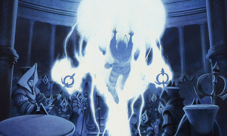
Council's Judgment | Art by Kev Walker
- The idea isn't worth the stress on the rules the change would require.
Magic has a very robust set of rules, but it has limits. For example, in Future Sight, we tried to make a futureshifted card with "last strike." The idea was very simple. Just as first strike happens before normal combat damage, last strike would happen after normal damage. We had no problem playing with it. It's logically consistent, and we always knew what happened when it came up in gameplay, but the rules manager at the time (Mark Gottlieb) explained that adding last strike to the game would require a complete overhaul of how combat works. The system was built around normal damage and first strike. Adding in new layers requires pulling out the existing system and extensively reworking it. Gottlieb felt that the work required to make the change and the impact of the change on the rest of the game wasn't worth it for the new mechanic, so it was abandoned.
- The card can't be templated.
In design, we tend to simply write cards in such a way that people understand what they do. To actually print it, though, the card has to be templated (aka written in such a way that it is consistent with how language works on Magic cards—I call it "Magic-ese"). We're reworking a mechanic right now for an upcoming set because the editors informed us that there wasn't any way to template the cards' current functionality. The mechanic had a few quirky things about it that made it fall through some templating cracks. To keep the mechanic, we had to tweak it so it could be templated.
- The text cannot fit on the card.
When we made the cycle of gods' items in Theros, many people questioned why we didn't make them Equipment, and the answer was because they were already legendary enchantment artifacts. We simply didn't have room on the card type line for the word "Equipment." Often, late in development, cards will be altered because the rules text doesn't fit. A lot of people like to think of design as an open-ended blue sky capable of doing anything, but there are constraints that we must meet, and the ability to physically fit the rules in the text box is one of those constraints.
- The card contradicts flavor.
In Exodus design, Mirri, Cat Warrior originally had protection from black. One small problem: In the Exodus story, she was killed by Crovax, a character who had recently, through a curse, been turned into a Vampire. Crovax was a mono-black character. Cards have the ability to bend a little on how to interpret flavor, and mechanics have a little wiggle room, but this was over the line. It contradicted the story, so we ended up removing protection from black and adding a toughness point.
- The card has a developmental issue.
A very common reason that cards and mechanics get killed in design is because the development team expresses concern that there is no way to make them playable without great developmental risk. Other times, the only way to cost it fairly would make the whole mechanic seem super-unappealing. And sometimes, it messes around in an area that is off limits because of something we've done previously, which development has to work around. Many designs get killed because they can't be properly developed.
- The card cannot work in digital.
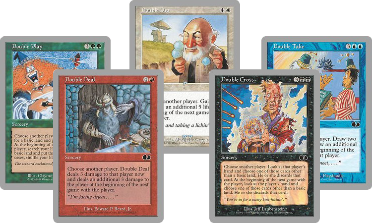
In Future Sight, I toyed around with a cycle of cards based off of the Double cards from Unglued. The cards each had an effect when played and then again at the start of the next game. The Magic Online people came to me when they heard about those cards and said that there was no way for effects in one game to interact with another game, as the system had no way to connect the two. Making this change would entail a major overhaul in the system, and even then, there was no promise they could get it to work. I removed the cycle. (I should note that it was a contentious cycle anyway, so it might have been killed later for different reasons.)

- The card creates excessive problems in digital.
Sometimes the issue isn't that it can't work in digital, but rather that the current incarnation will be problematic. A slight tweak can often take something that would be very difficult to program or something that would be unwieldy in execution for the user and make it go away.
- The card creates problems in organized play.
Just as the cards have to work digitally, they also have to work with the tournament rules. From time to time, we make cards that cause problems because they do something that isn't allowed in the floor rules or cause players to do something that they traditionally aren't allowed to do. Now, most of the time, the tournament rules are able to adapt, but every once in a while it's easier to just tweak the card than majorly overhaul some aspect of tournament play.
- The card has a brand issue.
Unglued and Unhinged both played around in very crazy space, and there were several cards that the brand team asked very politely for us to either severely change or remove.
- The card has a legal issue.
I'm not allowed to give an example for this one, but suffice it to say: It's happened.
My point here is that there are many pitfalls along the journey of creating a design and making it work practically. We've started doing more work in design to address all these issues so we can kill things earlier if we know they're not going to work out.
Colorless Me Impressed
So, let's get the actual story of devoid. What happened? How did it end up as a keyword?
As I explained in my preview article, I needed a way to unify all of the Eldrazi. In Rise of the Eldrazi, we did it by using the tribal card type to allow every Eldrazi card to have the subtype Eldrazi. We've stopped using the tribal card type, though, so that option was off the table. The Eldrazi were closely associated with colorlessness, so I was interested to see if we could use that as the mechanical component tying them all together. The problem was, we needed enough Eldrazi to establish them as being the dominant threat on Zendikar, but creating that many cards with generic costs had all sorts of issues (see Mirrodin block for a good example of things going horribly wrong because most of the good cards could fit into any deck).
The solution to the problem ended up being the futureshifted card Ghostfire from Future Sight. It was a card requiring red mana that was colorless. Using this technology would allow us to make all the Eldrazi colorless while not causing color-pie issues because cards would be segregated by their mana costs.
The very first cards we made simply had "This card is colorless" written near the top of the rules text. I quickly decided that I didn't want to have to write that line on every card. There were going to be a lot of colorless cards, and it was adding what I thought were unnecessary words to the set.
My original take on it was that the cards were going to physically be colorless. How would players know the card was colorless? They'd look at the frame, and it would be obvious. So I changed all the cards in the file and removed the line "This card is colorless." This created a small problem for playtesting, though. Colorlessness was an important quality mechanically; players had to be able to tell whether or not their stickered cards were colorless. My first idea was to sticker all of them on colorless cards, but my worry was people would just assume they were stickered incorrectly. The solution I eventually settled on was to use the word colorless on their card type line as if it were a supertype. A devoid sorcery, for example, would read colorless sorcery.
To make sure I wasn't being completely unrealistic, I went and talked to Matt Tabak, the current rules manager, to see if we could convey colorlessness in some way other than writing it out. Matt was optimistic we could. All seemed good.
The first sign of trouble didn't actually happen until development. Early in development, they have to sign off on whether or not we're going to need new card frames, because if we do, we have to start work on them early. I said that I assumed we'd have a colorless frame similar to what we did in Rise of the Eldrazi but adapted to the newer card frame. My assumption was the devoid cards would use the same colorless frame the true colorless cards used. (In design, we came up with the term "true colorless" as a means to discuss the colorless cards that had a generic mana cost.)
This all changed when more eyes started focusing on the devoid cards. They were weird, and they rubbed a bunch of R&D people the wrong way. Were they necessary? Yes, I said, both because I wanted to be able to mechanically tie all the Eldrazi spells together, and because the "colorlessness matters" theme was a strong one in the set—something that was helping give Eldrazi a strong mechanical identity, especially in Limited. So we talked to the people who were concerned and began to understand their issues. The biggest was that in your hand, they wanted the card to communicate that it required colored mana to cast, but on the battlefield, it had to be clear that the card was a colorless permanent. How could a card be "colored" in your hand and colorless in play?
That was the challenge presented to Liz Leo, a member of the art team that focuses on larger graphic-design issues like frames. Liz came up with a clever solution. What if the card title looked like a title bar on a colored card but the rest of the card below it looked more like a colorless card?
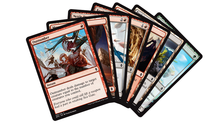
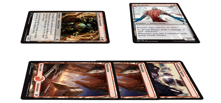
I'll use Nettle Drone as my example. In your hand, Nettle Drone seems like a red card.

But on the battlefield, it appears more colorless.

Okay, we had the frame worked out. We were good to go, right? Not exactly.
Colorless of the Wind
Here was the problem. The rules say there are three ways to determine color. One, it can be defined by the colored mana (or lack of colored mana) in their mana cost. That didn't work on devoid cards, as they were not the same color as the colored mana in their mana cost. Two, it can be stated in the rules text. I didn't want this one because I was trying to keep the devoid cards from being cluttered with what I felt was unnecessary text. Three, cards can have what is called a color indicator. I think they first came about because we had double-faced cards that had a side that didn't have a mana cost, and we didn't want to have to write it out in their rules text, so we used a colored circle right before the word "Creature" on the card type line to indicate color.
If the first answer didn't work and we didn't want to use the second, that meant our only answer was to make the third option work. We needed to make a color indicator that conveyed colorlessness. Liz worked on some executions, and then we tested them on Wizards of the Coast employees who were Magic players but had never seen devoid cards. Here's what we learned: It is near-impossible to convey with a colored circle the concept of colorlessness. If it's gray, it reads as gray. If it's brown, it reads as brown. If it's see-through, it reads as whatever color is in the art below it. We tried test after test, and it became clear that people just weren't getting it.
Once the third option had been ruled out, it became clear that the second option was our only way of making it work. We were going to have to use words. The first thing we did was to come full circle, back to where we began, and use the text "This card is colorless."
We then did another round of testing and found a new problem. When we showed new players the cards and asked, "Is this card colorless?" they said yes. But if we then asked, "Is this card red?" (for a devoid card with red in its mana cost), they also said yes. Players believed it was possible for cards to be both colorless and a color.
The rules text we wanted to use, "This card has no color," doesn't actually work as stand-alone rules text. It uses vernacular that might be easier to understand but doesn't follow the programming language that is Magic templating. Tim Aten, the editor on the set, came up with the solution. If we keyworded it, we could use the line we wanted as reminder text. Reminder text can be looser in structure than actual rules text. In addition, keywording it solved another problem we were running into. How could players talk about devoid cards without an assigned name? Calling them colorless cards was incorrect, because the set was full of true colorless cards, cards that are colorless with generic mana costs. Keywording the ability allowed players to discuss the subset as a thing.
And that is how an idea that started off as one concept ended up being executed very differently. Why does devoid have to be the way it is? Because every other version of it we tried failed.
The Solution That Works
Today's column isn't just about devoid. It's about how game design (any design really) has to face certain truths. It's wonderful to have a cool idea, but if that idea can't be practically applied, it's of no use. The key is taking your good idea and figuring out what you need to do with it so that someone else can actually use it. It's not always pretty, and sometimes you end up far away from where you started, but it's a painful truth of creation. Concepts are great, but a concept without an execution is nothing more than a dream. If you want to work in a field where you produce tangible results and a finished product, you have to face the reality of making compromises to make your thing work. Devoid is just the latest Magic example of this principle in action.
That's all I have for today. I hope the story of devoid was illuminating. As always, I'm eager to hear your feedback. You can write to me through email or any of my social media (Twitter, Tumblr, Google+, Instagram).
Join me next week, when I'll be beside myself.
Until then, may your concept be executable.
"Drive to Work #270—10 Things Every Game Needs: Flavor"
This is part nine of my ten-part "10 Things Every Game Needs" series. Today, I talk about the importance of flavor.
"Drive to Work #271—Un-Rules Manager"
This podcast is about one of my jobs that I don't talk about much: being the rules manager for silver-bordered Magic.
- Episode 271 Un-Rules Manager (16.7 MB)
- Episode 270 10 Things Every Game Needs: Flavor (15.4 MB)
- Episode 269 Breaking Rules (15.1 MB)
- Episode 268 PAX 2015 (20.5 MB)
- Episode 267 Green-Blue (15.3 MB)

