Kaladesh Ingredients, Part 1
Welcome to the first week of Kaladesh previews! I can't tell you how excited I am that this day is finally here. The hardest part of my job is creating something that I'm very proud of that I know you all are going to love and then having to sit on that information for many, many months (sixteen this time around, I believe). Well, the day is here, and I can finally start telling you the story I've been wanting to tell about a set I am immensely proud of.
The Aetherpunks Behind the Design
But before I dive into the story of how this set got made, I have to begin by introducing you to our cast of characters. This list is a little longer than normal because a number of people had to swap in and out along the way.
Shawn Main (co-lead)

Shawn led the design of Magic: The Gathering—Conspiracy and Conspiracy: Take the Crown as well as Magic Origins, but tackling a large non–core set expansion was a little bit bigger of a task than Shawn had ever taken on. Back when I did Gatecrash, timing forced me to leave the set early (as the lead designer) and pass the reins to Mark Gottlieb, who at the time had never led the design of a large set. The swap-the-reins-halfway style of design worked well then, so we decided to do it again with Kaladesh. Shawn and I co-led the set, with me taking lead of the design for the first half and Shawn for the second. Both of us were there for the whole design and we would consult with one another as we were deciding what changes to make to the file. Shawn was a wonderful partner and I couldn't be happier with the result of our work.
Doug Beyer

Doug was the creative team representative on the design team. He was in charge of making sure our design stayed true to both the world of Kaladesh and the story of the block. Doug is also a good card designer, so not only did he help keep the creative aspects intact, he also made a bunch of cool cards.
Mark Gottlieb

Mark didn't join until the halfway point. He was leading the design for Aether Revolt and we wanted him to be up to date on the first set before he started leading the design for the follow-up.
Ben Hayes

Ben was our first development representative. His main job is making sure that we were keeping the power level in check so that our playtests were about finding out what was fun and not just what was broken. Ben had to leave partway through due to responsibilities on other projects.
Jonathon Loucks

Jonathan was one of the eight finalists from the second Great Designer Search. He ended up coming and working on the Magic R&D digital team. I knew Jonathan was a great designer, so I was happy when we were able to get him on the Kaladesh design team. Jonathan left the design team when he left Wizards to pursue other game design opportunities.
Drew Nolosco

When Drew started on the Kaladesh design team, he was working on Duel Masters, a trading card game we make for the Japanese market. He eventually had to leave the team because he changed roles and started overseeing Magic Duels.
Adam Prosak

When Ben left, Adam swapped in to be the new development representative. Like Ben, he helped us make sure the focus of our playtests was on the things we were trying to learn about and not mis-costed cards.
Scott Van Essen

Scott was the third person on Kaladesh design to have participated in the second Great Designer Search (along with Shawn and Jonathon—Scott was a finalist in the first Great Designer Search as well, the only person to be a finalist on both). Scott also worked on Duel Masters, but I was eager to get him onto a Magic design team. Scott is a font of ideas and cool card designs, so I'm glad we were able to get him onto the team.
Mark Rosewater (co-lead)

I came. I saw. I co-led.
Now that I've introduced the design team, in its many incarnations, let's get to the meat of our story—the design of Kaladesh.
The Origins of Kaladesh
A "steampunk world" had been on R&D's short list of worlds to possibly visit in future Magic blocks for many years. What finally got us to do it, interestingly, was Chandra. You see, we decided that Magic Origins was going to tell the origin stories of the future members of the Gatewatch. To do that, we wanted to show their home planes and the planes they visited when they first sparked (meaning traveled to another plane for the first time; sparking is usually not done consciously and thus is a huge surprise). That meant we had to figure out where exactly each of our five characters came from.
Nissa was easy, as it was already known she was from Zendikar. Gideon and Liliana both came from worlds we knew, even though it was news that these were their home planes (Theros and Dominaria, respectively). But Jace and Chandra wanted to be from worlds that we hadn't visited yet (well, at least not as a setting for a block). As the creative team figured out which world made sense for Chandra, they ended up circling back to a steampunk-inspired world—although one with a very different sensibility than most.
Influenced by the little we knew about Chandra's homeworld, the creative team crafted a world that made sense as where Chandra came from. It wanted to have some technology as hinted by her clothing and goggles. It wanted to have some elements of Indian flavor, as Chandra's name is an Indian name. It also had to have some kind of authoritative force that Chandra, as a red character, could rebel against. This led them to the idea of a technology-driven city, but one that leaned more toward technology as art. Traditional steampunk usually has strong Victorian influences and tends to be a bit pessimistic in its worldview. The creative team liked the idea of tackling a "steampunk" aesthetic, but one with a more optimistic tone. They ended up dubbing it "Aetherpunk."
As the creative team worked on the world, they started falling in love with it and made the bold proposal to R&D. What if we introduce the world in Magic Origins and then revisit it a short time later as a setting for a block? Everyone liked the plan, so the creative team put extra care in making sure they set up a world in Magic Origins that we could then deliver a little over a year later as a fully fleshed-out block.
Let's Start from the Very Beginning
Exploratory design for Kaladesh was unique in that we were going to a world we had never centered a block around before, yet we had a sense of what the world looked like. Normally, world building doesn't happen until halfway through design, so I'm used to starting design with no visuals in mind (unless of course we're returning to a world we've visited before). Having pictures to look at helped create a sense of what kind of world we were building. I knew from day one that we wanted an optimistic tone that played into the idea of technology as a kind of art. Kaladesh is a world of invention. If we were going to do it justice in its design, we were going to have to make the player feel like an inventor. That concept is what drove the design.
This meant that yes, the set was going to have an artifact component, but I didn't want the sense of invention limited to artifacts. I knew going in that any artifact set would bring up memories of Mirrodin and I wanted to make sure that from the get-go, I was clear that Kaladesh wasn't just another "artifact set." The line I came up with early on and used all during design and development is that on Kaladesh, artifacts are technology, not biology. Most creatures on Mirrodin had metal connected in some way with their biology. The idea was that on Kaladesh, the connection would be one of technology, where you would see most creatures interacting with devices that aided them in their work.
This also meant that I wanted to have something key to the world that wasn't just tied to artifacts but tied to cards of all colors. I wanted some kind of through line that would give Kaladesh its own clear identity. Interestingly, the origin of my solution would go way back to over twelve years earlier.
Building Up Energy
Our story begins with the design of original Mirrodin. I had wanted to do an artifact block for a long time (my first favorite set was Antiquities) and I had finally convinced the Powers That Be to let me do one. There were a lot of goals I had set for myself, but one was the loudest. I had to make a lot of cool artifacts. I tried different techniques to come up with them. I went on the internet and looked for cool real-life artifacts. I imagined things that never existed but could have, and designed cards to match the flavor I had come up with in my head. And, of course, I went back and looked at old artifact cards to see what might inspire me. One card that inspired me was an artifact from Homelands, one of the few cards from the set that was actually tournament-viable. This card:
Serrated Arrows had a mechanic I really liked: it came with a set number of uses. It made you have to think about when and where you used them, as it wasn't something you could do endlessly. I found the resource management to be interesting, so I made a number of artifacts that each entered the battlefield with a certain number of counters (I think they were charge counters) that got depleted as you used the artifact.
Then one day, I made an artifact that could not only use its counters but could use counters from other artifacts. The card playtested well. It forced you to do interesting calculations. Would I rather this counter be effect A or effect B? I was so tickled by this new card that I decided to try something a little wilder. What if all my artifacts with charge counters worked this way? What if getting three charge counters on one artifact meant that I get three uses not just of this artifact but of any other artifact that used this resource?
The more I played around with this new mechanic, the more enamored I was with it. However, there was still one part I had an issue with. Because the counters sat on artifacts, if an artifact was destroyed, it meant you lost all the counters on it. This dynamic created a mini-game where the opponent would try to destroy the artifact with the most counters, so you started playing a counter game (pun, as always, intended) where you were constantly monitoring which artifact had how many counters to maximize the difficulty for the opponent when using artifact destruction (which was more common than normal, as this was an artifact block).
It was creating a lot of mental strain for minimal gameplay, so I started thinking about a different way to do the mechanic. Instead of putting the counters on the artifact that created them, what if they created a special kind of mana—one that didn't leave the mana pool until you spent it? This way, destroying any one artifact wouldn't take away uses. It also meant that we got to use a cool symbol. Okay, technically we could have spelled it out and not used a symbol, but I thought the symbol would be splashier, create fewer words on the cards, and make it clearer from a distance what the cards were doing.
For flavor, I had dubbed this mechanic "energy," so I started using the letter E to represent both the mana made and the cost needed to use it. Yes, this was Mechanic E that I hinted about so many years ago (in an article back in 2007). As we played with it, we eventually moved energy from being a new type of mana to being a counter that the player received, which they could then spend to "pay" an energy cost. The new execution worked wonderfully. It was flavorful. It played well. We were good to go.
That is, until I turned in my design to then–Head Designer Bill Rose (who is now vice president of R&D). Bill liked the design but felt it had too much going on. Something had to be pulled. Energy took up a lot of space and Bill liked other mechanics more, so he told me to remove it. I put up a fight, as I liked energy, but I realized he was right that the set was overstuffed and energy was less intertwined than other mechanics, meaning it would be easier to take out. I changed a bunch of my designs over to just having charge counters, but they were then closer to my original Serrated Arrows–inspired designs. I did put in one card that let you move charge counters, but, for all intents and purposes, energy was gone.
I knew energy was a good mechanic, so I kept a lookout for where we could use it. It actually got into the design of Shards of Alara for a little while (part of Esper if I remember correctly), but it wasn't a perfect fit, and it wanted to use more space than the set allowed, so once again the mechanic was pulled.
Energy Conservation
Fast forward to the beginning of Kaladesh exploratory design. I knew I wanted the players to feel like inventors and I knew I was looking for something that would create what's known as a "high variance of play." The idea was that if you take a deck and play ten games with it, there is a spread of how differently the games play out. In normal Magic, that spread is something like one to five. I was interested in changing the spread to more like one to ten. I wanted to choose mechanics that gave the player more choices and synergy options, such that playing the same deck would lead to a wider variety of things happening. The more I thought about what I was trying to do, the surer I became of one thing. In fact, the very first thing I said to my exploratory design team at our very first meeting was "Okay, let's explore using energy."
Even though I had done a lot of design with energy back in the day, I wanted to properly put it through its paces and not assume anything. Design technology had changed a lot in twelve years, so I was interested to see what the exploratory design team felt was the right way to do energy. The team came up with three versions:
Version #1—Charge Counters on Cards
This version worked very much like my first version of energy. Cards entered the battlefield with charge counters, and then any card that cared to could remove a charge counter from any card you controlled for its activation. The charge counters lived on the cards that created them, so if you destroyed that card, you also got rid of any charge counters on it.
Version #2—Energy Counters for Players
This version was basically identical to what I had been using at the end of Mirrodin design. Note that because I didn't want to sway the testing, I didn't tell the team that this was the version I had chosen when I originally created the mechanic.
Version #3—Artifact Tokens
This final version had energy as artifact tokens that sat on the battlefield. You could then sacrifice them to pay any energy cost.
The first option we eliminated was version #3. It had a few problems. One, the block before it was already using artifact tokens. (Hello, Clues.) Two, while Kaladesh wasn't an "artifacts matter" block, we wanted the ability to have a few individual cards that cared about artifacts—and having a battlefield full of artifact tokens would make that a little too easy to abuse.
The exploratory team then came to the exact same conclusions we had back during Mirrodin design. Version #1 just took more bookkeeping and didn't have better gameplay, so after an extensive review, we ended up choosing version #2.
We knew that energy would require an economy that development would have to put together, so we spent a bunch of time in design building the framework. For example, we made sure that energy expenditure lined up in power level. This means if you spend one energy on one card, it would roughly be the same power level of another card that also used one energy as a cost. We did this for each energy expenditure.
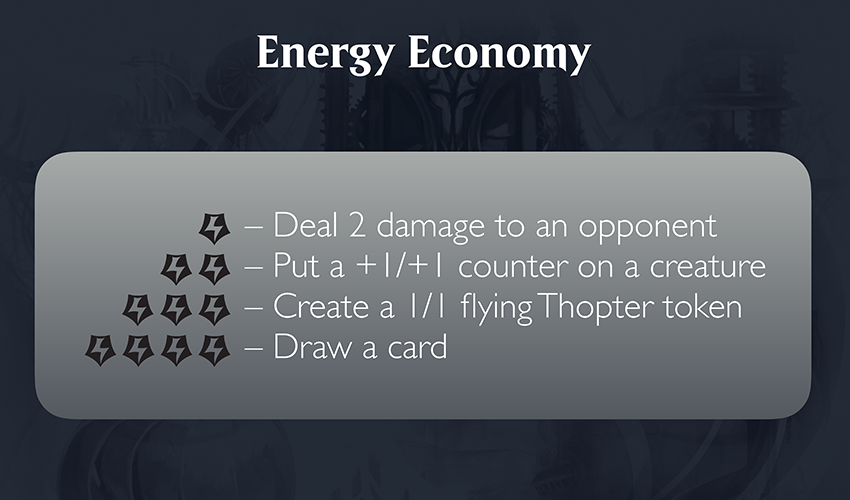
We also spent a bunch of time talking energy philosophy. For example, must every card that produces energy use energy? Must every card that uses energy produce energy? In the end, we decided that most of the time we wanted them to line up, but we would occasionally allow cards that produced energy without using it, as energy would be so prevalent in the set.
We spent a lot of time working to make sure that energy didn't just feel like a mana replacement. We tried to limit how often you were using mana with energy in costs. We also tried to make sure our designs felt a little different from normal cards so that we didn't create cards that felt like the mana was simply swapped out for energy. And we worked hard to give each color a different identity in how it interacted with energy. It was important that if you drafted different energy decks in different colors, they would play differently. (I'm going to let Shawn talk about this one at some point in a future article, as the execution changed a bunch during development.)
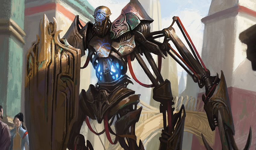
Meanwhile, we worked with the creative team to help weave energy into the look and feel of the world. It represented a crucial resource, Aether, that the politics of the world revolved around. The art team spent time in world building making sure they understood what the Aether looked like and how it was intertwined into the technology of Kaladesh. Energy wouldn't just be a cool mechanic to play with; it would serve as a crucial component of the world and story.
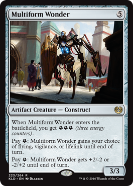
Before I finish up talking about energy, I have one last thing to do—show you a preview energy card!
Click here to meet Multiform Wonder
But Wait, There's More
Energy was just the first piece in the Kaladesh puzzle, but I've run out of time for today. Luckily, this is just part 1, so I have more story coming. Note that part 2 is actually going to be in two weeks, because I have a different article about a different aspect of Kaladesh next week. (Something cool, I promise you.)
I'm eager to know what you think of Kaladesh so far as well as how you found today's article. You can respond to me either through email or through any of my social media accounts (Twitter, Tumblr, Google+, and Instagram).
Join me next week for, well, something cool.
Until then, may you start to think of all the inventing you're going to do.
"Drive to Work #362—Work/Life Balance"
In this podcast, I talk about a topic suggested by a reader from my blog: balancing work with the rest of your life.
"Drive to Work #363—Packaging"
This podcast looks back at the history of Magic packaging.
- Episode 361 Twenty Lessons: Emotional Response (20.9 MB)
- Episode 360 Tweaking (14.9 MB)
- Episode 359 Top 10 Non-Design Jobs (18.6 MB)

