Nuts & Bolts #11: Art
Welcome this year's installment of "Nuts & Bolts," my annual series dedicated to helping players design their own Magic cards and/or sets. This series provides hands-on technical advice, but for those of you uninterested in making your own set, it gives you a behind-the-scenes look at how we make Magic sets.
Here's a recap of what I've written so far.
Nuts & Bolts #1: Card Codes
The first column is the most technical, explaining how we use a system to make sure everyone is always talking about the same card.Nuts & Bolts #2: Design Skeleton
The second column introduces the most important tool in designing a set, something called a design skeleton. (It makes use of card codes, which is why that article came first.)Nuts & Bolts #3: Filling In the Design Skeleton
The third column talks about how you begin filling in your design skeleton, starting with the common cards.Nuts & Bolts #4: Higher Rarities
The fourth column talks about filling in all the other rarities.Nuts & Bolts #5: Initial Playtesting
The fifth column discusses how to best use playtesting to gather feedback and make improvements on your set.Nuts & Bolts #6: Iteration
The sixth column talks about the concept of iteration and how you can incrementally improve your set.Nuts & Bolts #7: Three Stages of Design
The seventh column explains the three different stages of design, walking you through how your priorities shift as the set evolves.Nuts & Bolts #8: Troubleshooting
The eighth column answers a number of questions about common problems that can happen in the early to mid-design stages.Nuts & Bolts #9: Evaluation
The ninth column talks about how you can look at your set as a whole and figure out what fine-tuning it still needs.Nuts & Bolts #10: Creative Elements
The tenth column discusses how you interweave your mechanical and creative elements into a cohesive set. It discusses both top-down (starting with the flavor) and bottom-up (starting with the mechanics) design. I then go into detail about how to handle names, creature types, and flavor text.- Episode 608 Other People's Lessons – Poetry
- Episode 607 Unique Creature Types
- Episode 606 Lessons Learned – Dominaria
That brings us to the eleventh column in the series, a continuation of last year's column. Last year, I talked about how to incorporate creative elements that appeared in text. This year, I'm going to dive into the other big part of your creative—art.
The Power of Perception
Before I get into the weeds, let's first examine a bigger question, should your homemade set have art? It doesn't have to. You can playtest your set without it. I'm going to argue though that you should, at least once you get to the point where you're playtesting with people outside of your design team. Why?
Because it matters, it really, really matters.
A big part of game design is creating an emotional response in your players. The art goes a long way in helping create this emotional response. You're trying to convey flavor on each and every card. Yes, you have a name and rules text, and maybe flavor text if there's room (and you've chosen to write some), but none of that has the impact of a picture. The reason I know this is because for years, we made our playtest cards without pictures.
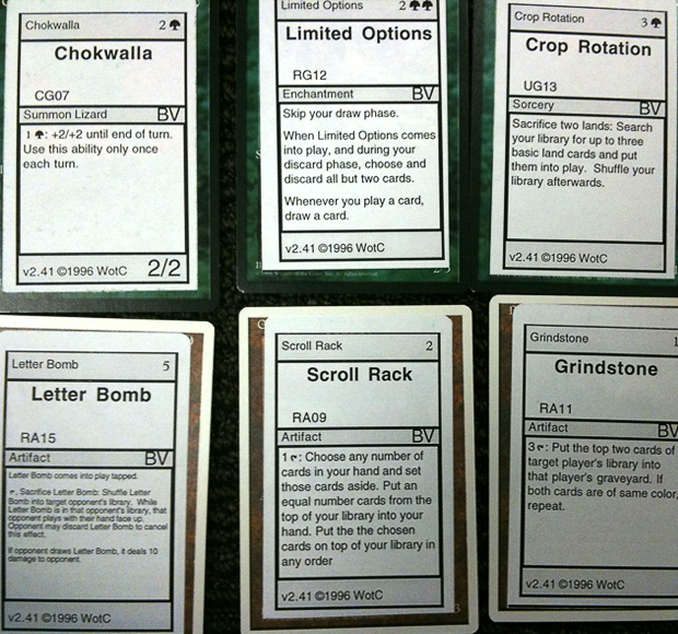
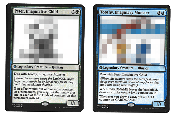
I played many finalized, completed sets on stickers. It was just the reality of how R&D played Magic. And then, we would get the boosters in of the actual product. The first game with actual cards was such a different experience. None of the text was different. The only change was the addition of art, and it felt like a different, better set. R&D realized this was so important that we changed how we made playtest cards to maximize the ability to get art on the cards as early in the process as possible. We won't even do an outside playtest without art (provided the art exists at the time).
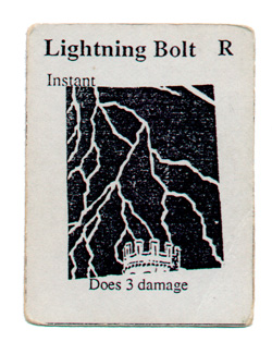
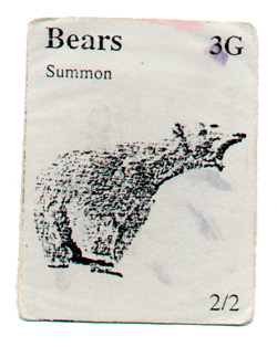
When Richard Garfield first tested Magic with his playtesters, he made tiny pieces of cardboard (about three inches by one and a half inches) with the text photocopied on them. Even those earliest playtest cards had pictures on them because Richard understood the very concept I'm explaining now—pictures help convey the flavor and make the game a richer experience.
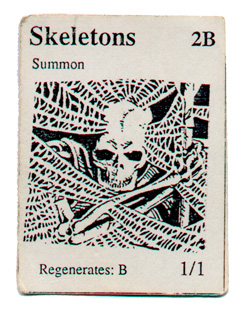
This long aside is just me stressing that if your goal is to make your homemade Magic set feel as real as possible, art matters. If you don't have the time, resources, or technology to have pictures on your cards, that's okay. You can have a homemade set without it (you can make a pictureless playable set), but I just want you to understand that it will have an impact on how it gets perceived by others.
It's a Wonderful World
At Wizards, the art starts with the creation of the world. Where exactly is this expansion set? What plane are we on? If we're returning to a plane we've already visited, we need to go back and look at all the reference material and discuss any new aspects that previous visits didn't show. If it's a new plane, we have to build it from the ground up.
As I've explained in previous "Nuts & Bolts" columns, design approaches a new set in one of two ways, "top-down," where we start with flavor, and "bottom-up," where we start with mechanics. Usually in a top-down design, we're building on something that comes with some built-in resonance—it's a gothic horror world (Innistrad), it's a Greek mythology–inspired world (Theros), it's a steampunk inventor's world (Kaladesh). Usually, in this case, the original exploration of world building is trying to figure out how Magic wants to approach the inspirational source at hand. Design will work with the Creative team to make sure that we're leaving open areas to explore mechanically, but Design tends to follow the lead of the Creative team more in the world-building space.
In bottom-up design, the set is being crafted around a mechanical identity, meaning Design has to work with the Creative team to figure out how that's visually represented. For example, Ravnica wanted to be a block about the ten two-color pairs, each on equal footing with the others. That mechanical constraint led the Creative team to the idea of the guilds which in turn led to the idea of a city world. Usually in a bottom-up design, the Creative team works to understand how to creatively express mechanics and then the Design team makes other mechanics that reinforce the flavor. Zendikar, for example, made lands matter, which in turn led to the idea of an adventure world, which then led Design to make things like Allies, Maps, and Quests.
It's important if you're making your own set that you have some rough idea of what world it's taking place on. You obviously don't have the resources that Wizards does (our world-building process is lengthy and involves a large team of people), so there shouldn't be any expectation that it's as fleshed out, but I would recommend spending at least a little time on it. If this is the kind of thing that you enjoy, feel free to spend as much time on it as you want. It's also okay to build your set on a known plane. Just be aware that doing so will come with some expectations from your audience if they've previously played a set based on that world.
A few tips on world building in design:
Don't use jokey names – In the past, R&D tended to use a lot of silly names in design, but over the years, we've learned the importance of using the names to convey the flavor as early as possible as it gives the set a better feel of what you're designing toward. A good way to start building an overall feel is to use realistic card names as early in the process as you can.
Create some proper names of places and characters for card titles and flavor text – One of the easiest ways to start giving your set an overall feel of a world is making use of words that are specific to that plane. I believe it was important that Limited Edition (Alpha) had Llanowar Elves and Serra Angel rather than just Mana Elves and Warrior Angel. Just make sure those words are easy to pronounce. My simple test is showing the word to three people that have never seen it before and have them read it aloud. If they don't all pronounce it the same, change it.
Limit the amount of fictional place names – Less is more with fictional place names. It's much better to use a few that show up a lot than use a whole bunch that each show up just a little. Because Magic makes extensive use of flavor text and additional story support, we can get away with using more proper names on less cards than all of you can, so I'd advise using a little less than we do.
Cards referencing other cards helps a world feel connected – A good trick to help a set feel more cohesive is to have cards reference one another in flavor. You can do a tiny bit of mechanical referencing, but I'd recommend being stingy with it.
When hitting resonant tropes, make sure your names and art convey what you're trying to hint at – A classic example of this was in Theros when the Creative team took our top-down Trojan Horse and changed it to Akroan Horse. The card that had been getting positive comments suddenly started getting negative reviews because players didn't get it. Resonance won't work in your favor if the audience can't see the source material you're hinting at.
Building a world is hard. It's going to take just as much iteration as the mechanical part of the design. That's why I suggest starting it early in the process to give you time to get a feel for what works and what doesn't. I will say of all the things I'm talking about today, the cohesive world part is not as important as the card-by-card resonance that I'm going to be getting to in a second, but the more you can do, the more your set will feel like an actual Magic set.
The Making of a Card
Now it's time to talk about flavoring individual cards. To do this, I have to start by explaining a thing called "card concepting." Card concepting is figuring out what each card means flavorfully. For example, I have a red card that deals 4 damage to any target. What is it? It's obviously some kind of direct-damage spell. It could be fire or lightning or sound or lava or rocks or earth. The only limitation is that it has to make sense on the world and in the color(s) of the card. Some sets allow us to push the color definition through the flavor of the plane. For example, Coldsnap had a few direct-damage spells flavored as cold based. As a general rule, I'd avoid pushing things outside the general feel of the color unless there's a very strong reason to do so, and even then, do it sparingly.
I started with a direct-damage spell because that's pretty straightforward. Not every spell is as easy to flavor. For example, we often make a modal green spell that destroys one of two options that aren't connected (such as an artifact or a flier), and the card conceptor has to work hard to find a viable explanation for the card. I point this out because I want to stress that card concepting can get very difficult and set the expectation that some cards might need some iteration to get to the best concept.
What this means is that for each card, you have to decide what exactly the spell is flavorfully representing. If it's a creature, you have to decide what creature type(s) it is. (The Creative team chooses creature types of cards unless there's a mechanical need for it to be a specific creature.) This card concept will lead you to a name, flavor text (if necessary), and a direction for what kind of image you want the card to have. Let's walk through a number of issues you'll be facing:
Comprehension
The main goal with your card concept is that it helps the player better understand what the card does. The trick in card concepting is finding a clean, flavorful explanation for what is mechanically happening on the card. The cleaner the card concept, the easier it will be for the players to grasp and understand the card. Resist the urge to make the flavor convoluted. The test I do is to show the name to someone who plays Magic and ask them what they think the card does based solely on the name. If they can get close, you're usually good. If they have no idea, it's most often a sign that the concept is problematic (although sometimes it's an issue with the name more than the concept).
Consistency
Each card has to make sense in a vacuum, but they also have to make sense when seen together. For instance, if you flavor a keyword mechanic a certain way, odds are you're going to want to flavor it the same way for other cards with the same mechanic. You have some ability to differentiate between colors, but be careful with trying to make one mechanical element represent too many different concepts.
Card Separation
That said, there's an opposite issue to watch out for. You don't want too many cards that can easily be confused with one another. For example, let's say you have a bunch of direct-damage spells. Try to concept them such that it's obvious what the small effect is in contrast to the medium one in contrast to the large one. If you gave a player the three names in a vacuum, you want them to be able to order them from smallest to largest. There's a balance between concepting similar cards differently enough that the players can tell them apart while still being connected enough that they feel like the same world. Creative work is just as hard as the mechanical part, so be aware that what I'm talking about today can take some time.
Cycles
Cycles tend to do one of two things. Either they allow you to show the difference between things that are similar or show similarity between things that are different. In either case, though, all the cards in a cycle have a flavor connection to one another. Usually, you're going to want to use the creative elements to communicate that they're a cycle.
Creatures
The Creative team normally makes a creature chart that lists Small, Medium, and Large on one access, and Flying and Non-Flying on the other. They then fill in the chart to explain what on this world fills all of those gaps. I'd recommend making a similar chart. Also, be careful about having too many unique creature types as a world feels more cohesive if you see repetition.
| White | Blue | Black | Red | Green |
| S, NF | Human, Kor, Hound | Human, Merfolk | Human, Vampire, Wraith, Shade | Human, Goblin, Lizard | Human, Elf, Basilisk |
| M, NF | Human, Spirit, Cat (Felidar) | Human, Merfolk, Serpent | Human, Vampire, Zombie, Horror, Surrakar | Human, Ogre, Minotaur, Giant, Boar, Elemental | Human, Elf, Beast, Giant Insect, Snake |
| L, NF | Elemental, Giant, Cat (Felidar) | Elemental, Leviathan, Kraken | Demon, Horror, Giant Scorpion, Giant Insect, Elemental | Giant, Beast, Hellion, Elemental | Hydra, Wurm, Beast, Giant Spider, Elemental |
| S, Flying | Bird, Spirit | Bat, Drake | Bat, Imp | X | X |
| M, Flying | Griffin, Angel, Spirit | Drake, Illusion, Jellyfish (Gomazoa) | Vampire, Giant Insect | X | X |
| L, Flying | Angel, Archon | Sphinx | Demon, Vampire | Dragon, Manticore | X |
Novelty
One of the ways to make your world feel new is to have one or two things that aren't something you'd normally see. It could be a brand-new creature type (something based on real-world mythology that Magic's never used or perhaps something you've made up). It could be a known creature type pushed into a color that it's not normally in. (Just make sure that the flavor properly justifies the shift.) It could be some original world element that explains a key mechanical component of the design. Just remember that new and different works better in smaller quantities.
Tokens
If you're trying to match up with how we make Magic sets, be aware that we try to rein in how many different creature tokens we make. With a few exceptions at higher rarities, we tend to have just one creature type for a certain size and color of token. For example, "on this world, 1/1 green creature tokens are Saprolings."
Worth a Thousand Words
Finally, it's time to actually get down to pictures. Hopefully, if you've done your world building and card concepting properly, it will be clear what kind of image you're looking for. Always remember that Magic's card art box is small. You don't have tons of space to show a lot of different things. Figure out what matters to the card's flavor, and focus on that. As always, a good test is to show someone the image in a vacuum and ask what they think it's for. If the image doesn't do a good job of conveying the card concept without text, it's not going to do a good job when the text is there. (Players notoriously will just look at art and skip text whenever they can.)
Here's my advice for how to choose your images for each of the card types:
Artifacts – Show the object. It's not important that the artifact is being used. It being recognizable as an object is more important than it being clear what effect it's creating.
Creatures – Show the creature represented by the card. They can be doing something, but don't pull too far back to show it. It should be clear that the creature is the focus.
Enchantments – This is the trickiest card type to concept as it can represent so many different kinds of things. In general, I think the best enchantment images capture the feel of the effect the enchantment generates. Enchantment images can be the most abstract.
Instants & Sorceries – It's more important that you see the spell happening than you see the person casting it. More often the picture should be of the recipient of the spell being affected by it than the caster of the spell.
Lands – Lands should focus on showing the place and not worry about capturing other aspects. In general, still landscapes of the location work just fine.
Planeswalkers – The card should just show the planeswalker in question basically standing there. They can be in a slight pose, but the focus should be on the character. It's more about the planeswalker having a sense of attitude than conveying any magical spell.
I would suggest always erring on the side of simplicity of your images. Remember that it's more important that players can tell what it is rather than it capturing the effect of the card 100%. Players are more than willing to fill in aspects that aren't readily apparent.
My one final note is to be careful about images that look too similar to one another, especially on the same card type. If you find playtesters confusing cards with one another, that's usually a sign that something needs to change on a least one of the cards.
Last Thought
Adding in a visual component is a lot of work, and I understand why many designers will be hesitant to include it. I just want to stress that even a little work in this area will have huge dividends. Richard's playtest cards are a good example of how just the tiniest of visual flavor goes a long way. Even if you can only sketch simple scribblings on your cards, it will have a big impact in how your audience will respond to your set. I can't urge enough for you to at least give it a try.
"I Love It When a Set Comes Together"
That's all the time I have for today. As always, I hope this column helps all of you out there making your own sets. I'm curious to hear your thoughts on today's column as well as areas I've yet to touch on that you'd like to see in future "Nuts & Bolts" columns. You can email me or contact me through any of my social media accounts (Twitter, Tumblr, and Instagram).
Join me next week when I try on other people's shoes.
Until then, may your pictures bring smiles.
#609: Designing Direct Damage
#609: Designing Direct Damage
48:53
This is another podcast in my "Designing _________ " series where I discuss how we design basic Magic effects. In this podcast, I talk about designing direct damage.
#610: Bends and Breaks
#610: Bends and Breaks
1:04:20
Often on my blog and social media accounts, I talk about things being "bends" and "breaks." In today's podcast, I go in depth defining what those terms mean and talk about why bends (in moderation) are good for the game and why breaks are bad.

